 here are names that are included in the history of art almost automatically. They belong. Rodchenko and Stepanova are artists of this kind. Indeed, there would now – thanks to the efforts of their heirs and interested scholars – hardly seem to be an unexplored corner of their existence after the outpouring of their letters and scholarly articles and memoirs about them that began to be published in the late 1980s with the renewal of interest in the Russian avant-garde. Yet this conversation with Aleksandr Lavrentiev, scholar and professor at the Stroganov Academy, offers a new angle on many questions: Rodchenko’s life before the era of Constructivism, his role at VKhUTEMAS, the Constructivist lettering almost obscured by the paintings, his acclaimed advertising projects undertaken in the 1920s. This interview is devoted to these aspects of Rodchenko’s life and creativity. Here I would like especially to thank Yekaterina Lavrentieva, a teacher and historian of graphic design and the daughter of Aleksandr Lavrentiev. Her participation in the conversation and the discoveries in the family archives that she shared with me, as well as her staunch defense from the lectern at the Stroganov so that Aleksandr Nikolaevich might be left in peace for at least half an hour more for our conversation, were instrumental in the preparation of this text. — R. G.
I would like to talk a bit about Rodchenko’s first years in Moscow, after his move from Kazan. Who was the biggest influence on him at that time? How did he come
to non-figurative art?
Aleksandr Lavrentiev: A look at Rodchenko’s life shows that he was always interested in the modern. He was interested in the music and literature of symbolism. His early drawings, for example, are very suggestive of Beardsley, and that was no accident. Like Vrubel’s, the strokes in Rodchenko’s pencil sketches multiply, rather than end. As he searched for a wholeness of contour, his early line was nervous, broken. It seems to me that, once Rodchenko had seen Beardsley’s sketches, he understood that any multiplicity could be brought together as a unique graphic sign. That was his first discovery. Furthermore – and this is, of course, putting it simply – he brought the compass out of the workshop. Every art-school student had a compass, of course; everyone studied descriptive geometry and had drawn all kinds of diagrams with all kinds of lines. It simply had not occurred to anyone to make art with this draftsman’s tool.
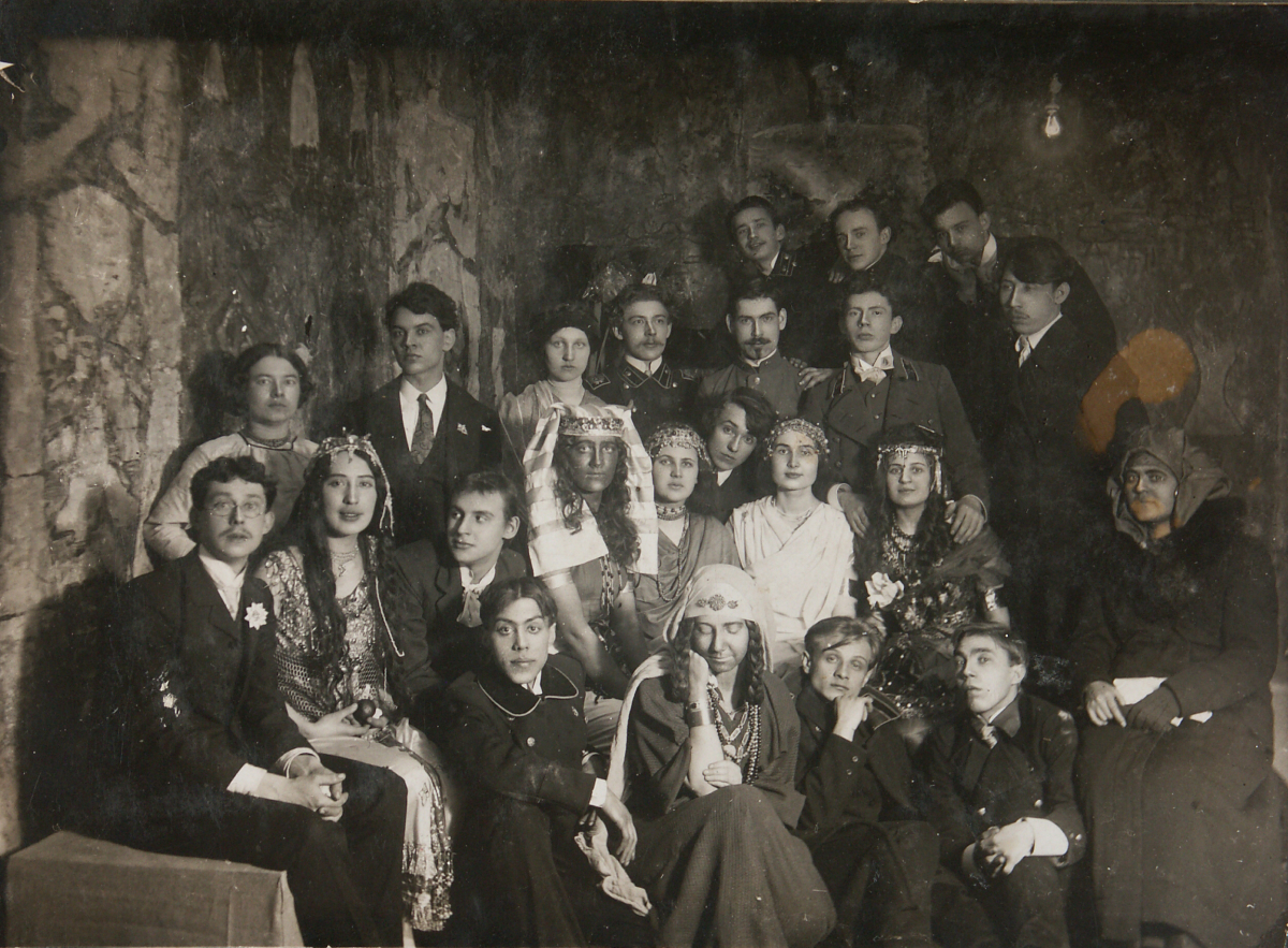
The Egyptian Ball. A student social at the Kazan Art School. 1912. Rodchenko is third from left in the second row. The Rodchenko family moved from St. Petersburg to Kazan in 1902. Rodchenko had completed only four years at a parish school. Without a diploma attesting the completion of his secondary education, Rodchenko enrolled as an auditor at the Kazan Art School, widely known, though unofficially, for its preparation of artists for provincial theaters.
In 1914 Rodchenko met Varvara Stepanova, and they had a stormy romance. When she had to leave Kazan before finishing her studies, they wrote to each other. Rodchenko’s letters of the period are virtual reports on his artistic activities. In one letter, he wrote: “I am doing something for which there is as yet no name.” He imagined that he was entering some sort of demon-haunted underworld. It was at this time, I think, that he saw the motifs of his non-figurative work.
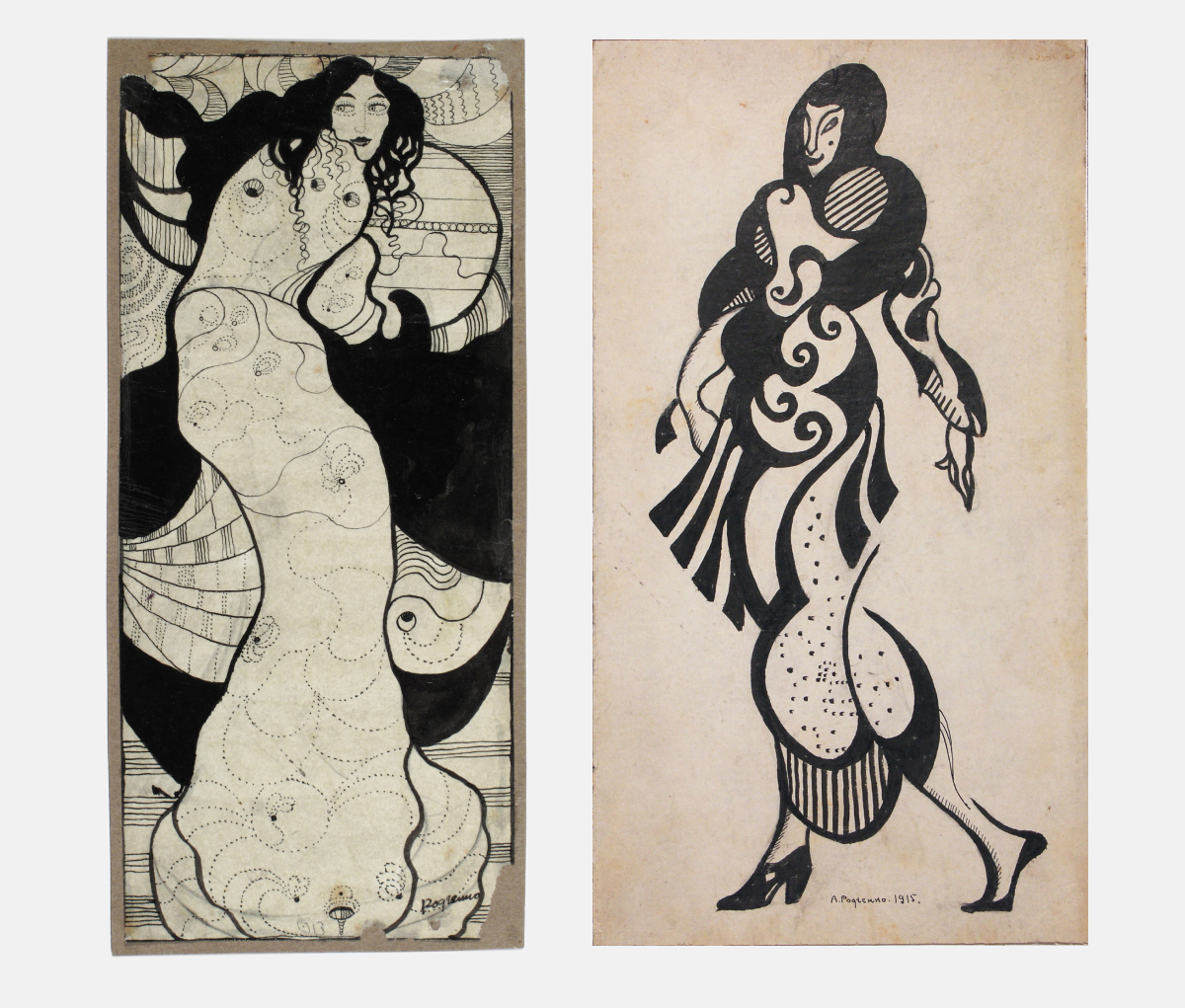
Александр Родченко. Слева: женская фигура в кимоно, 1912. Справа: женская фигура, 1914.
Из записной книжки, 30 июля 1912. Я устроил свою квартиру. Поставил шкаф с книгами, тут много стихов, тут Гамарди, Стриндберг, Уайльд. На стенах японские эскизы, Анта в белой раме… Мой стол покрыт светло-зелёной бумагой, на нём разложены кисти, карандаши, мастихины, пузырьки, коробки с красками, альбомы с репродукциями, с набросками, журналы, акварель, темпера, записные книжки, каталоги. Автопортрет Врубеля, миниатюра мамы, бронзовый медведь, нож для бумаги с мельхиоровой ручкой, книга черновая для стихов, наполовину исписанная моми почерком и заполненная рисунками пером.
Incidentally, why does Stepanova always refer to him as “Anti” in her letters? What’s it short for?
Aleksandr Lavrentiev: At first she called him Leander Ognenniy [Leander on Fire]; the moniker turns up often in the early letters, and Rodchenko called her, poetically, Naguatta. Anti – that came about because he was always in opposition, against the world. He resisted the usual judgments and opinions. At the same time, the nickname hints at Anti Kitaeva, whom he had been in love with at the art school.
The change from Leander Ognenniy to Anti happened rather fast. Is there something deeper in it? And is it correct to say that modern book design marked a substantial break with the classical tradition, at least with respect to covers?
Aleksandr Lavrentiev: For him, it seems to me, everything flows from his sense of vignette, not from book covers or illustrations. The Rodchenko vignette of those years was something twisted, unreal, like a snail shell. Even the figure later becomes a vignette for him, even an ornament. Ornament for Rodchenko is something akin to a medium; he made more discoveries in the world of ornament than in illustrations or covers. He was drawn to the rhythm of ornamentation: not descriptive but still natural.
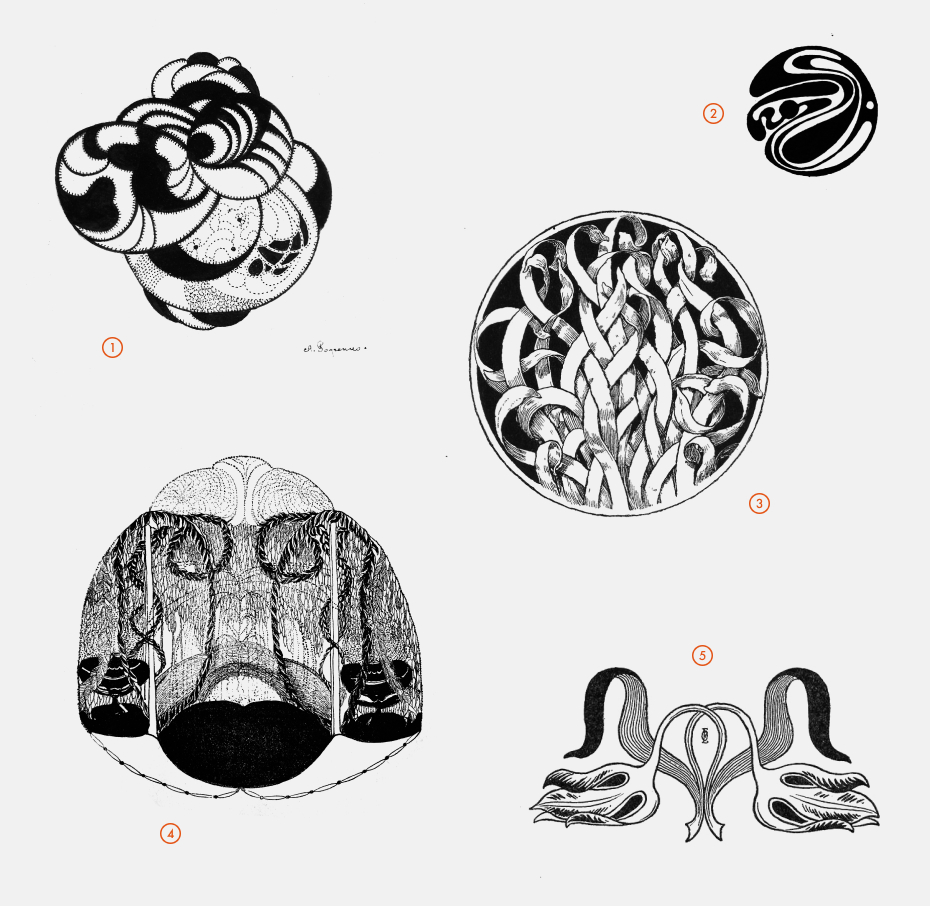
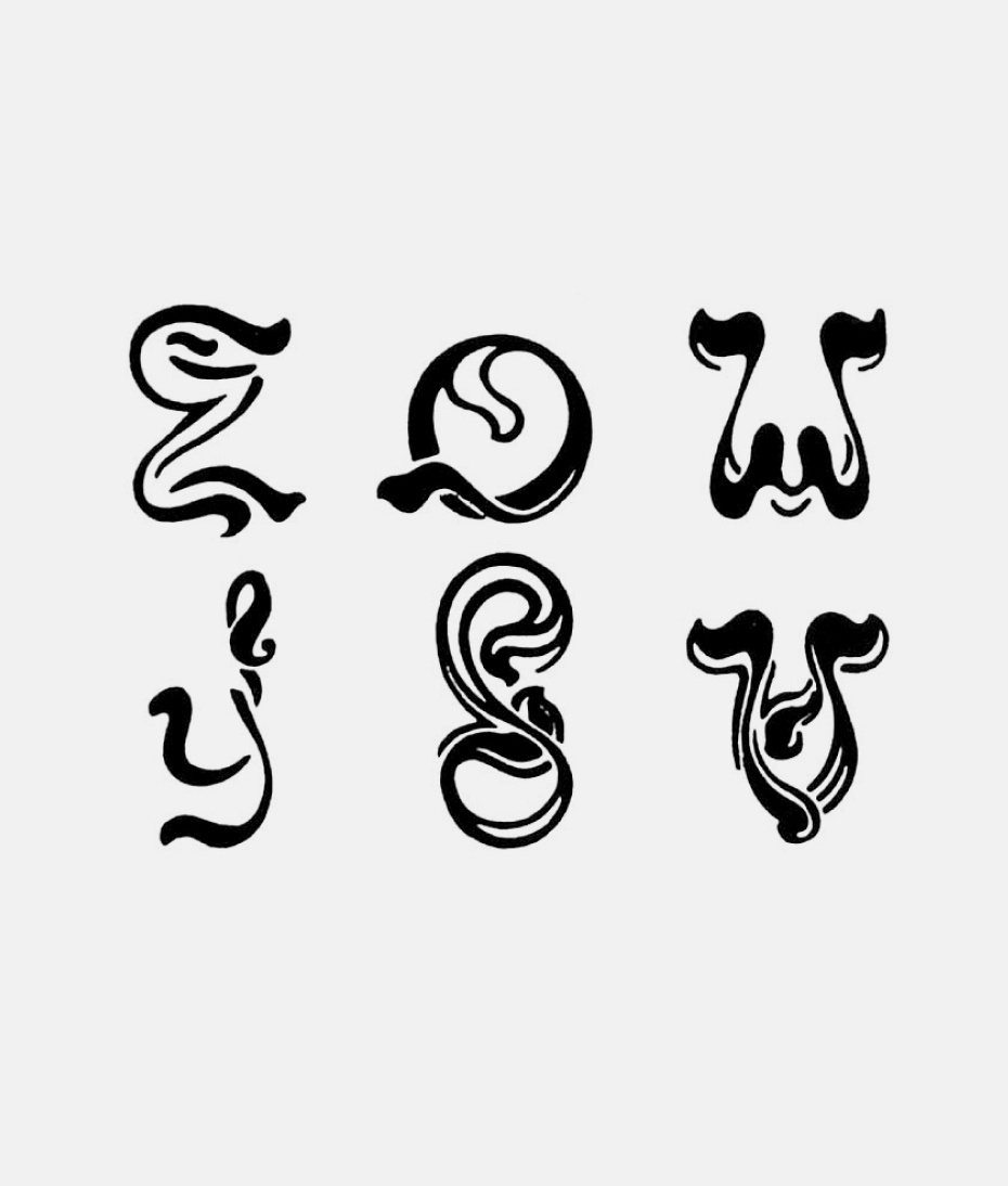
A vignette by Aleksandr Rodchenko (No. 1, 1914), and vignettes from journals of the art-moderne period: 2 – Koloman Mozer (Ver Sacrum, No. 4, 1899); 3 – Ernst Walter (PAN, No. 4, 1897); 4 – Pavel Kuznetsov (Vesyi, No. 12, 1906); 5 – Otto Eckmann (PAN, No. 3, 1895).
Europe saw a boom in art journals beginning in the mid-1890s. Most of these art-moderne periodicals originated in the cultural centers of various principalities of Germany (from Berlin, PAN and Die Insel; from Munich, Jugend and Simplicissimus; from Darmstadt, Deutsche Kunst and Dekoration); to these should be added Ver Sacrum (Vienna) and, of course, Petersburg’s Vesyi and Mir Iskusstva and Moscow’s Apollon. Among their typically art-nouveau illustrations and typography, there are examples, too, of vignettes, a particularly clear symbol of the rejection of the academic. Some of the vignettes are drawn almost realistically (as, for example, those by Otto Eckmann and Ernst Walter), while others are dynamically abstract forms. While the vignettes feature moderne’s usual curving lines and suggestions of vegetation, the tiny objects are clearly moving toward a kind of “Constructivist moderne” graphic style, a stone’s throw from pure Constructivism.
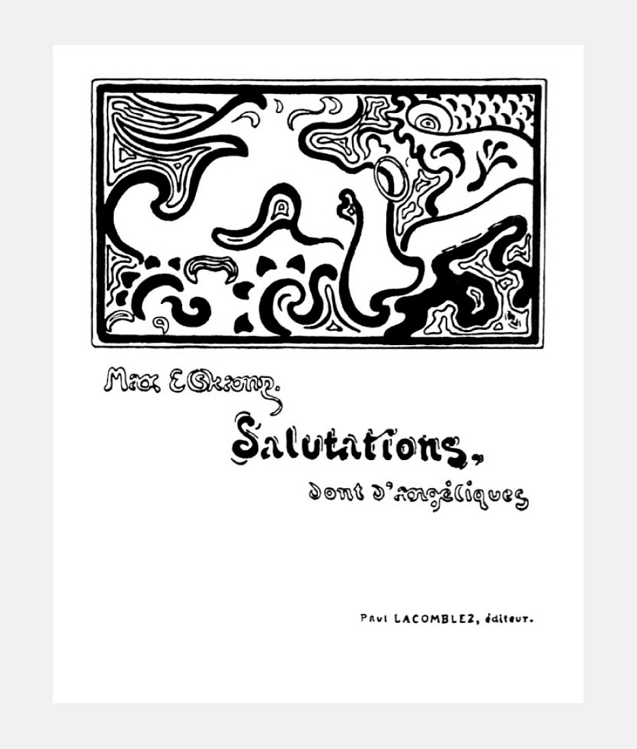
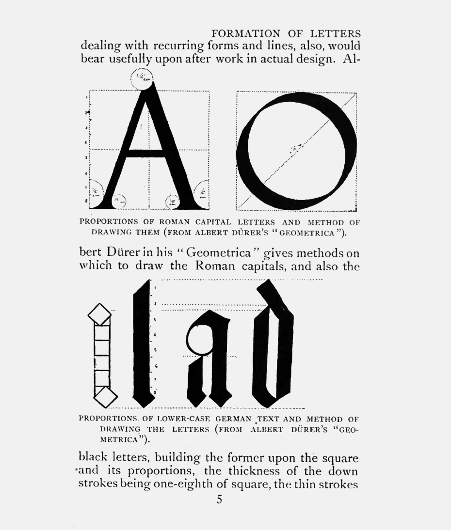
Yekaterina Lavrentieva: Here we should mention Henri van de Velde and his cover for a book of poems by the Belgian symbolist poet Max Elskamp, or the famous poster for Tropon, the maker of food concentrates. The cover includes an abstract drawing, and it was done long before Kandinsky, for example. It’s not even an ornament, in the sense of Alphonse Mucha, for example, but a substance with its own atomic particles. And with these atomic particles he proposes to construct completely “realistic” elements and, for example, lettering for journals. Walter Crane, a member of the Arts and Crafts movement, a book designer and researcher, came close to doing something very similar. His book, Line and Form, includes an illustration in which he shows that all existing ornaments develop from the basic geometrical forms of circle and square. Or, when viewed from top to bottom, how all descriptive forms, no matter how complex, can in the end be reduced to those two basic elements. That illustration stunned me when I first saw it, if only for its uniqueness. Everything else in Crane’s book was in the traditional mode of how-to books for artists.
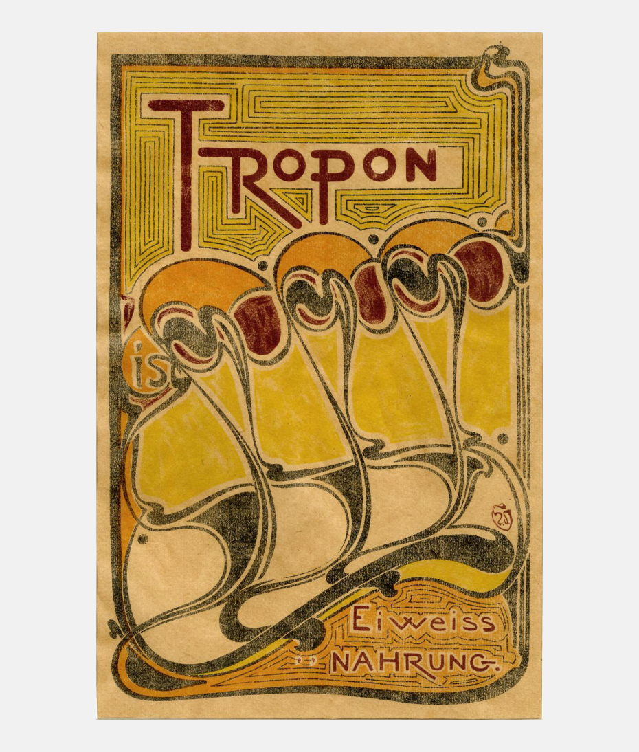
Henry van de Velde. Tropon. Poster for a manufacturer of egg-concentrate-based food additives. 1898. Moderne style was at its peak in the years when Aleksandr Rodchenko was developing as an artist. One of the most brilliant masters of Belgian art nouveau, Henry van de Velde, was a living embodiment in the 1890s of its concerns: the synthesis of arts, the role of ornament and the development of the new style. Van de Velde worked in a great variety of genres – architecture, furniture and tableware design, graphic art. Clearly visible in van de Velde’s work is the quest for the unifying rhythm, the “linear module,” as suggested in van de Velde’s curved, sometimes abstract lines, which seem to want to free themselves from everything inessential•The British Museum
Henry van de Velde. Cover for a book by the Symbolist poet Max Elskamp. 1893. Moderne style was at its peak in the years when Aleksandr Rodchenko was developing as an artist. One of the most brilliant masters of Belgian art nouveau, Henry van de Velde, was a living embodiment in the 1890s of its concerns: the synthesis of arts, the role of ornament and the development of the new style. Van de Velde worked in a great variety of genres – architecture, furniture and tableware design, graphic art. Clearly visible in van de Velde’s work is the quest for the unifying rhythm, the “linear module,” as suggested in van de Velde’s curved, sometimes abstract lines, which seem to want to free themselves from everything inessential.
Initials for the journal Van Nu en Straks. 1893. Moderne style was at its peak in the years when Aleksandr Rodchenko was developing as an artist. One of the most brilliant masters of Belgian art nouveau, Henry van de Velde, was a living embodiment in the 1890s of its concerns: the synthesis of arts, the role of ornament and the development of the new style. Van de Velde worked in a great variety of genres – architecture, furniture and tableware design, graphic art. Clearly visible in van de Velde’s work is the quest for the unifying rhythm, the “linear module,” as suggested in van de Velde’s curved, sometimes abstract lines, which seem to want to free themselves from everything inessential.
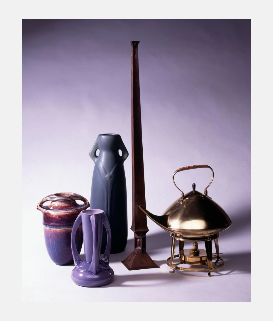
Henry van de Velde. Set of china, made by the Reinhold Hanke company. Approximately 1902. Moderne style was at its peak in the years when Aleksandr Rodchenko was developing as an artist. One of the most brilliant masters of Belgian art nouveau, Henry van de Velde, was a living embodiment in the 1890s of its concerns: the synthesis of arts, the role of ornament and the development of the new style. Van de Velde worked in a great variety of genres – architecture, furniture and tableware design, graphic art. Clearly visible in van de Velde’s work is the quest for the unifying rhythm, the “linear module,” as suggested in van de Velde’s curved, sometimes abstract lines, which seem to want to free themselves from everything inessential•The British Museum
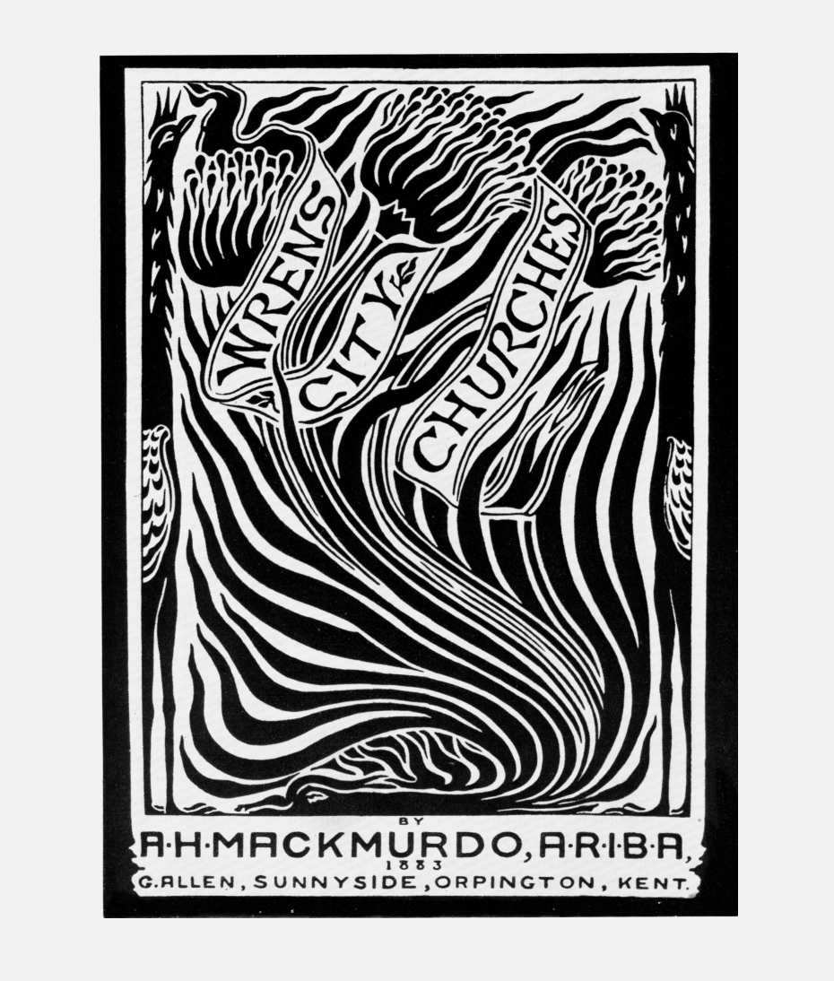
Arthur Mackmurdo. Cover for his book, Wren’s City Churches. 1883. Henry van de Velde was much influenced by English applied art and graphics of the 1880s, in particular the work of the artists of the Century Guild, who in turn had adopted and transformed the traditions of the Arts and Crafts movement and William Morris. Arthur Mackmurdo, in the cover for his book on the churches of Christopher Wren and in this chair from 1881, created compositions as interactions of form and counterform, using expressionistic lines and minimal ornamentation. Others associated with the Century Guild – Image, Horne, Shields, Heaton – brought to their images an abstract quality rare for the 19th century and sought to create, out of typography and image, single symbolic figures.
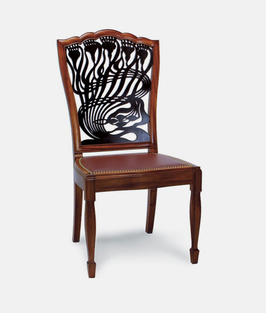
Arthur Mackmurdo. Chair design, one of the first furniture design in Moderne style. 1881. Henry van de Velde was much influenced by English applied art and graphics of the 1880s, in particular the work of the artists of the Century Guild, who in turn had adopted and transformed the traditions of the Arts and Crafts movement and William Morris. Arthur Mackmurdo, in the cover for his book on the churches of Christopher Wren and in this chair from 1881, created compositions as interactions of form and counterform, using expressionistic lines and minimal ornamentation. Others associated with the Century Guild – Image, Horne, Shields, Heaton – brought to their images an abstract quality rare for the 19th century and sought to create, out of typography and image, single symbolic figures.
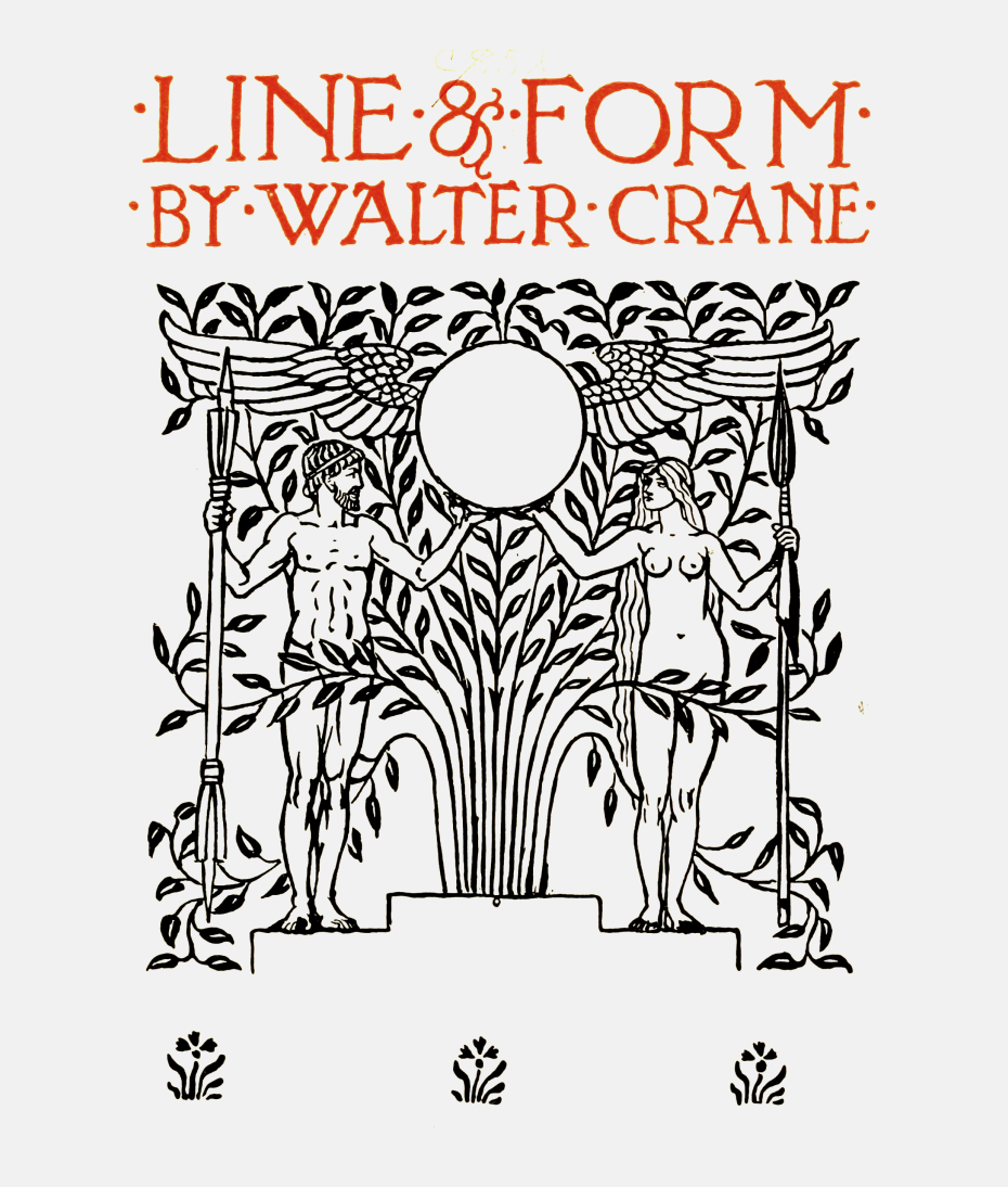
Walter Crane. Line & Form. London: G. Bell & Sons. 1914. The Arts and Crafts Exhibition Society was created shortly after the emergence of the Century Guild in the 1880s. Led by Walter Crane, who had worked with William Morris, it included all the artists cited. In his book, Line and Form (1900), Crane analyzed contemporary decorative art, giving special attention to book design, including lettering, illustrations, display types, multicolumn texts, line drawings and ornaments of all sorts. Significantly, Crane emphasized line as the crucial component of figuration. This was the actual bridge between modern art so-called and Constructivism. But it came into its own only 20 years later.
Walter Crane. Line & Form. London: G. Bell & Sons. 1914. The Arts and Crafts Exhibition Society was created shortly after the emergence of the Century Guild in the 1880s. Led by Walter Crane, who had worked with William Morris, it included all the artists cited. In his book, Line and Form (1900), Crane analyzed contemporary decorative art, giving special attention to book design, including lettering, illustrations, display types, multicolumn texts, line drawings and ornaments of all sorts. Significantly, Crane emphasized line as the crucial component of figuration. This was the actual bridge between modern art so-called and Constructivism. But it came into its own only 20 years later.
Walter Crane. Line & Form. London: G. Bell & Sons. 1914. The Arts and Crafts Exhibition Society was created shortly after the emergence of the Century Guild in the 1880s. Led by Walter Crane, who had worked with William Morris, it included all the artists cited. In his book, Line and Form (1900), Crane analyzed contemporary decorative art, giving special attention to book design, including lettering, illustrations, display types, multicolumn texts, line drawings and ornaments of all sorts. Significantly, Crane emphasized line as the crucial component of figuration. This was the actual bridge between modern art so-called and Constructivism. But it came into its own only 20 years later.
Walter Crane. Line & Form. London: G. Bell & Sons. 1914. The Arts and Crafts Exhibition Society was created shortly after the emergence of the Century Guild in the 1880s. Led by Walter Crane, who had worked with William Morris, it included all the artists cited. In his book, Line and Form (1900), Crane analyzed contemporary decorative art, giving special attention to book design, including lettering, illustrations, display types, multicolumn texts, line drawings and ornaments of all sorts. Significantly, Crane emphasized line as the crucial component of figuration. This was the actual bridge between modern art so-called and Constructivism. But it came into its own only 20 years later.
Walter Crane. Line & Form. London: G. Bell & Sons. 1914. The Arts and Crafts Exhibition Society was created shortly after the emergence of the Century Guild in the 1880s. Led by Walter Crane, who had worked with William Morris, it included all the artists cited. In his book, Line and Form (1900), Crane analyzed contemporary decorative art, giving special attention to book design, including lettering, illustrations, display types, multicolumn texts, line drawings and ornaments of all sorts. Significantly, Crane emphasized line as the crucial component of figuration. This was the actual bridge between modern art so-called and Constructivism. But it came into its own only 20 years later.
Perhaps we make a mistake in thinking of the abstract meandering ornament and the solid Constructivist line as opposites. After all, Rodchenko, Stepanova and Gan might have looked at these things on paper as ornamentation, though in extremely simplified form, as if collapsed to the minimally expressive form.
Yekaterina Lavrentieva: But let’s not forget structure. Ornament usually hides structure: for example, a building’s façade concealing the line of a balcony. Ornament functions similarly on a book cover; it obscures the body of the book. But Constructivist lines, to the contrary, bring out the structure. For Rodchenko it was important to clarify the space by means of the graphic.
You mentioned Kandinsky. Why, in the end, did he and Rodchenko part ways intellectually?
Aleksandr Lavrentiev: I rather like the explanation from the art historian, who said the youngsters were crowding poor Kandinsky in his own home, playing on the piano when the owners were out, and so they quarreled. In fact, Stepanova’s diaries tell us that they were very close and considerate toward each other; the cook was even instructed to meet every request from the neighbors upstairs. The first meetings of INKhUK [Institute of Art Culture] were held there, at Kandinsky’s. The institute was his darling, and he wrote its original programmatic statement. The meetings there were thoroughly academic: a theme would be set, and designated members would come with prepared reports. Kandinsky had the idea at the time that, if you could describe and systematize all the elements of every type of art, it would be possible to use them for some kind of a new, synthetic art.
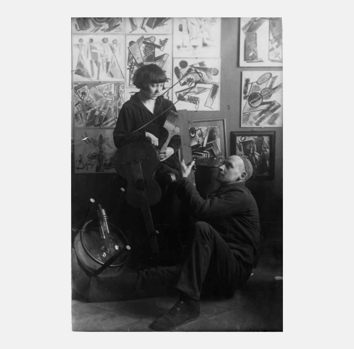
Aleksandr Rodchenko and Varvara Stepanova as wandering musicians. The photograph was made in the home of V. V. Kandinsky. 1920. Stepanova and Rodchenko lived for about a year in Kandinsky’s home at 8 Dolgiy Alley (now Burdenko St.) in Moscow. The Museum of the Pictotial Culture opened in 1920 in Moscow. Rodchenko headed the museum staff, with Stepanova as aide. Vasily Kandinsky was the museum’s first director (1919–1920).
Yekaterina Lavrentieva: If I may try in a very simple way to formulate the moment: Kandinsky held that all the visual arts spring from music and dance (hence his later theatrical-pictorial experiments, Zheltiy Zvuk [Yellow Sound], Kartinki s Vystavki [Pictures at an Exhibition]), while for Rodchenko, as for all the Constructivists, primacy belonged to sculpture and architecture. It was emotion versus the ultimately tactile, constructive, material, consciously organized project.
Aleksandr Lavrentiev: Kandinsky’s starting point was his emotional understanding of art, but the youngsters, the new grass (Rodchenko, Popova, Stepanova,) needed a method, not mere descriptions. They wanted exact formulations for what they were doing. This was the root of Kandinsky and Rodchenko’s failure to understand each other. And this was approximately when Stepanova and Rodchenko left. Stepanova’s diaries colorfully describe what happened: how much they had hoped to get from living together and how dissatisfaction grew and led to the break.
But they had so much in common at first, right? The interest in music, in the new painting?
Aleksandr Lavrentiev: That is so. Rodchenko and Stepanova were in raptures over Kandinsky’s description of the Schoenberg concert. They were struck by the fact that the idea of the music that was going to be heard was explained before the concert began. This was a strategy that they found very attractive for themselves: their art needed explanation. This was exactly when Rodchenko wrote his first conceptual texts: “Line” “It’s All — Experiments,” others. He took it as a model: if there was a new direction, a new form, it had to be explained, beginning with how the creator understood it. Insofar as every artist would have his own understanding of his creations, the result would be a history of the arts as seen by the creators. Rodchenko understood everything in a linear way, in strict logical terms, although he conceded that he really didn’t know why he did so. He recognized that there are always irrational and inexplicable elements in art.
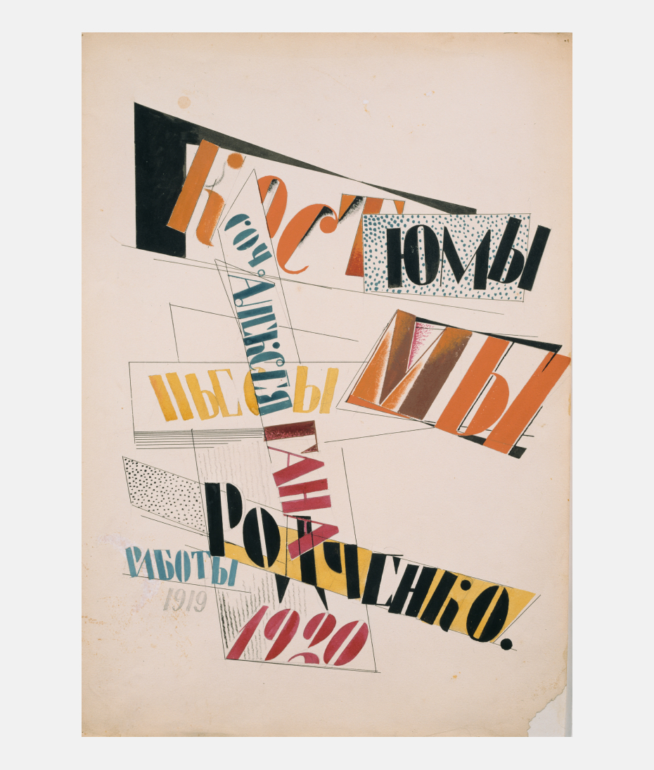
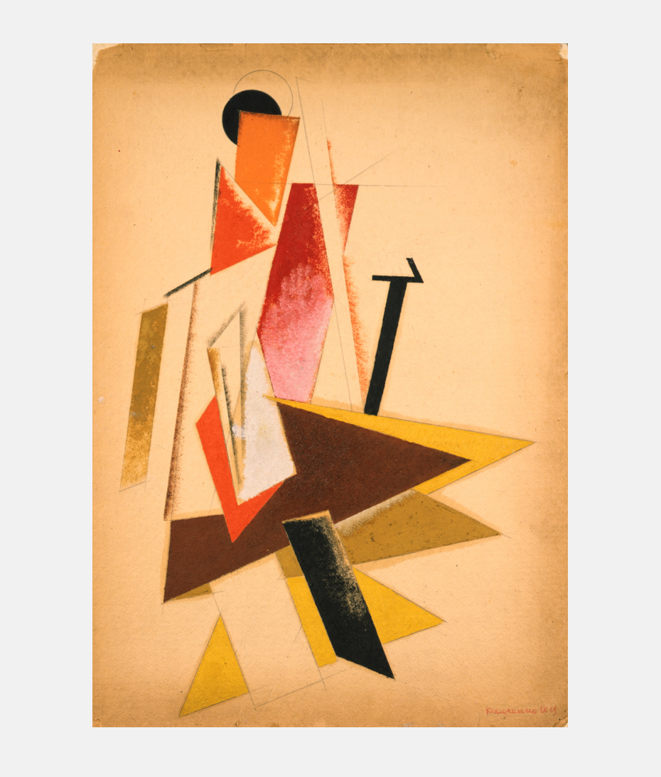
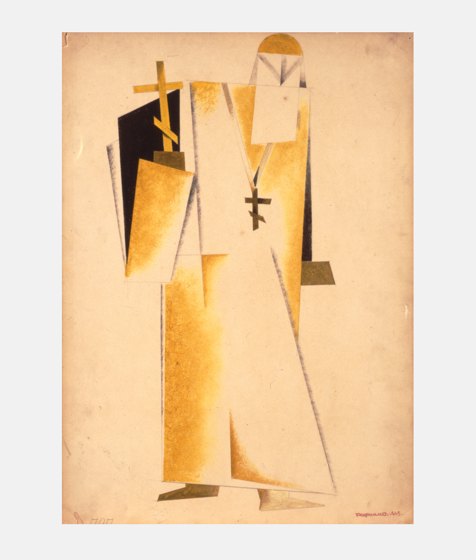
Aleksandr Rodchenko. Title page for a portfolio of paintings — costume sketches for Alexei Gan’s play, We. 1920. The paintings that follow are of the play’s chief characters: worker, soldier, officer, clown, unknown hero, priest, cabaret artist. Even before 1920, Rodchenko often used lettering that featured a high degree of contrast and stencil-like interrupted contours. Such lettering is shown in this decorative collage by Naum Granovsky for Ilyazd’s drama, lidantiIU fAram (1923). The Futurists frequently used such lettering in connection with their beloved hand setting.
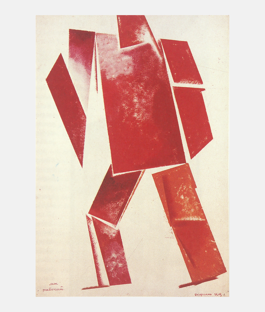
Aleksandr Rodchenko. Title page for a portfolio of paintings — costume sketches for Alexei Gan’s play, We. 1920. The paintings that follow are of the play’s chief characters: worker, soldier, officer, clown, unknown hero, priest, cabaret artist. Even before 1920, Rodchenko often used lettering that featured a high degree of contrast and stencil-like interrupted contours. Such lettering is shown in this decorative collage by Naum Granovsky for Ilyazd’s drama, lidantiIU fAram (1923). The Futurists frequently used such lettering in connection with their beloved hand setting.
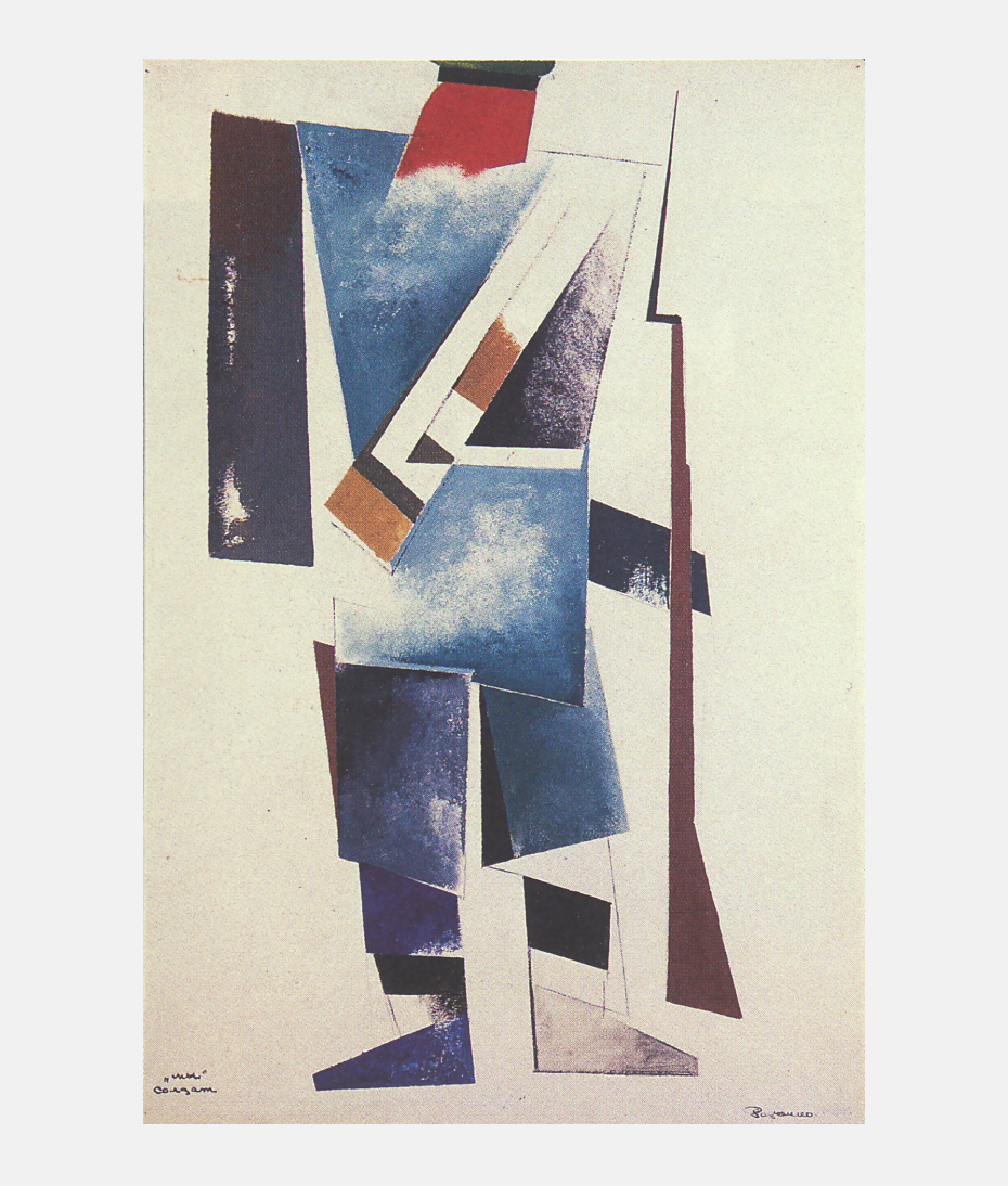
Aleksandr Rodchenko. Title page for a portfolio of paintings — costume sketches for Alexei Gan’s play, We. 1920. The paintings that follow are of the play’s chief characters: worker, soldier, officer, clown, unknown hero, priest, cabaret artist. Even before 1920, Rodchenko often used lettering that featured a high degree of contrast and stencil-like interrupted contours. Such lettering is shown in this decorative collage by Naum Granovsky for Ilyazd’s drama, lidantiIU fAram (1923). The Futurists frequently used such lettering in connection with their beloved hand setting.
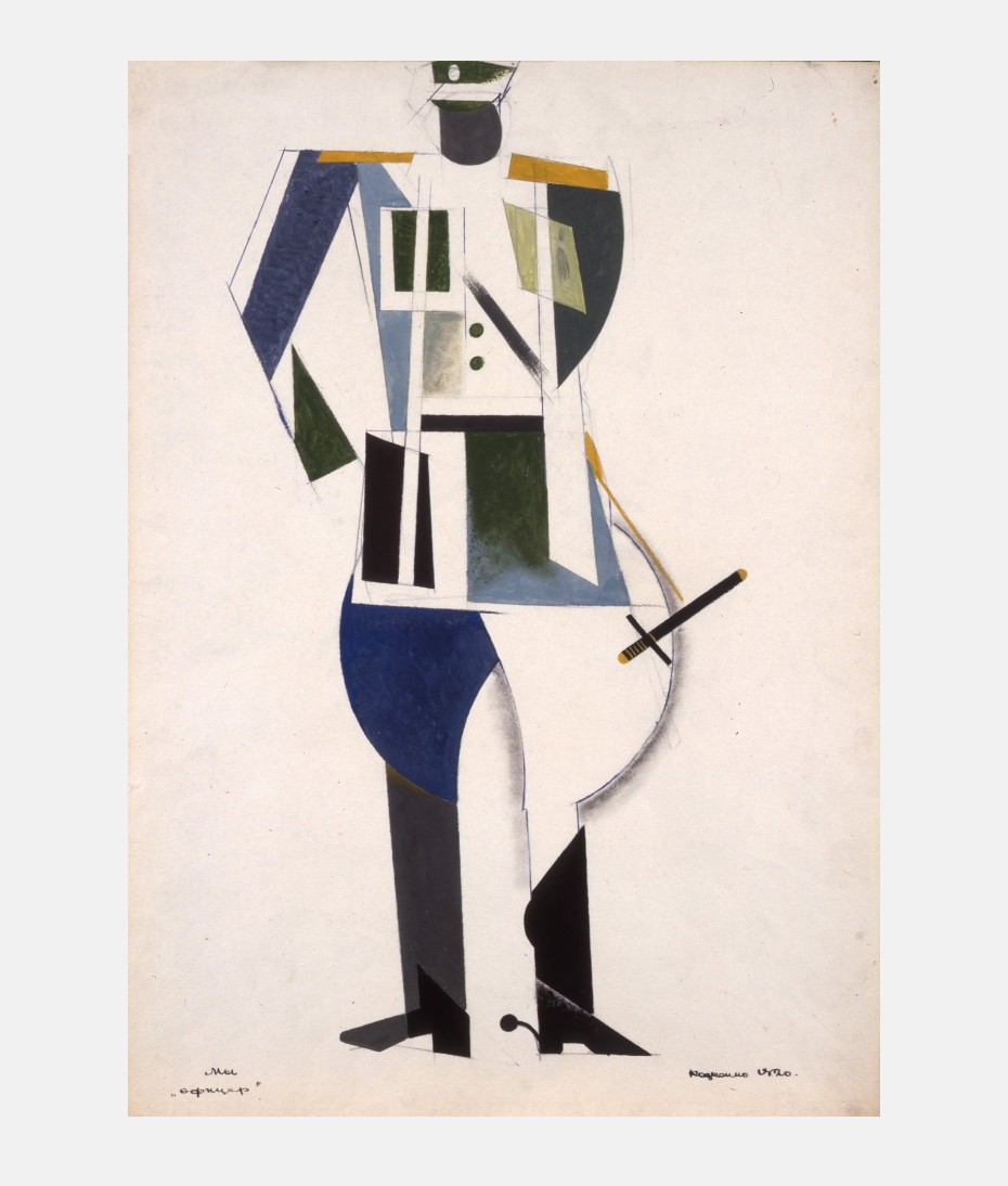
Aleksandr Rodchenko. Title page for a portfolio of paintings — costume sketches for Alexei Gan’s play, We. 1920. The paintings that follow are of the play’s chief characters: worker, soldier, officer, clown, unknown hero, priest, cabaret artist. Even before 1920, Rodchenko often used lettering that featured a high degree of contrast and stencil-like interrupted contours. Such lettering is shown in this decorative collage by Naum Granovsky for Ilyazd’s drama, lidantiIU fAram (1923). The Futurists frequently used such lettering in connection with their beloved hand setting.
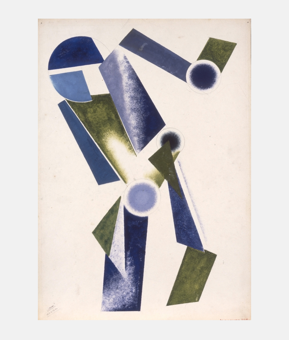
Aleksandr Rodchenko. Title page for a portfolio of paintings — costume sketches for Alexei Gan’s play, We. 1920. The paintings that follow are of the play’s chief characters: worker, soldier, officer, clown, unknown hero, priest, cabaret artist. Even before 1920, Rodchenko often used lettering that featured a high degree of contrast and stencil-like interrupted contours. Such lettering is shown in this decorative collage by Naum Granovsky for Ilyazd’s drama, lidantiIU fAram (1923). The Futurists frequently used such lettering in connection with their beloved hand setting.
Aleksandr Rodchenko. Title page for a portfolio of paintings — costume sketches for Alexei Gan’s play, We. 1920. The paintings that follow are of the play’s chief characters: worker, soldier, officer, clown, unknown hero, priest, cabaret artist. Even before 1920, Rodchenko often used lettering that featured a high degree of contrast and stencil-like interrupted contours. Such lettering is shown in this decorative collage by Naum Granovsky for Ilyazd’s drama, lidantiIU fAram (1923). The Futurists frequently used such lettering in connection with their beloved hand setting.
Aleksandr Rodchenko. Title page for a portfolio of paintings — costume sketches for Alexei Gan’s play, We. 1920. The paintings that follow are of the play’s chief characters: worker, soldier, officer, clown, unknown hero, priest, cabaret artist. Even before 1920, Rodchenko often used lettering that featured a high degree of contrast and stencil-like interrupted contours. Such lettering is shown in this decorative collage by Naum Granovsky for Ilyazd’s drama, lidantiIU fAram (1923). The Futurists frequently used such lettering in connection with their beloved hand setting.
Aleksandr Rodchenko. Title page for a portfolio of paintings — costume sketches for Alexei Gan’s play, We. 1920. The paintings that follow are of the play’s chief characters: worker, soldier, officer, clown, unknown hero, priest, cabaret artist. Even before 1920, Rodchenko often used lettering that featured a high degree of contrast and stencil-like interrupted contours. Such lettering is shown in this decorative collage by Naum Granovsky for Ilyazd’s drama, lidantiIU fAram (1923). The Futurists frequently used such lettering in connection with their beloved hand setting.
How did Rodchenko understand line at this time?
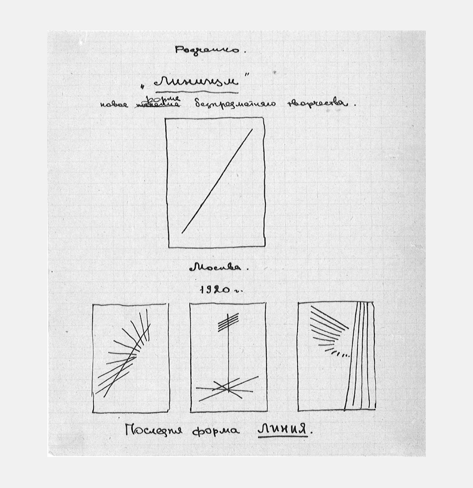
Aleksandr Lavrentiev: Line had several key aspects for him. First, line as internal axis. Rodchenko taught his students at VKhUTEMAS [Higher Art and Technical Studios] to see line as the dominant internal element, the invisible leader. The combination of leaders defined the composition. Second, line as the general compositional scheme along which the internal elements are situated. And, third, line-as-outline, line as the technical side of drawing. “Line is the binding, the combination, the separating out,” he wrote in the texts where he explained “lineism”, his term, not just as a movement in art but as a world-view.
Did he apply his principles in approximately the same way to his typography, painting, architecture and photography?
Yes, they constituted a kind of overarching principle. When he writes, “today we don’t have cover photographs,” he has in mind vertical photographs, compositionally strict.
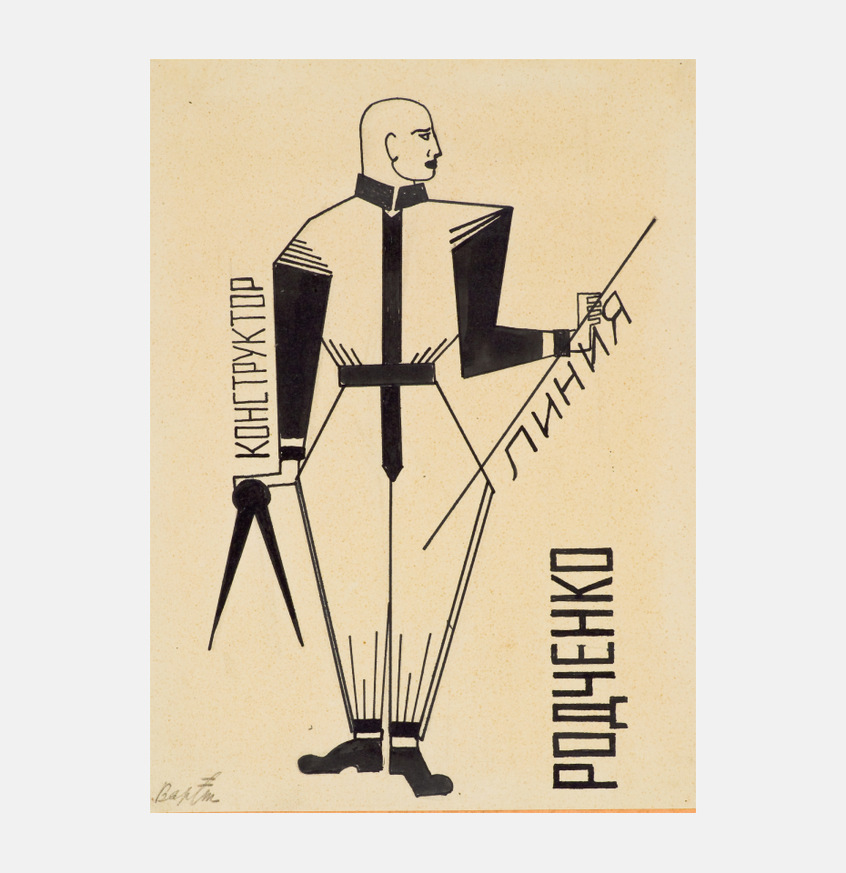
Varvara Stepanova. A friendly caricature, “Konstruktor Rodchenko.” 1921.
Aleksandr Rodchenko. Page from notebook. 1920.
Sketch for the cover of Liniia [Line], a brochure. 1921.
Was the course work for Graphic Construction on Plane, which as part of VKhUTEMAS’s Preliminary Course, also dictated by these structural ideas?
Yekaterina Lavrentieva: Yes. Moreover, in the examples that Rodchenko showed to his students (which included examples of work deemed unsatisfactory), the surface seems to open telescopically inward; it feels like work in three dimensions.
How did the students respond to the assignments?
Yekaterina Lavrentieva: We have the very detailed recollections of Anastasia Akhtyrko about her training at VKhUTEMAS under Rodchenko. Writing very much later, around 1965, she shared in one of her letters her consternation that their youth had kept them from understanding the degree to which Rodchenko’s assignments were useful and how applicable they were as a universal method. Essentially, he was sharing his artistic system, laying it out in terms of its separate components.
Aleksandr Lavrentiev: Yes, and it’s also worth remembering Zakhaar Bykov, another of Aleksandr Rodchenko’s favorite students. Many left for other departments and some dropped out altogether, like the Chichagova sisters.
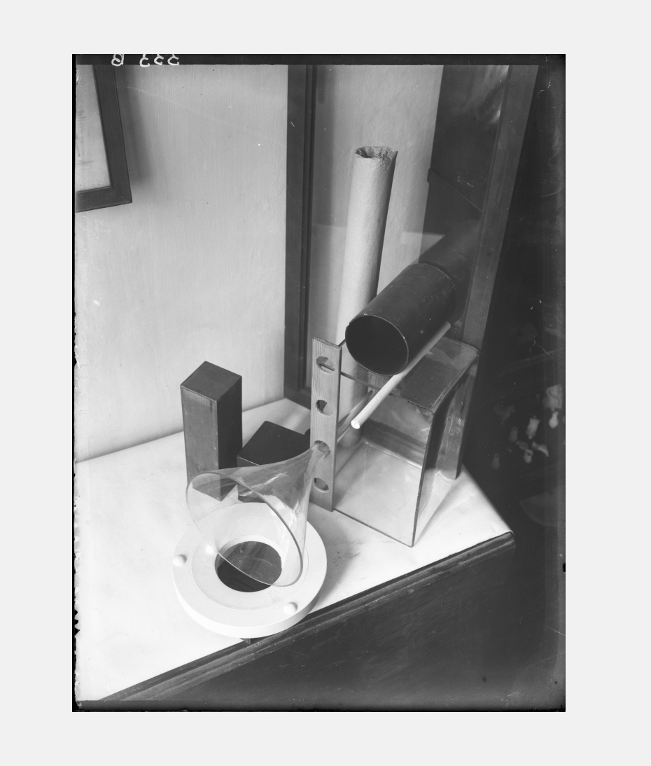
Aleksandr Rodchenko. Stage still-life. 1924.
How did this training system differ from the training in the First and Second Free State Art Studios and, looking further back, from the work at the Stroganov school?
Aleksandr Lavrentiev: Before the revolution, geometric work (work with circle, square and triangle, to simplify) was done mostly in drawing classes; that’s where assignments were given in basic combinatorics. The closest thing to analytic art was Vrubel’s class, and it didn’t last long. They stylized flowers and plants, transforming them into ornament. The students were required to find the precisely right contour, discover the right combination of figures.
These schematics are a little reminiscent of Rodchenko paintings: which have their angle, zigzag, even diagonal. He believed that the power of his paintings lay in their compositional schemes. Malevich, through the square, conveyed an understanding of form in general, but Rodchenko showed that every composition has an internal carcass, and that if this is brought out, the composition and the work generally gain. In any case, the approach means that every work is distinctive. This is evident if you look at examples of work by Rodchenko himself – line up his photographs, book covers and even the smallest of his little accidents. Each work has its own rigorous scheme, which keeps it distinct from anything similar nearby. Rodchenko was always after a visually concentrated idea, not merely abstract geometry.
So Rodchenko was preparing students to become professional graphic designers in the contemporary sense? Today one can count on the fingers of one hand the designers who have their own methods to find the right image. Rodchenko offered such a method: how to avoid crashing in the first stage of work and, consequently, not wasting time.
Yes, it offered a key to organizing one’s material. The name of one of his courses – Initiative – implied three levels: first, the initiative of the artist; second, the initiative of each of the compositional elements, and, third, the initiative of the general composition.
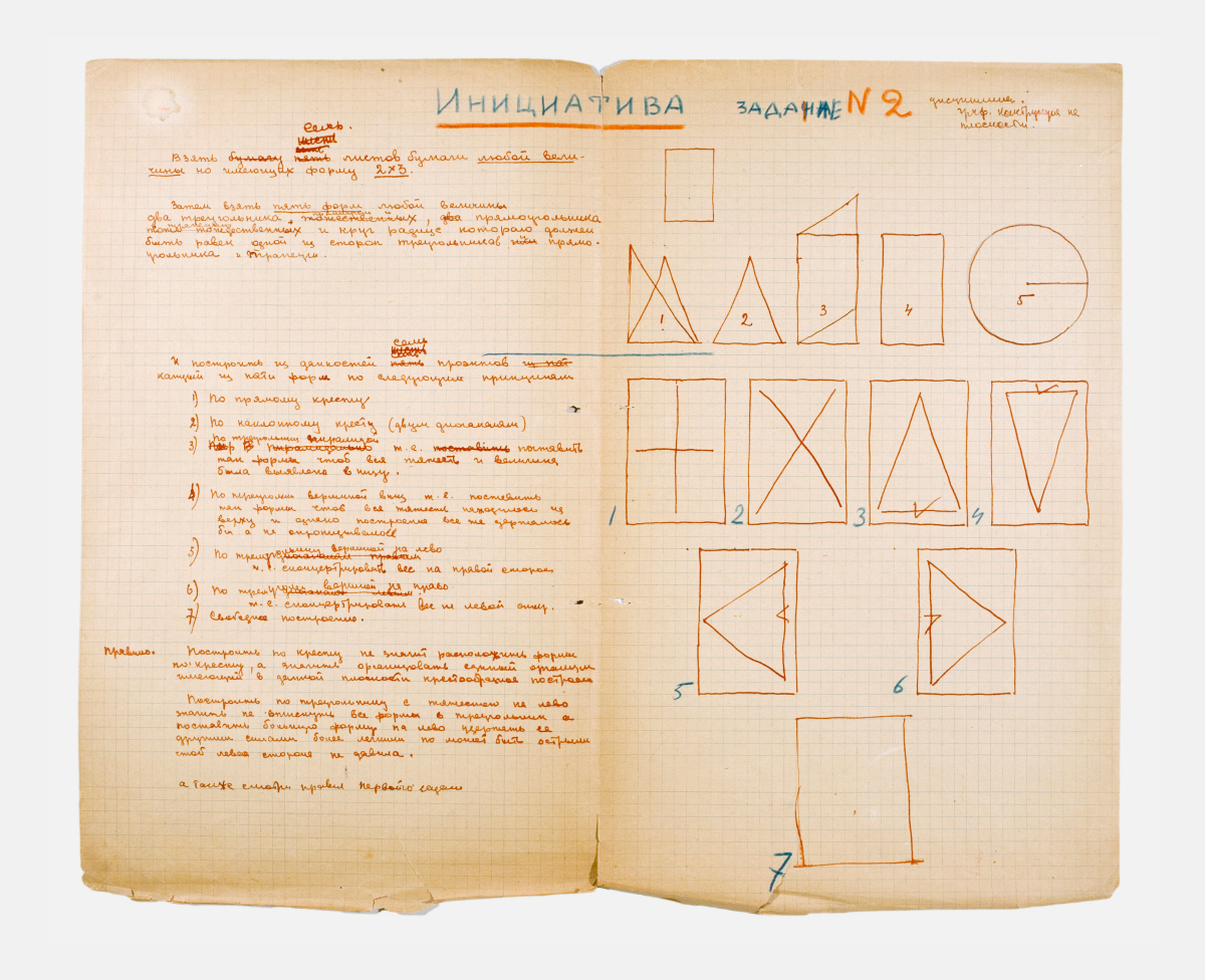
Initiative. Task No. 2. In April 1921 Rodchenko started a special notebook in which he laid out the plan for the introductory VKhUTEMAS course in graphics. The course was Graphic Construction on Plane (Initiative). The idea of the exercises is suggested in the title – the student was to devise combinations of given forms such that their geometry and the overall composition were simultaneously honored. Preserved in the archives are Rodchenko’s detailed notes, examples and comments, as well as student works (e.g., examples by Anastasia Akhtyrko). Line here is understood as more than outline; it is also seen as the mark of the powerful draftsman’s tool used in its creation. The practical exercises were accompanied by brief theoretical comments on construction, form and the axes of composition.
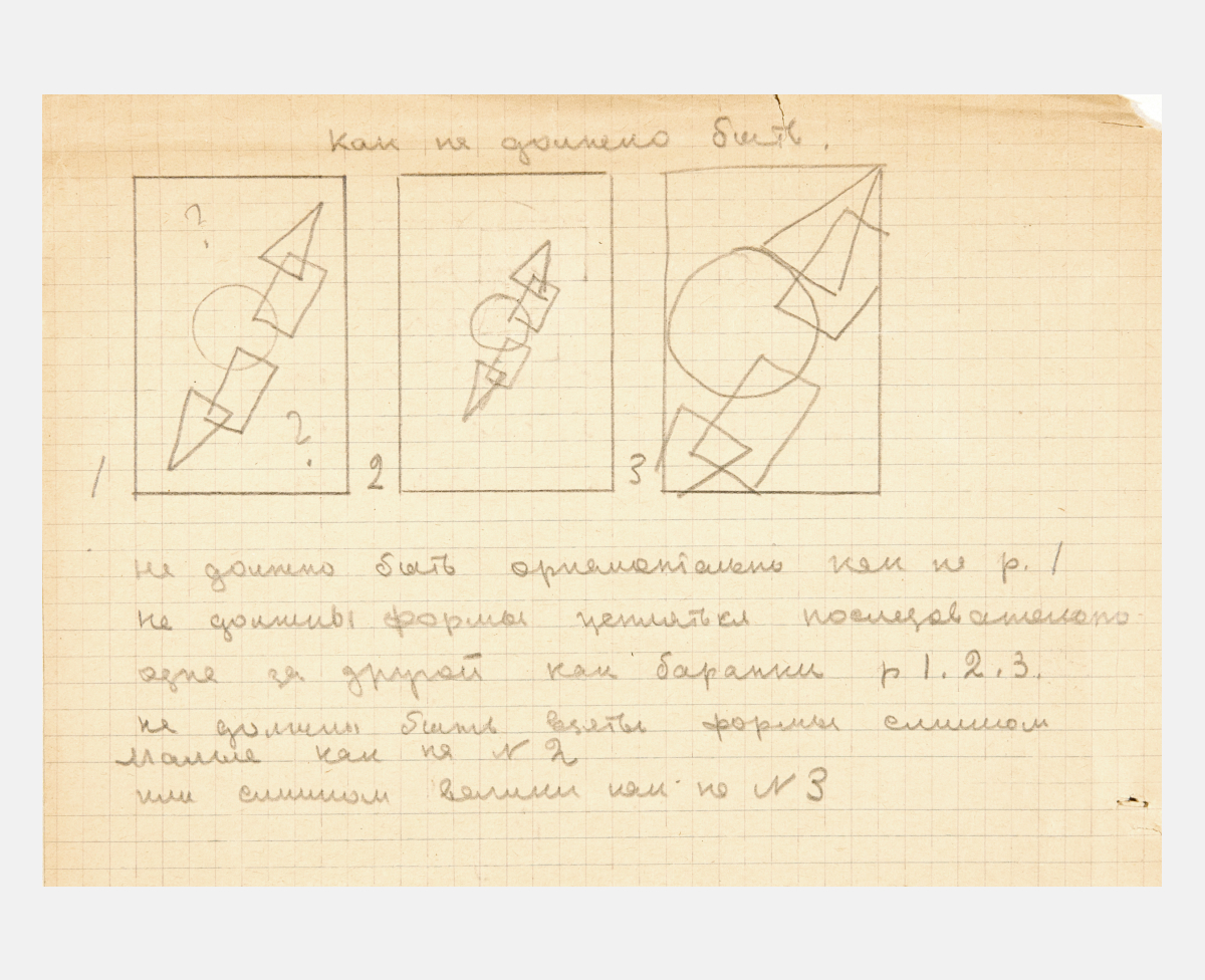
The tasks are divided into three series. The first call for creation of compositions of the simplest geometric figures (circle-rectangle-triangle) in vertical, horizontal and diagonal combinations. The second series used the same structural elements in non-right-angled formats, such as, for example, on a field in the form of a rhombus, circle, ellipse or triangle. The third series involved giving depth to a flat surface, using the same basic geometric forms. Depth was to be achieved by the use of color in the contour or by the axonometric treatment of right-angled figures. The complexity of the task increased as flat figures were imposed one on another, intersected or structured along different axes (vertical, horizontal, diagonal, etc.).
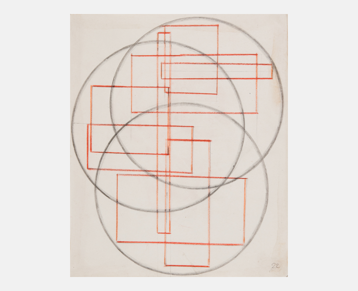
An example of a student’s (Anastasia Akhtyrko) work in the Initiative course. 1921. This is her response in the final and most complex stage of the given task — a linear composition in which intersecting rectangles are inscribed in a composition of one, two, three, four or five circles. In this and other such work, the feeling of depth is achieved through the projection of parallelograms, with the three-dimensionality enhanced by the use of color. Later, other conditions would be imposed, involving the axes of construction and the centers of the composition (see the next example). Akhtyrko recalled in the 1960s: “On the basis of what we learned, it was not difficult to move forward in any kind creative work: easel painting, graphics, design, etc.”
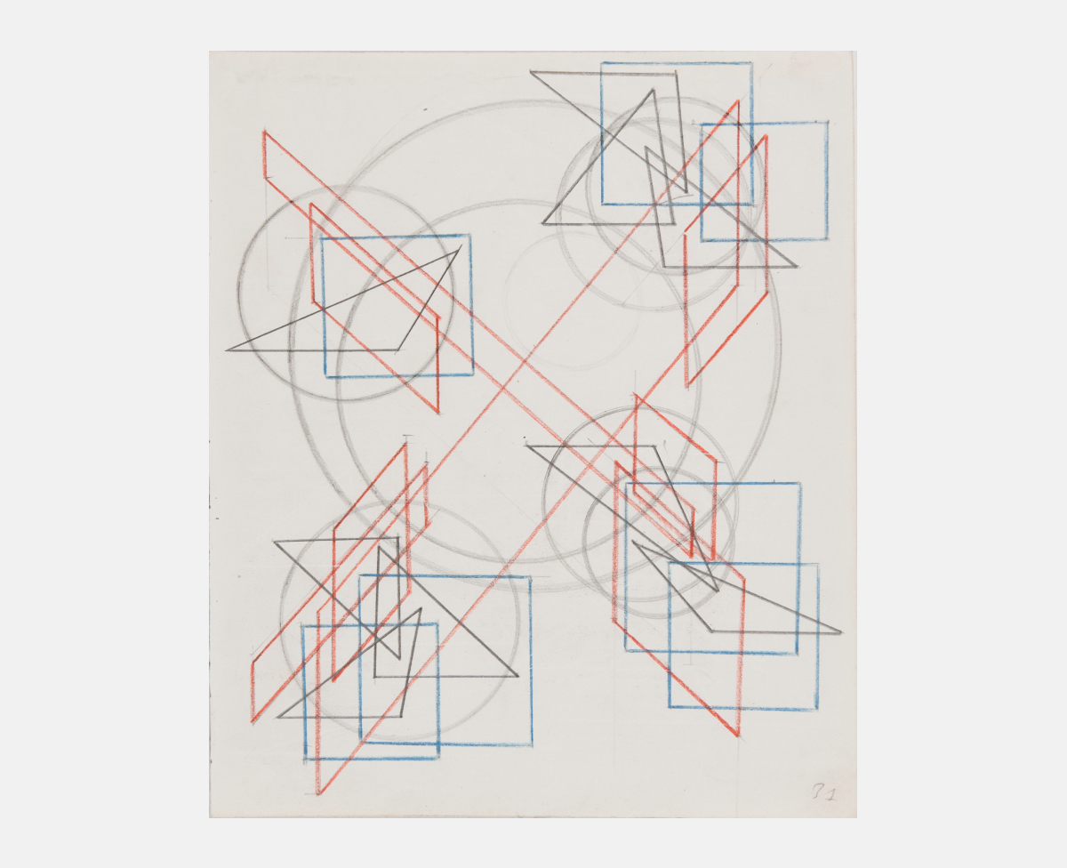
An example of a student’s (Anastasia Akhtyrko) work in the Initiative course. 1921. This is her response in the final and most complex stage of the given task — a linear composition in which intersecting rectangles are inscribed in a composition of one, two, three, four or five circles. In this and other such work, the feeling of depth is achieved through the projection of parallelograms, with the three-dimensionality enhanced by the use of color. Later, other conditions would be imposed, involving the axes of construction and the centers of the composition (see the next example). Akhtyrko recalled in the 1960s: “On the basis of what we learned, it was not difficult to move forward in any kind creative work: easel painting, graphics, design, etc.”
How did the course help students in their training in the electives they chose after the Preliminare Course?
Aleksandr Lavrentiev: Unfortunately, almost not at all; after all, Rodchenko’s leadership of the Basic program lasted only a year, perhaps a year and a half. Academic drawing was later introduced. The architecture faculty had its own system, which included graphic exercises. Sculpture was similar – Babichev would set his own tasks (“incisions”). The only one who might have drawn on something from the Rodchenko course was Klutsis.
Yekaterina Lavrentieva: Klutsis’ photomontages are worth noting; they have a special assertiveness and a geometrical skeleton that supports the whole structure. With Rodchenko, it is as if he is doing the montage in a different dimension and has set himself a different task. Klutsis approaches the task more from an architectural standpoint. Overall, student attitudes to the basic disciplines was quite special. They put on an entire show, “The Trail of VKhUTEMAS or Vkhutemaskites and Their Torments,” with eight costumes for the eight disciplines.
Galina and Olga Chichagova. Construction. 1921. Comic costume on a motif from Rodchenko’s course in the Preliminary program. The costume was used in a student production, A VKhUTEMASite’s Trail of Tears.
Galina and Olga Chichagova. Caricature and jingle on the theme of Discipline No. 5 – Construction, a class that Rodchenko taught as part of the Preliminary Course during 1920–1922. 1922.
Khan-Magomedov in his monograph about VKhUTEMAS emphasizes that the leadership tried more than once to remake the syllabus so that the disciplines of the Basic Course would more logically fit the elective courses. Did Rodchenko have any plans along these lines?
Aleksandr Lavrentiev: It wasn’t an easy thing to do. I have talked with people who specialized in textiles, and they rather skeptically recalled: well, yes, Rodchenko came by, asked us to draw a loom set-up, a particular model with lots of threads and plaques, perhaps a jacquard. But why draw it, they complained, we already know it by heart! Of course, Rodchenko wanted the technical drawing for the designers, and they, unlike the other students, understood why it was needed.
The most popular courses at VKhUTEMAS were the ones directly connected to professions. For example, the course “Space” – the training in this discipline produced many architects. On the other hand, “Graphics” was not popular because it was not taught by the typography department, where drawing and engraving were taught in their own way by Favorsky, Miturich, Bruni and others. They had their own teaching methods.
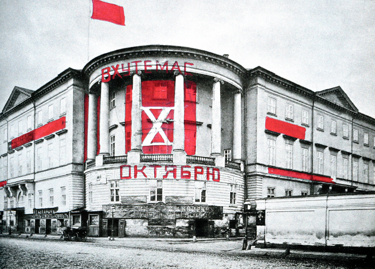
Aleksandr Vesnin. A Design for the VKhUTEMAS Building on Miasnitskiia Street on the Occasion of the 10th Anniversary of the October Revolution. 1927.
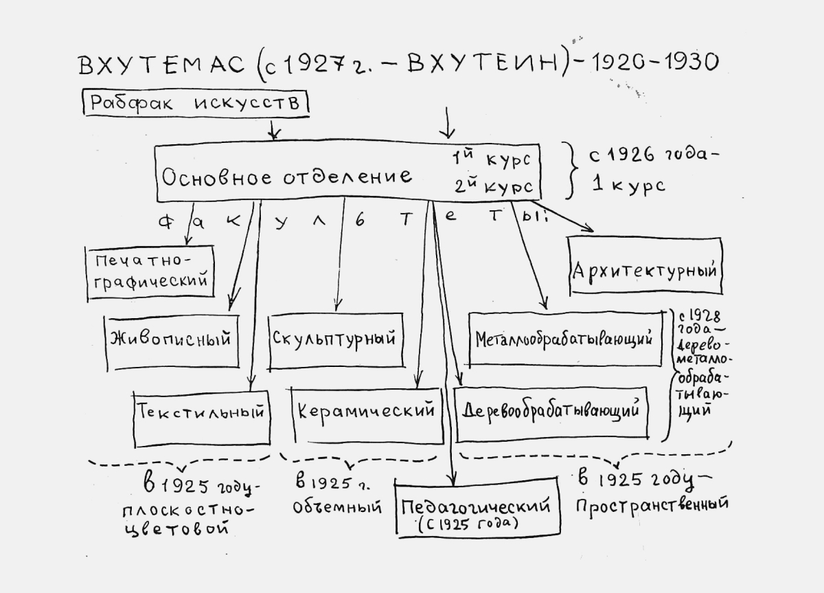
In 1918 in the course of the first art education reform all art schools in Russia were transformed into Free State Art Studios (SGKhM). In Moscow the First SGKhM was the former Imperial Central Art and Industry School (Stroganov School). The Second SGKhM used to be the Moscow School of Painting, Sculpture and Architecture. In 1920 during the second reform the First and Second Studios were merged. In documents and programs that new institution was often referred to as VGKhM. On December 19, 1920 by the Sovnarkom (Soviet of People’s Commissars) decree the formation of VKhUTEMAS (Higher Art and Technical Studios) was approved. See more: Alexander N. Lavrentyev. Heroes of Avant-Garde. Alexander Rodchenko. M.: Seregey E. Grodeev, 2011.
Larisa Zhadova. Organization of VKhUTEMAS-VKhUTEIN. 1970.
The ideas for the preliminary courses comprising VKhUTEMAS’ Basic Course came from a group of abstract artists from the Institute of Art Culture — A. Vesnin, L. Popova, A. Ekster, N. Udaltsova, A. Drevin, A. Rodchenko and others. The idea was that students would in turn go through the following eight courses, or disciplines: 1. Maximal Influence of Color (L. Popova); 2. Bringing Out Form by Color (A. Osmerkin); 3. Color in Space (A. Ekster); 4. Color on Plane (I. Kliun); 5. Construction (A. Rodchenko); 6. Simultaneity of Form and Color (A. Drevin); 7. Volume in Space (N. Udaltsova); 8. V. Baranov-Rossine. The creators of the disciplines sought to present their material so that it would be understood analytically, while showing the practical uses of the new approaches to form.
The famed VKhUTEMAS conflict between leftist artists and the teachers in Favorsky’s circle now looks quite paradoxical. After all, they were all seeking new images, just by different means. For example, for Favorsky the conception of time was extremely important for his theory of composition, whereas Rodchenko was concerned about questions of the organization of forms on the page. Why did they never get together, never discuss these things? This applies to Lisitsky, too.
Aleksandr Lavrentiev: What Viktor Shklovsky said at an evening honoring the memory of Rodchenko explains a lot: “We were having a child, and we quarreled about what color the eyes would be, and whether it would be a girl or boy and what profession the child would follow. But we were very happy.” At this point, we can’t know everything, and certainly not why they didn’t visit each other for tea. Lisitsky, for example, had his own team and his own tasks, and the same was true for Rodchenko, and their paths crossed only when one needed the other. For example, Lisitsky might be launching a course in furniture design in the woodworking department and learn that Rodchenko is planning to take his own students on a trip to the zoo or to the post office somewhere, and he says: “Can I come along?” Or he begins selecting work for an exhibition in Stuttgart and goes to Rodchenko for photographs and, at the same time, gives Rodchenko some photographic paper. Business contacts, nothing more.
It was important for Lisitsky to be in the thick of things, at the center of whatever was going on. He thought of himself as an international figure. How important was that for Rodchenko? And how did it happen that Rodchenko’s book wasn’t published in the famous Bauhaus series of Bauhaus Books (Bauhausbücher)?
Rodchenko prepared everything for Tschichold, but it didn’t work out. But Tschichold did publish everything in the journal Die Literarische Welt, and that single publication was enough to make a name for Rodchenko in the West. It’s interesting how little is sometimes needed for a professional public to appreciate and accept a new artist.
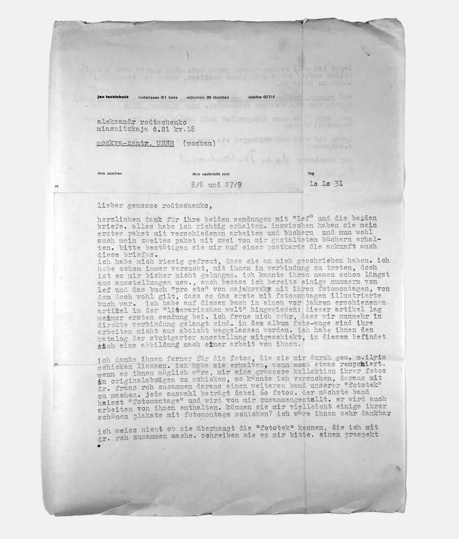
Jan Tschichold – A. M. Rodchenko. Oct. 10, 1931. For the cover of the acclaimed book, Fotoglaz (Photo Eye, 1929), discussed in letter, and replaced by a photo of El Lissitsky.
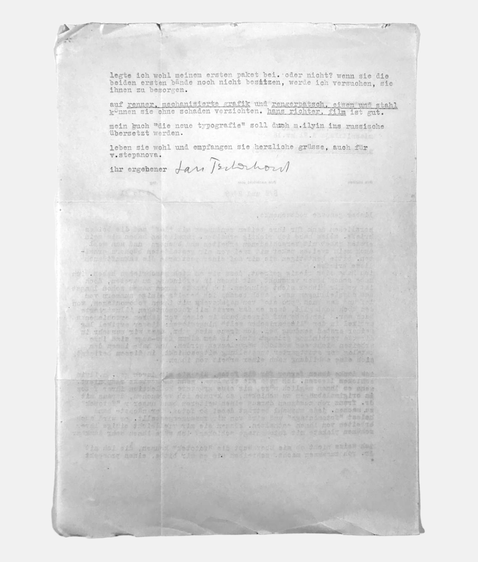
Jan Tschichold – A. M. Rodchenko. Oct. 10, 1931. For the cover of the acclaimed book, Fotoglaz (Photo Eye, 1929), discussed in letter, and replaced by a photo of El Lissitsky.
What was Rodchenko’s attitude to the West, generally speaking? On the basis of letters from Paris, one gets the impression that his feelings were ambiguous: on the one hand, he was inspired by the technical quality of the manufactured goods, and, on the other, he was disturbed by the pandering to bourgeois tastes.
Yekaterina Lavrentieva: The idea of “things as friends and helpers” was virtually a Rodchenko motto. He missed that in Paris, where he found what he thought of as an indifference to the human environment. The language barrier played a role in this. I recently came across a curious fact that I had never before considered. That very 1925 Paris exhibition included an Italian pavilion. Oddly, it showed, side by side, old-fashioned, totally unsurprising traditional designs and the displays of the futurists. It is clear from photographs that the futurist creations were, essentially, prototypes for the designs of the later Memphis group, which flourished in the 1980s. It would be interesting to know if Rodchenko saw them and how he reacted.
Aleksandr Lavrentiev: On the other hand, he surely did see and appreciate the works by Sonia Delaunay. In one of his letters to Stepanova, he writes of the geometric fabrics in Paris [at the show], but “our people are afraid of everything and would it not be good to show them at your factory.”
Yekaterina Lavrentieva: In thinking about the festival, Rodchenko wrote many letters home from Paris during his free time; in these he recorded all his visual impressions; the letters were a diary for him. In his hotel room, he set up a complete photo laboratory; he took and developed photographs, took pictures of everything that interested him – a street advertisement, objects, furniture. He was drawn to everything simple and functional; it’s no accident that there are folding chairs from a park in one photo.
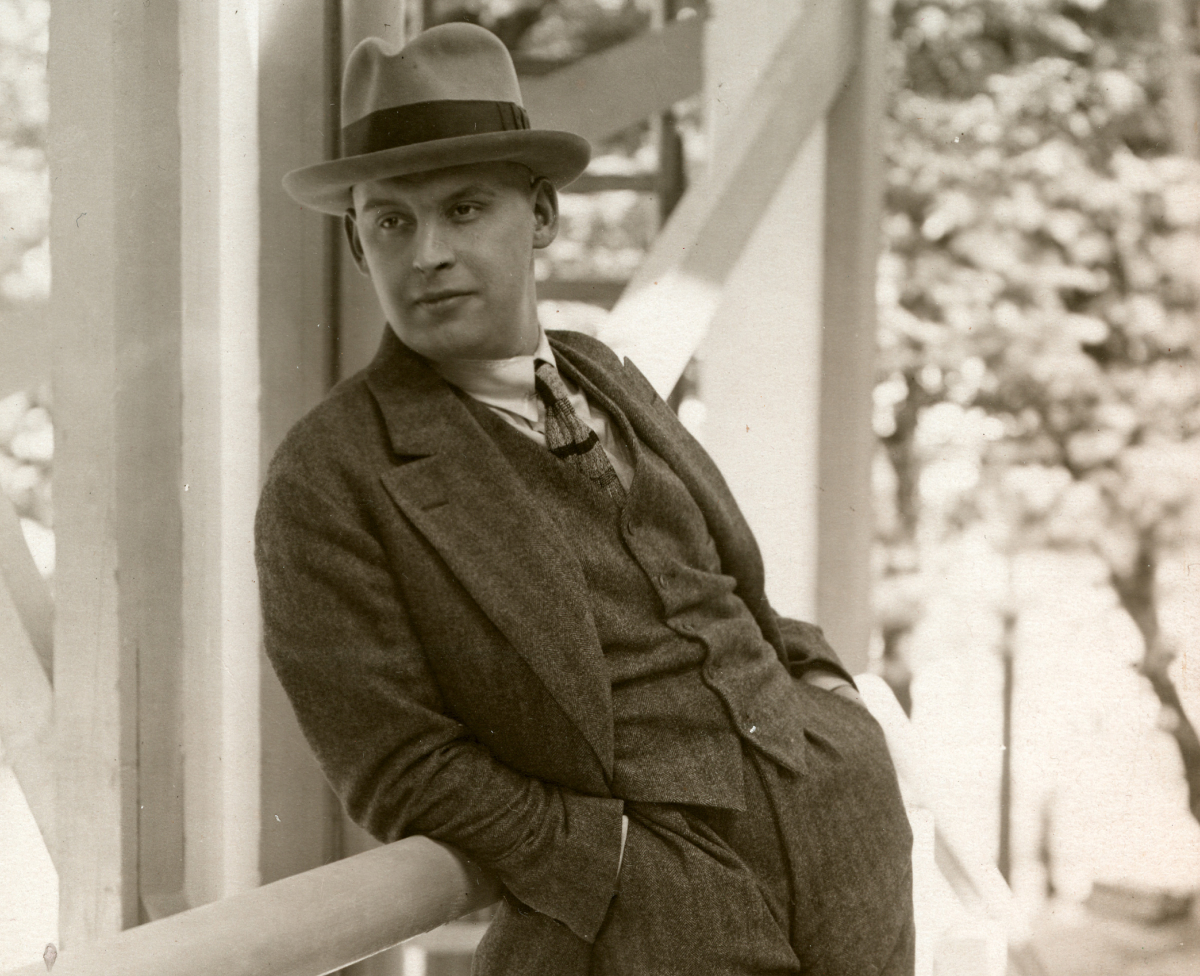
Alexander Rodchenko in Paris. The photo was taken by the entrance to the Soviet pavilion designed by architect K. S. Melnikov. 1925.
In the spring of 1925, Rodchenko traveled to Paris to work on the design of the Soviet pavilion for the International Exhibition of Modern Decorative and Industrial Arts. Rodchenko was also to design and build a life-size workers’ club for the fair. His almost daily letters home have been preserved. Varvara Stepanova bound them as a notebook. Rodchenko’s letters from Paris were published in part in the journal Novyi Lef, No. 1, 1927.
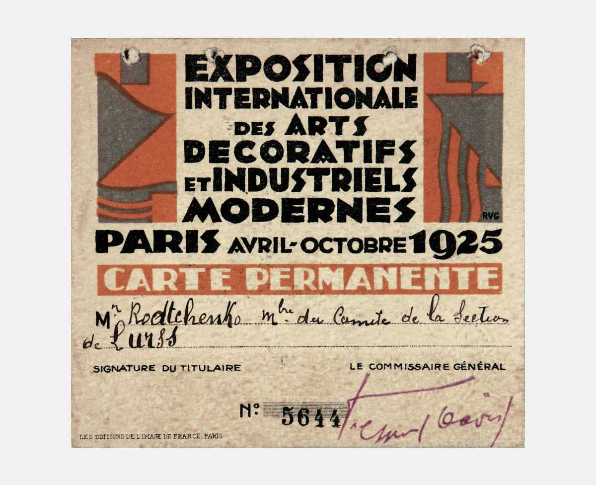
Rodchenko’s pass to the 1925 Paris Exhibition.
In the spring of 1925, Rodchenko traveled to Paris to work on the design of the Soviet pavilion for the International Exhibition of Modern Decorative and Industrial Arts. Rodchenko was also to design and build a life-size workers’ club for the fair. His almost daily letters home have been preserved. Varvara Stepanova bound them as a notebook. Rodchenko’s letters from Paris were published in part in the journal Novyi Lef, No. 1, 1927.
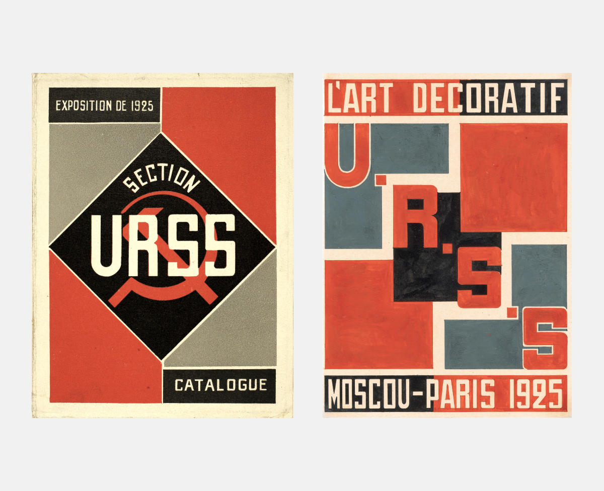
Catalog covers of the Soviet section at the International Exposition of Modern Industrial and Decorative in Paris. 1925.
In the spring of 1925, Rodchenko traveled to Paris to work on the design of the Soviet pavilion for the International Exhibition of Modern Decorative and Industrial Arts. Rodchenko was also to design and build a life-size workers’ club for the fair. His almost daily letters home have been preserved. Varvara Stepanova bound them as a notebook. Rodchenko’s letters from Paris were published in part in the journal Novyi Lef, No. 1, 1927.
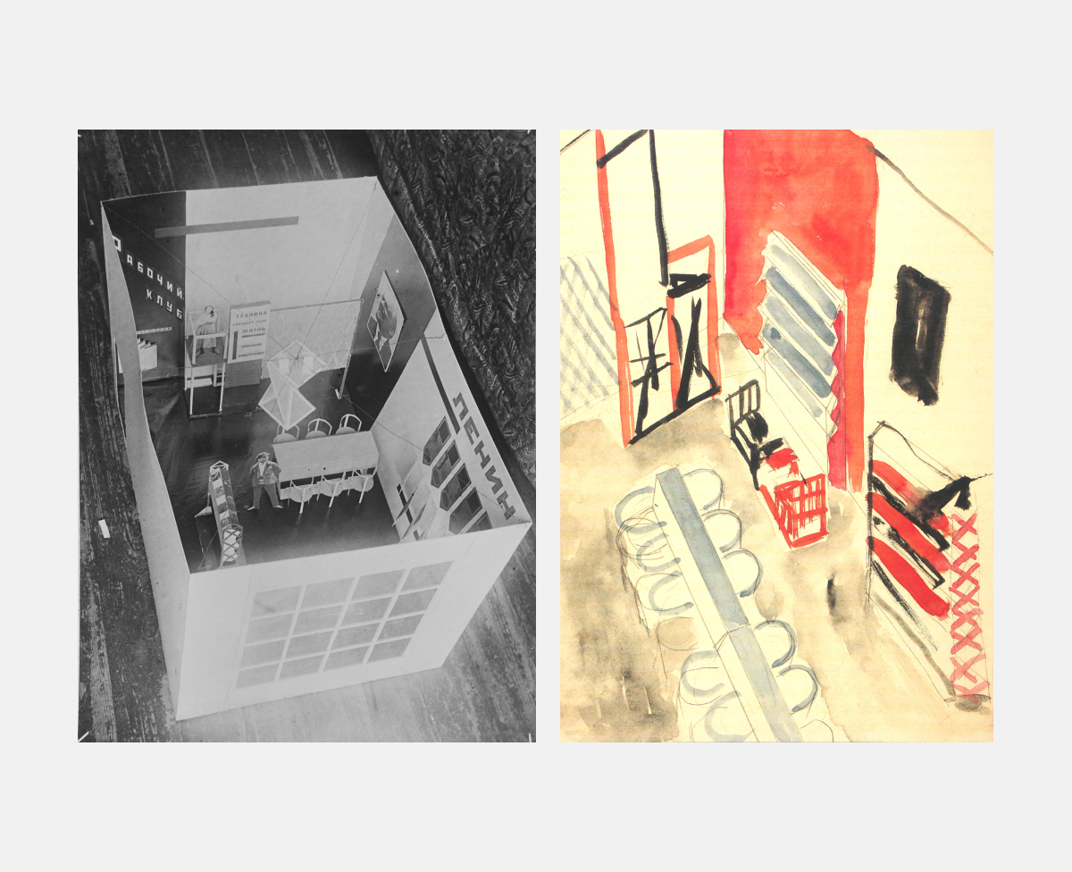
Worker‘s Club Designs for the Paris Exhibition. Preliminary model (photo by Rodchenko) and sketch for wall painting.
In the spring of 1925, Rodchenko traveled to Paris to work on the design of the Soviet pavilion for the International Exhibition of Modern Decorative and Industrial Arts. Rodchenko was also to design and build a life-size workers’ club for the fair. His almost daily letters home have been preserved. Varvara Stepanova bound them as a notebook. Rodchenko’s letters from Paris were published in part in the journal Novyi Lef, No. 1, 1927.
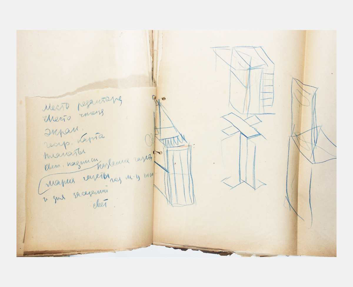
List with possible functions of the rostrum.
In the spring of 1925, Rodchenko traveled to Paris to work on the design of the Soviet pavilion for the International Exhibition of Modern Decorative and Industrial Arts. Rodchenko was also to design and build a life-size workers’ club for the fair. His almost daily letters home have been preserved. Varvara Stepanova bound them as a notebook. Rodchenko’s letters from Paris were published in part in the journal Novyi Lef, No. 1, 1927.
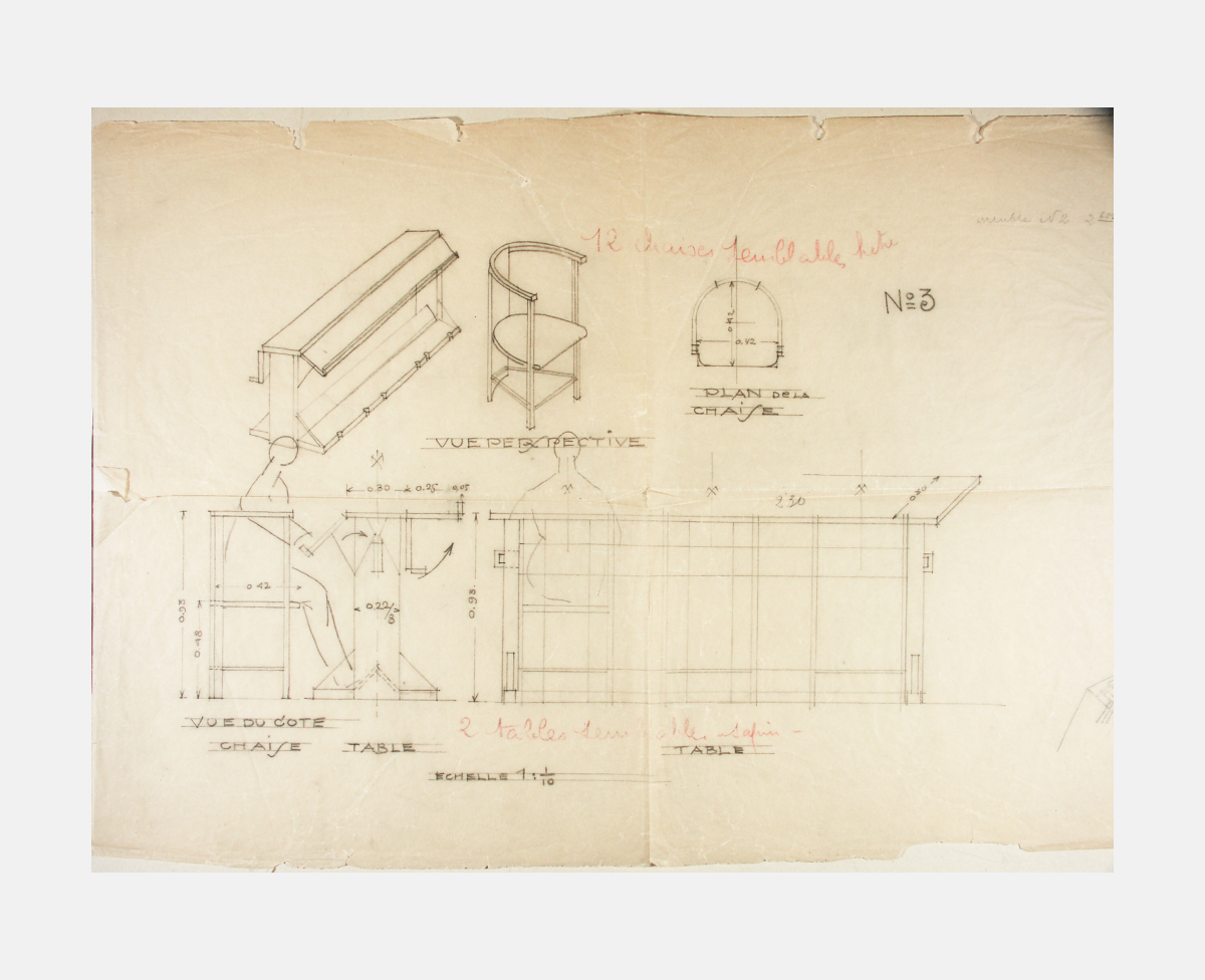
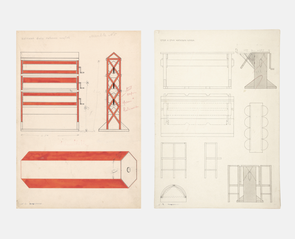
Working drawings for the Workers’ Club furniture.
In the spring of 1925, Rodchenko traveled to Paris to work on the design of the Soviet pavilion for the International Exhibition of Modern Decorative and Industrial Arts. Rodchenko was also to design and build a life-size workers’ club for the fair. His almost daily letters home have been preserved. Varvara Stepanova bound them as a notebook. Rodchenko’s letters from Paris were published in part in the journal Novyi Lef, No. 1, 1927.
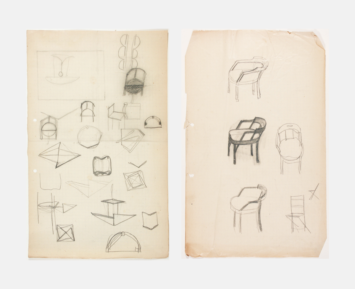
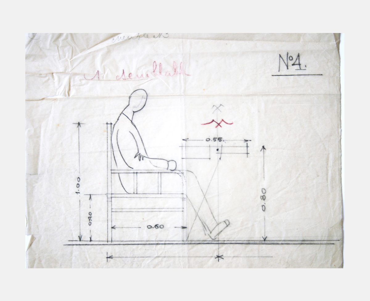
Sketches of chairs for the Workers‘ Club.
In the spring of 1925, Rodchenko traveled to Paris to work on the design of the Soviet pavilion for the International Exhibition of Modern Decorative and Industrial Arts. Rodchenko was also to design and build a life-size workers’ club for the fair. His almost daily letters home have been preserved. Varvara Stepanova bound them as a notebook. Rodchenko’s letters from Paris were published in part in the journal Novyi Lef, No. 1, 1927.
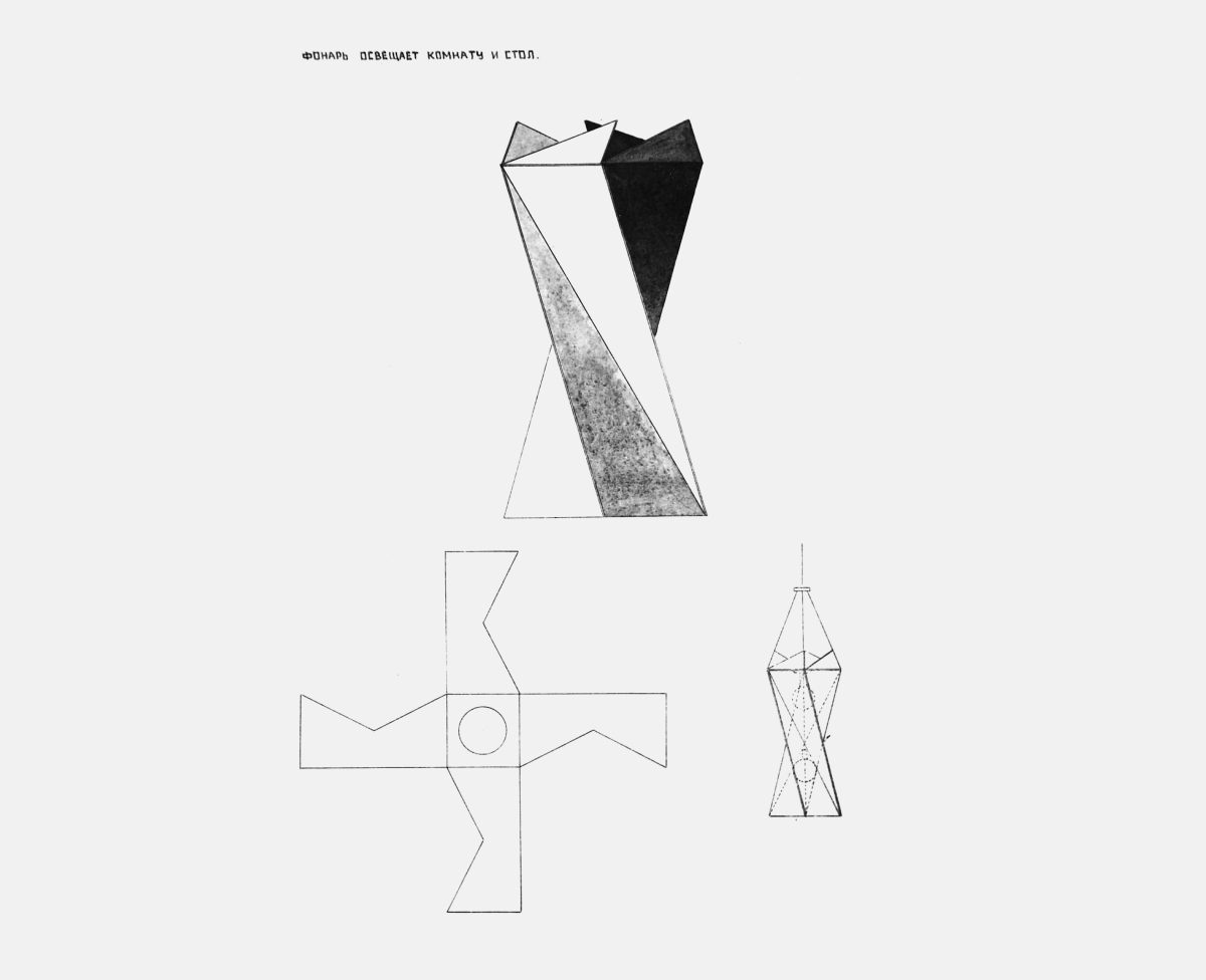
Lighting fixture design for the Workers‘ Club. Orthogonal and elevated views.
In the spring of 1925, Rodchenko traveled to Paris to work on the design of the Soviet pavilion for the International Exhibition of Modern Decorative and Industrial Arts. Rodchenko was also to design and build a life-size workers’ club for the fair. His almost daily letters home have been preserved. Varvara Stepanova bound them as a notebook. Rodchenko’s letters from Paris were published in part in the journal Novyi Lef, No. 1, 1927.
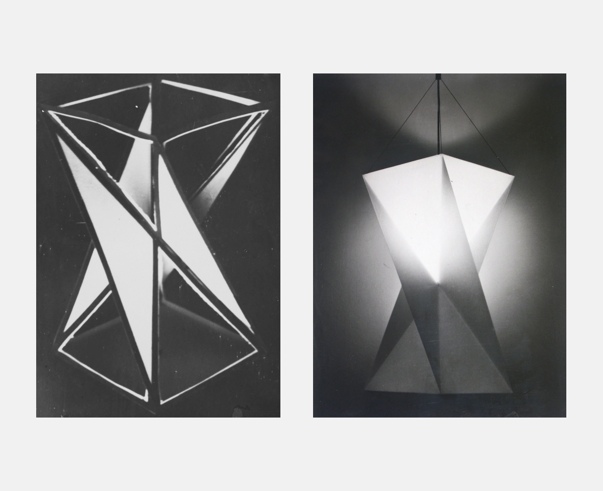
Left: Model of the lighting fixture for the Workers‘ Club. Right: Lighting fixture, 1974. Reconstruction by Italian Arteluce Company.
In the spring of 1925, Rodchenko traveled to Paris to work on the design of the Soviet pavilion for the International Exhibition of Modern Decorative and Industrial Arts. Rodchenko was also to design and build a life-size workers’ club for the fair. His almost daily letters home have been preserved. Varvara Stepanova bound them as a notebook. Rodchenko’s letters from Paris were published in part in the journal Novyi Lef, No. 1, 1927.
Left: Photo stand for the Workers‘ Club. Orthogonal views. 1925. Right: Design for the Workers‘ Club reading-room table and chair.
In the spring of 1925, Rodchenko traveled to Paris to work on the design of the Soviet pavilion for the International Exhibition of Modern Decorative and Industrial Arts. Rodchenko was also to design and build a life-size workers’ club for the fair. His almost daily letters home have been preserved. Varvara Stepanova bound them as a notebook. Rodchenko’s letters from Paris were published in part in the journal Novyi Lef, No. 1, 1927.
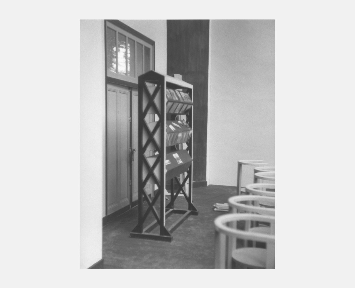
Photo stand for the Workers‘ Club. Photo by Rodchenko. 1925.
In the spring of 1925, Rodchenko traveled to Paris to work on the design of the Soviet pavilion for the International Exhibition of Modern Decorative and Industrial Arts. Rodchenko was also to design and build a life-size workers’ club for the fair. His almost daily letters home have been preserved. Varvara Stepanova bound them as a notebook. Rodchenko’s letters from Paris were published in part in the journal Novyi Lef, No. 1, 1927.
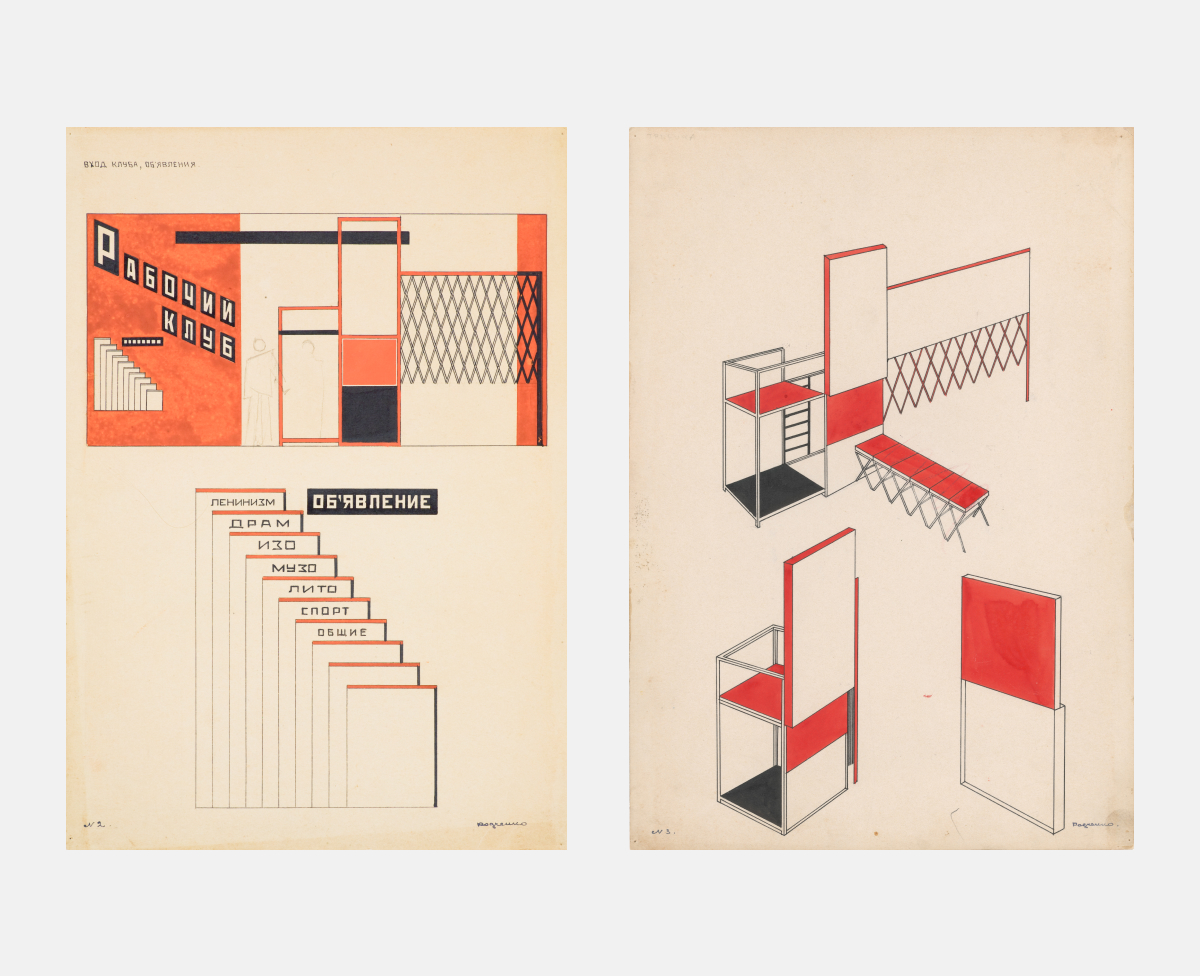
Left: Design of the Workers‘ Club central wall (entrance group). Elevation of the wall with rostrum. Right: Transformable rostrum. Axonometry.
In the spring of 1925, Rodchenko traveled to Paris to work on the design of the Soviet pavilion for the International Exhibition of Modern Decorative and Industrial Arts. Rodchenko was also to design and build a life-size workers’ club for the fair. His almost daily letters home have been preserved. Varvara Stepanova bound them as a notebook. Rodchenko’s letters from Paris were published in part in the journal Novyi Lef, No. 1, 1927.
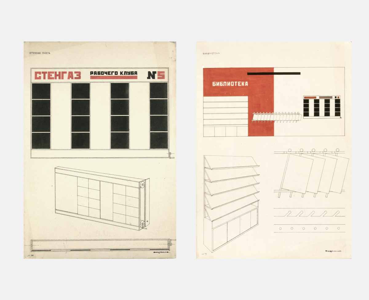
Left: Design of the wall newspaper for the Workers‘ Club. Right: Elevation of the Workers‘ Club library wall and the book-shelf perpective view.
In the spring of 1925, Rodchenko traveled to Paris to work on the design of the Soviet pavilion for the International Exhibition of Modern Decorative and Industrial Arts. Rodchenko was also to design and build a life-size workers’ club for the fair. His almost daily letters home have been preserved. Varvara Stepanova bound them as a notebook. Rodchenko’s letters from Paris were published in part in the journal Novyi Lef, No. 1, 1927.
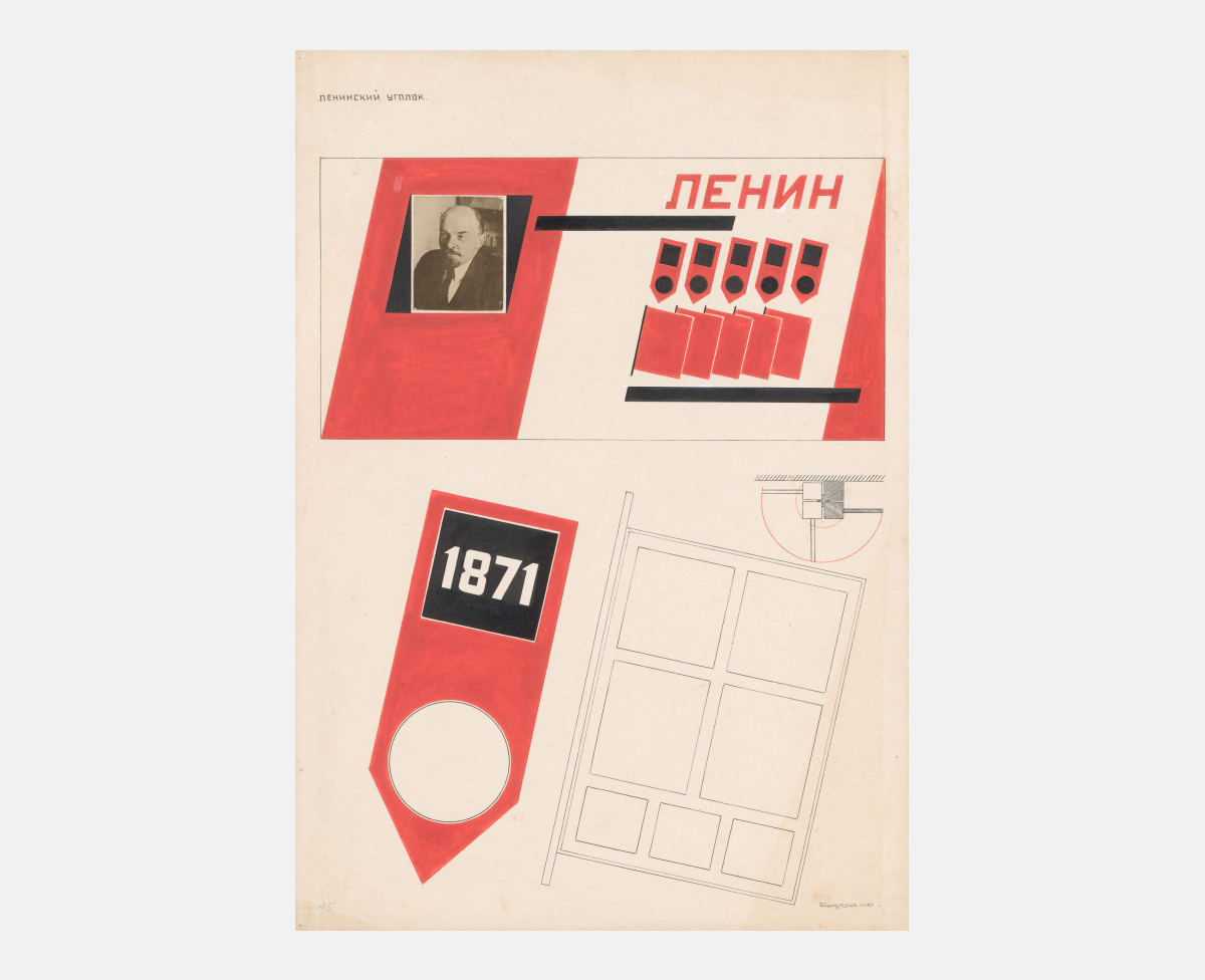
Lenin room. Wall elevation.
In the spring of 1925, Rodchenko traveled to Paris to work on the design of the Soviet pavilion for the International Exhibition of Modern Decorative and Industrial Arts. Rodchenko was also to design and build a life-size workers’ club for the fair. His almost daily letters home have been preserved. Varvara Stepanova bound them as a notebook. Rodchenko’s letters from Paris were published in part in the journal Novyi Lef, No. 1, 1927.
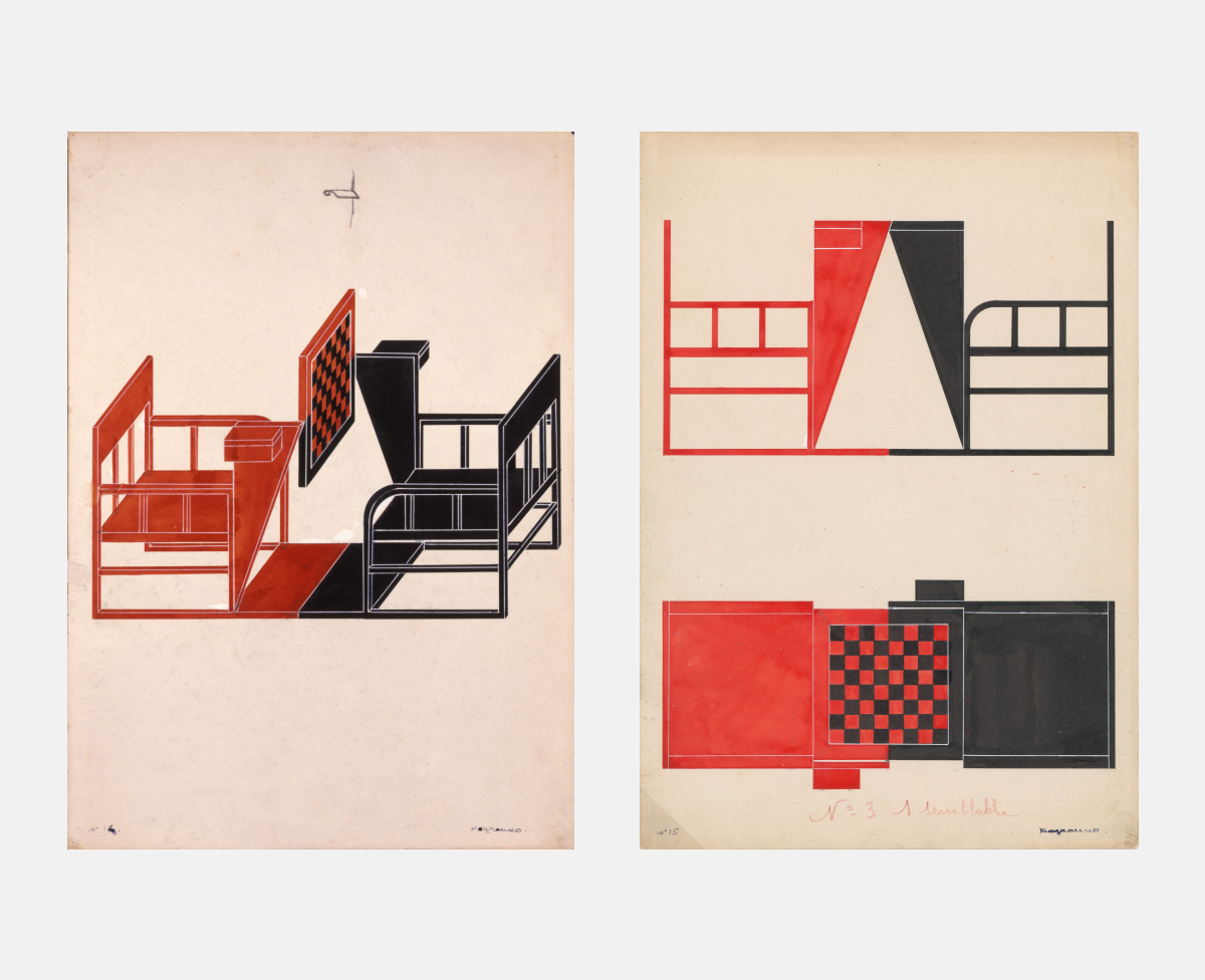
Chess table for the Workers‘ Club. Axonometry and orthogonal view.
In the spring of 1925, Rodchenko traveled to Paris to work on the design of the Soviet pavilion for the International Exhibition of Modern Decorative and Industrial Arts. Rodchenko was also to design and build a life-size workers’ club for the fair. His almost daily letters home have been preserved. Varvara Stepanova bound them as a notebook. Rodchenko’s letters from Paris were published in part in the journal Novyi Lef, No. 1, 1927.
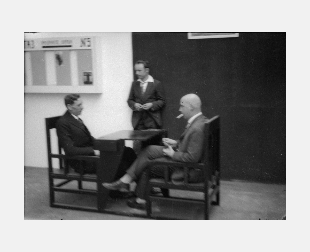
Alexander Rodchenko at the chess table in the Club‘s interiror. 1925.
In the spring of 1925, Rodchenko traveled to Paris to work on the design of the Soviet pavilion for the International Exhibition of Modern Decorative and Industrial Arts. Rodchenko was also to design and build a life-size workers’ club for the fair. His almost daily letters home have been preserved. Varvara Stepanova bound them as a notebook. Rodchenko’s letters from Paris were published in part in the journal Novyi Lef, No. 1, 1927.
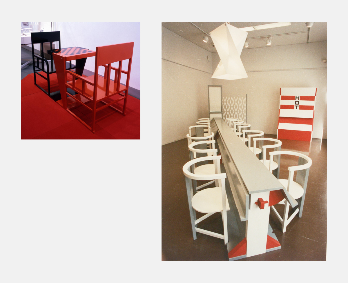
Left: Chess table. Reconstruction by the All-Union Technical Esthetics Research Institute. 1990. Right: Workers‘ Club. Reconstruction. Kuopio, Finland. 1993.
In the spring of 1925, Rodchenko traveled to Paris to work on the design of the Soviet pavilion for the International Exhibition of Modern Decorative and Industrial Arts. Rodchenko was also to design and build a life-size workers’ club for the fair. His almost daily letters home have been preserved. Varvara Stepanova bound them as a notebook. Rodchenko’s letters from Paris were published in part in the journal Novyi Lef, No. 1, 1927.
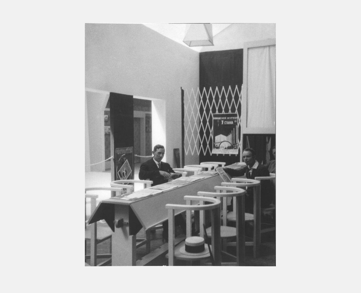
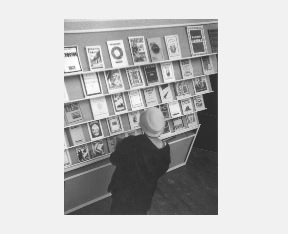
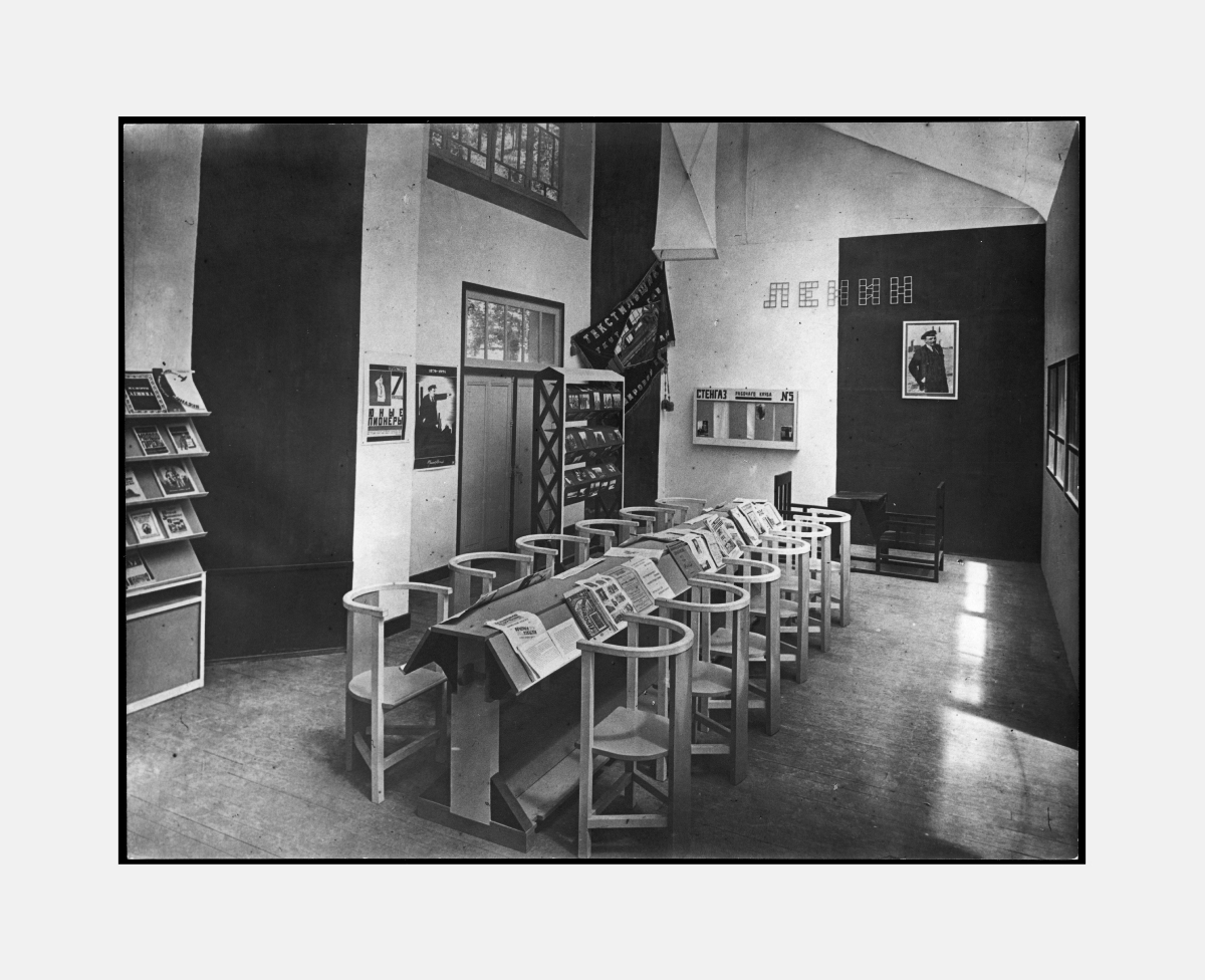
Workers‘ Club. Photos of the interior fragments as built pursuant to Rodchenko‘s designs. That part of the exposition was located at the National Residence of the Invalids‘ Esplanade. Paris, 1925.
In the spring of 1925, Rodchenko traveled to Paris to work on the design of the Soviet pavilion for the International Exhibition of Modern Decorative and Industrial Arts. Rodchenko was also to design and build a life-size workers’ club for the fair. His almost daily letters home have been preserved. Varvara Stepanova bound them as a notebook. Rodchenko’s letters from Paris were published in part in the journal Novyi Lef, No. 1, 1927.
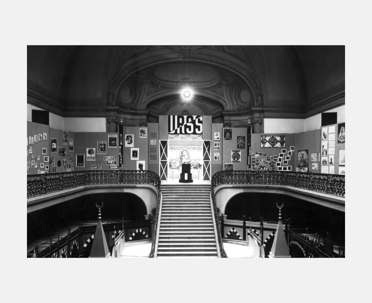
Entrance to the Soviet section of the exposition in Grand Palais. The exposition was designed by Rodchenko.
In the spring of 1925, Rodchenko traveled to Paris to work on the design of the Soviet pavilion for the International Exhibition of Modern Decorative and Industrial Arts. Rodchenko was also to design and build a life-size workers’ club for the fair. His almost daily letters home have been preserved. Varvara Stepanova bound them as a notebook. Rodchenko’s letters from Paris were published in part in the journal Novyi Lef, No. 1, 1927.
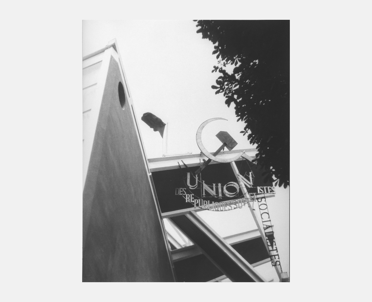
Soviet pavilion. Construction over the entrance. Architect Konstantin Melnikov. 1925. Photo by Rodchenko.
In the spring of 1925, Rodchenko traveled to Paris to work on the design of the Soviet pavilion for the International Exhibition of Modern Decorative and Industrial Arts. Rodchenko was also to design and build a life-size workers’ club for the fair. His almost daily letters home have been preserved. Varvara Stepanova bound them as a notebook. Rodchenko’s letters from Paris were published in part in the journal Novyi Lef, No. 1, 1927.
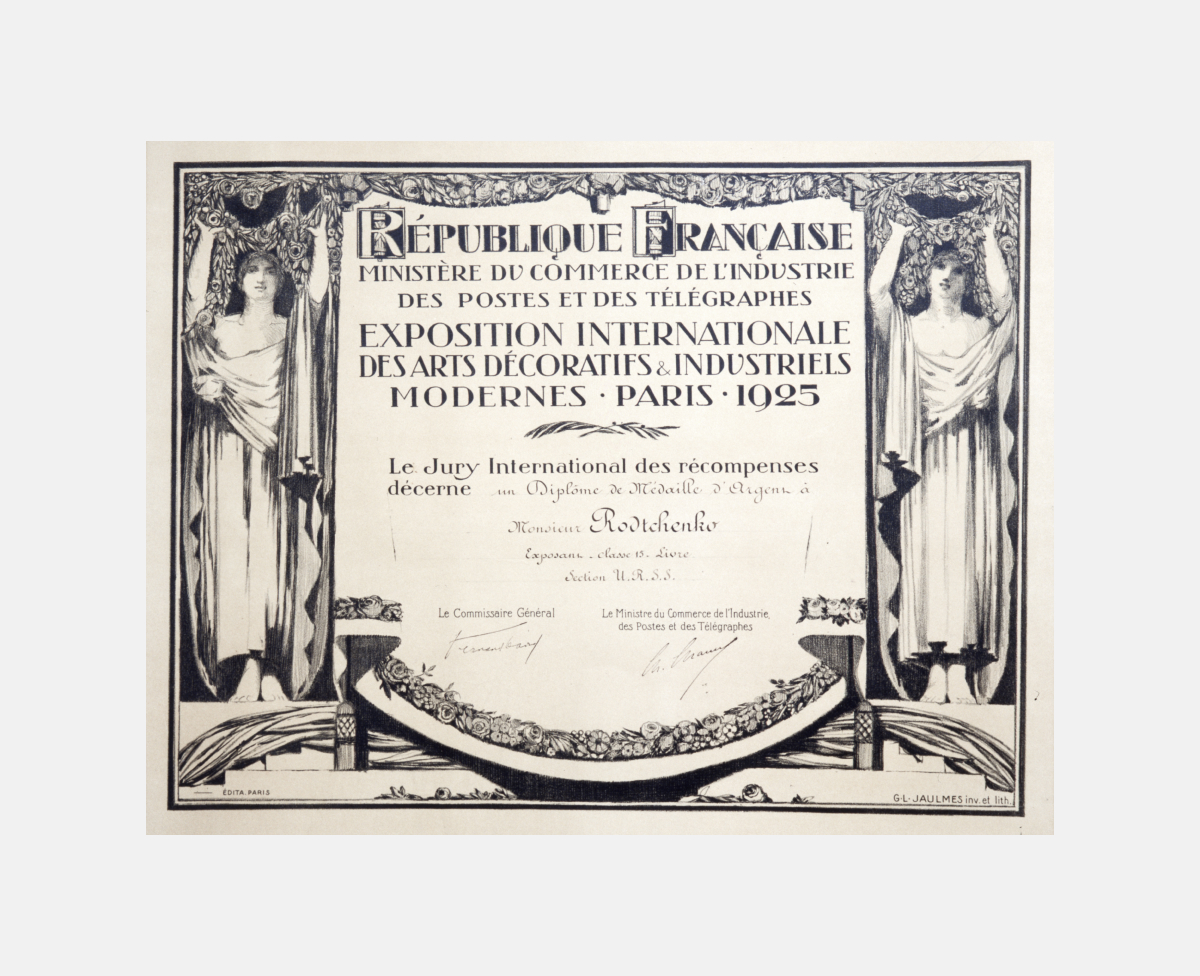
Honorary diploma for the Silver Medal won by Rodchenko in the Book of Art category in the 1925 Paris Exhibition.
In the spring of 1925, Rodchenko traveled to Paris to work on the design of the Soviet pavilion for the International Exhibition of Modern Decorative and Industrial Arts. Rodchenko was also to design and build a life-size workers’ club for the fair. His almost daily letters home have been preserved. Varvara Stepanova bound them as a notebook. Rodchenko’s letters from Paris were published in part in the journal Novyi Lef, No. 1, 1927.
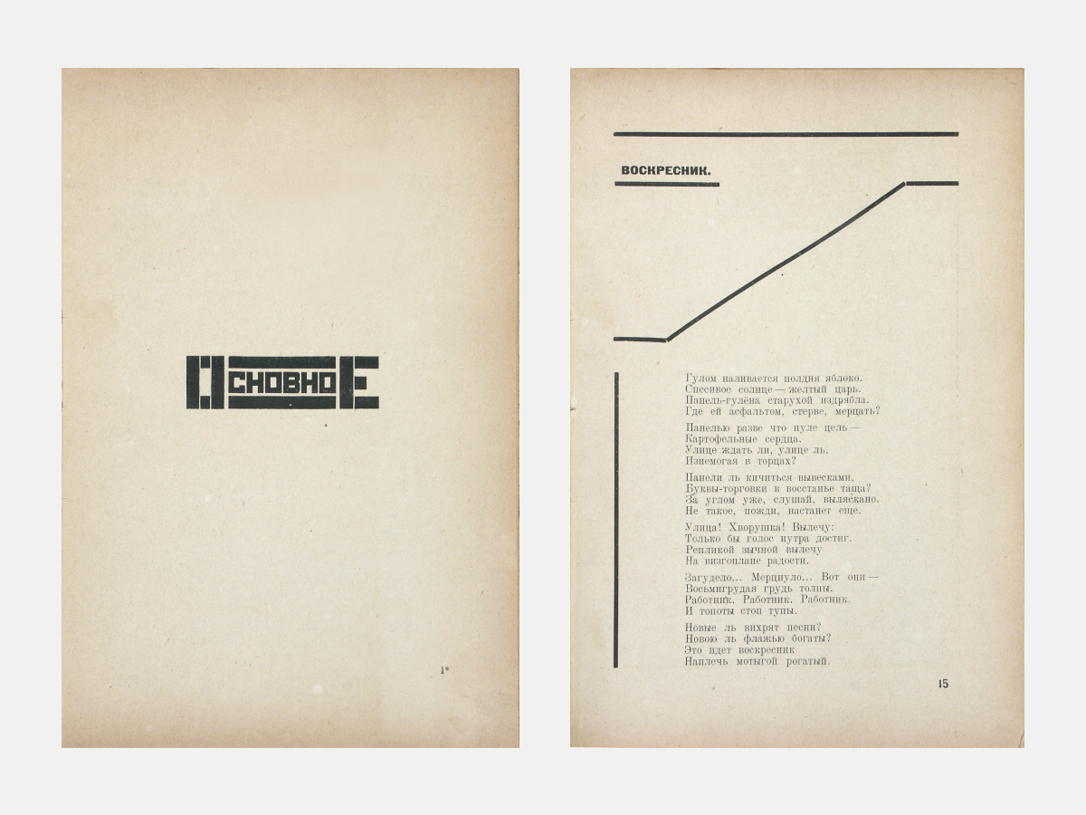
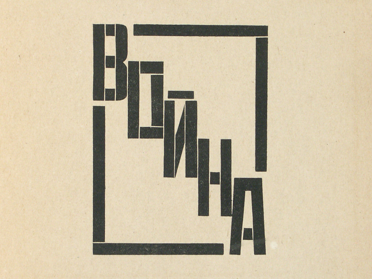
I would like to talk a little about Rodchenko’s print designs. Why did the Constructivists so love to use block letters without serifs?
Yekaterina Lavrentieva: I have some thoughts on the matter of block lettering. The artists of the 1920s did their sketches on graph paper; they liked the prepared divisions, which readily brought out structures and the rules that generated them. This was not faceless and amorphous stuff; it was precisely organized space. All that remained to do was to fill the boxes in a particular way; moreover, all sorts of variations were possible. Which letter would dominate? Would there be an arrow, a so-called pay-attention sign? Such accent-signs abound in Constructivist typography – Lisitsky referred to this as the articulation of the text. Each new variant called for a different kind of graphing. And then, too, it was very easy to enlarge these sketches.
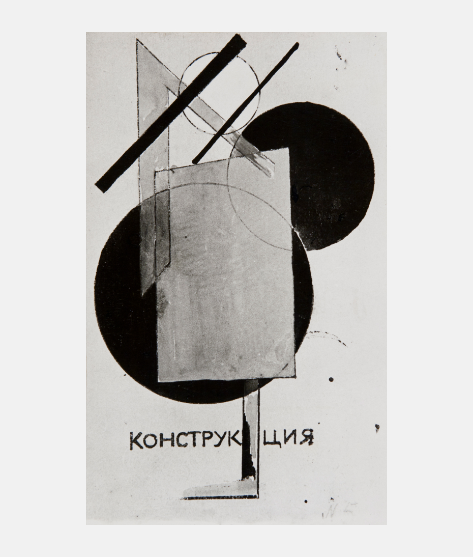
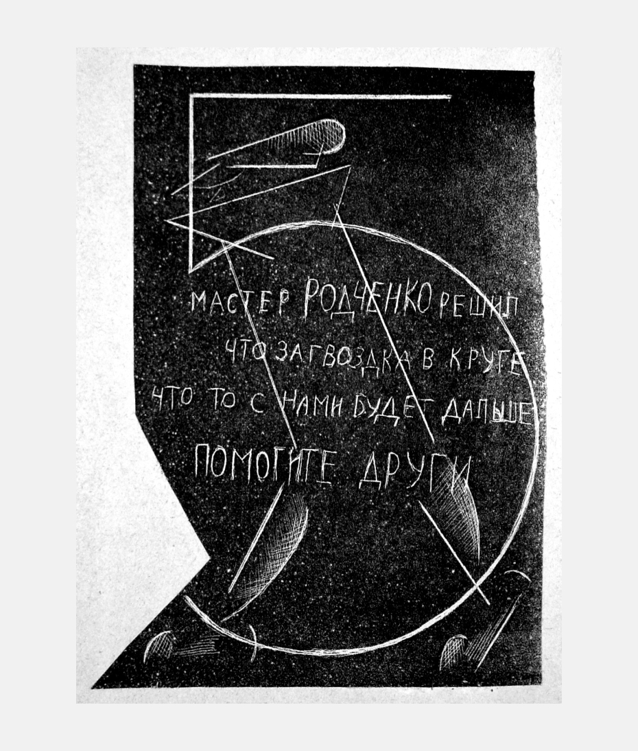
In the 5x5=25 exhibition, Rodchenko showed a work called “Kletka” [Сage]. It has not been preserved, but it was made up of lines that run through the surface from top to bottom and from right to left. It is as if he laid out in “Kletka” the fundamentals of the new art: there is line as a separate element, and then there is the structure. It seems to me that this comes out of Rodchenko’s nature, his character – he tried to follow logic in everything, and he tried to arrange himself, make himself disciplined in character. His scientific-experimental approach to creating was not merely a result of something in the air at the time, a fashion. Think of the posters for Mosselprom – crazily verbose things. A contemporary designer would play with it, ask for the text to be shortened, would add an image. Rodchenko had to lay out the entire text in a systematic way, bring out the main point, create a hierarchy – only thus could he work out a normal relationship with the viewer.
Rodchenko made many constructions of elements of a single kind. Alexander [Lavrentiev, Yekaterina’s father. – Editor’s note] gave them a wonderful name – formulas for future things. It seems to me that it is necessary to look at these things together with Rodchenko’s block lettering.
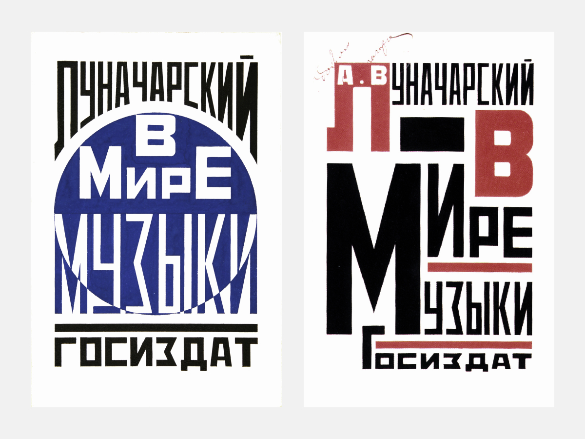
Lettering filling. Anatoly Lunacharsky. In the World of Music. 1923. Book cover versions.
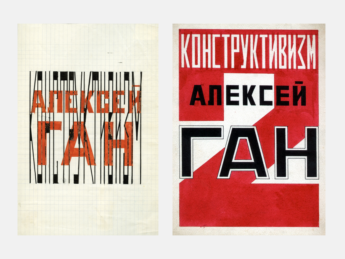
Alexei Gan. Constructivism. Cover version designed by Rodchenko. 1922.
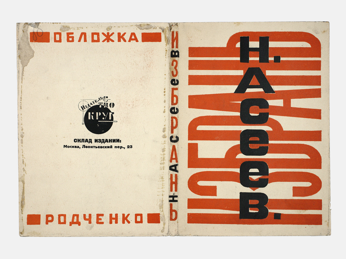
Multiple layers. Nikolai Asseyev. Izbran‘. Front and back covers designed by Rodchenko. 1923.
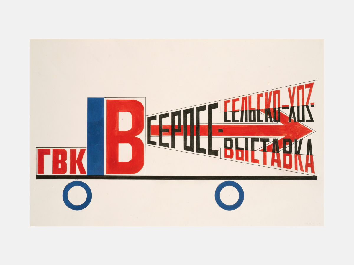
Cinema-truck design. Version. Reconstruction by Varvara Rodchenko based on the author‘s blueprint. 1994.
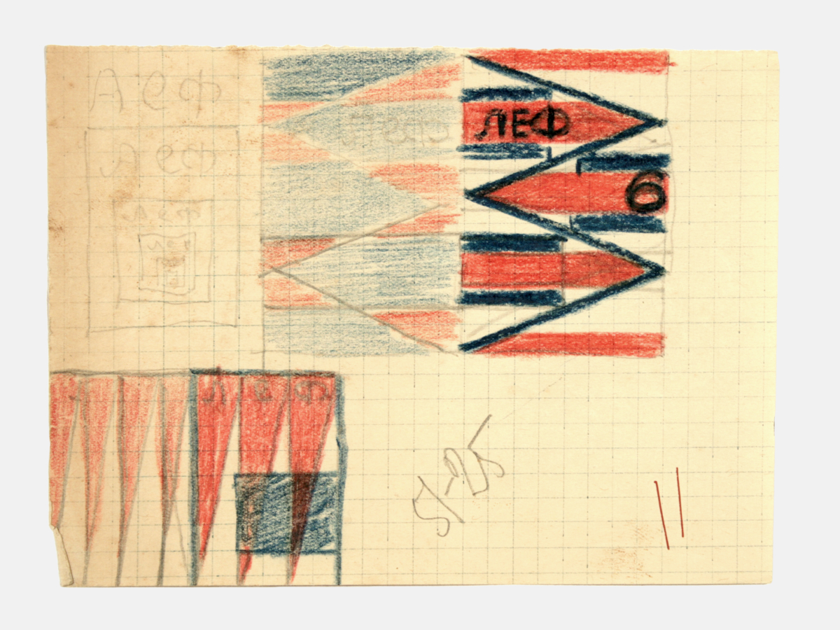
New LEF, Issue 6, 1927. Sketches of the cover on squared paper.
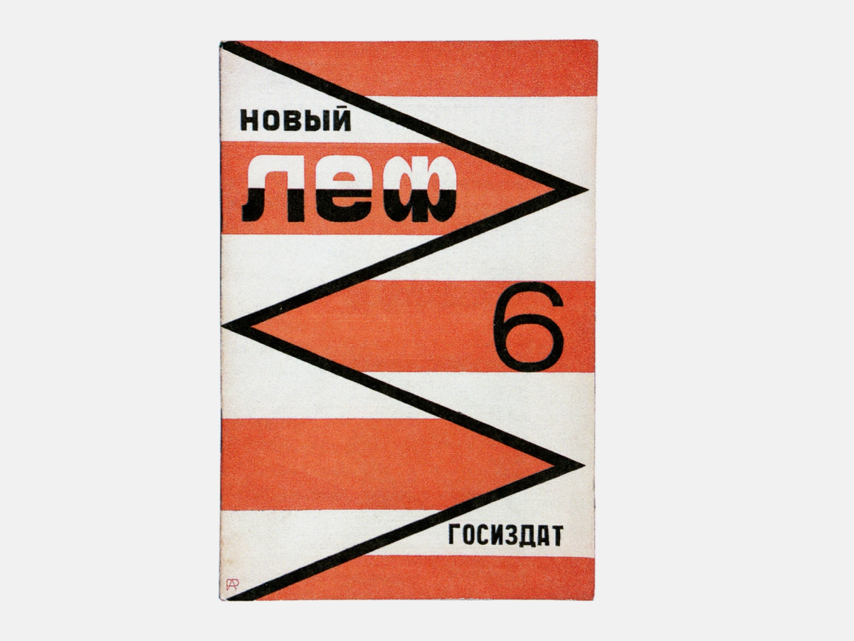
New LEF, Issue 6, 1927. Magazine cover.
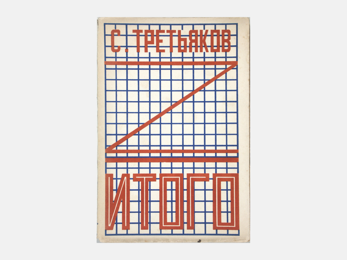
Sergey Tretyakov. Total. 1924. Cover.
Sergey Tretyakov. Total. 1924. Half-title and page. Fresh pages were probably composed by M.Schneider.
Sergey Tretyakov. Total. 1924. Half-titles. Fresh pages were probably composed by M.Schneider.
Sergey Tretyakov. Total. 1924. Half-title. Fragment, enlarged.
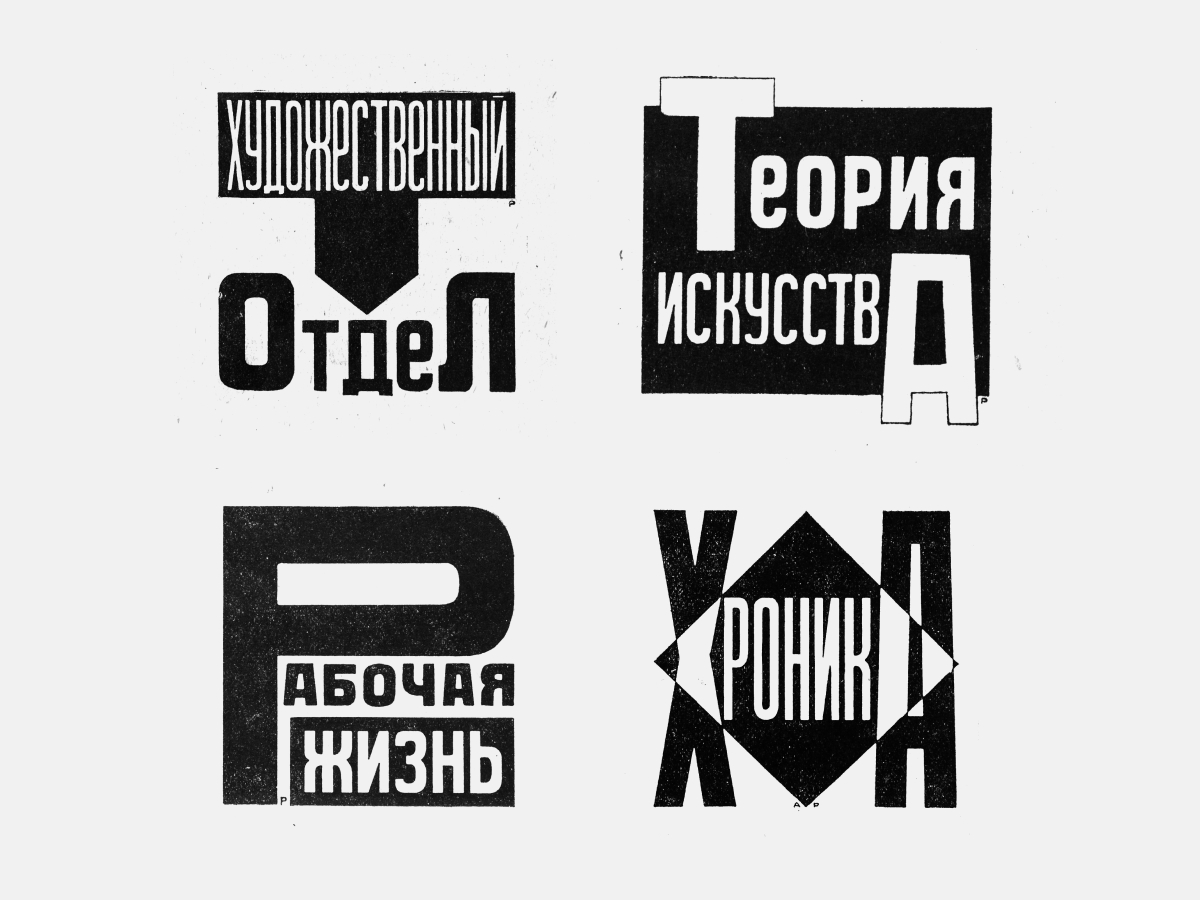
Lettering blocks. Magazine headers. 1924.
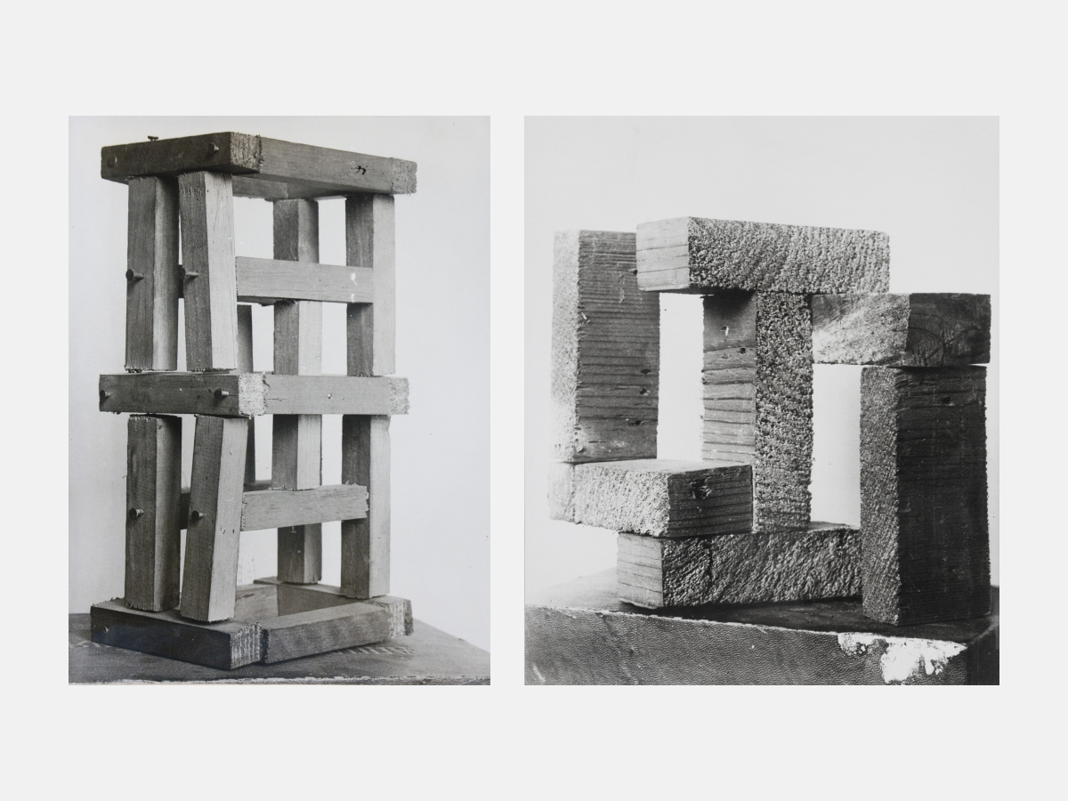
Spatial constructions from the third On Identical Forms‘ Basic series. 1921.
Block letters for the Constructivists were definitely not, all in all, a flat phenomenon. One gets a sense of this in Rodchenko’s work in cinema, more specifically, his subtitles for Dziga Vertov’s newsreels. The thing is that we have become used to thinking about the Constructivists’ stick fonts as something static, “typical” of them. But the impression grows that they saw stick fonts as part of their three-dimensional constructions, and they thought of such type as potentially three-dimensional.
One newsreel showed delegates entering an international meeting. Even with the best ideological predisposition, this would be boring to look at. Here Rodchenko’s subtitles serve as separate introductions (like stand-alone titles on a separate page before the start of a new section of a book) for each entrance, and each of the headings is symbolic. It conveys the concrete character of each country. To parse the symbolism is itself interesting.
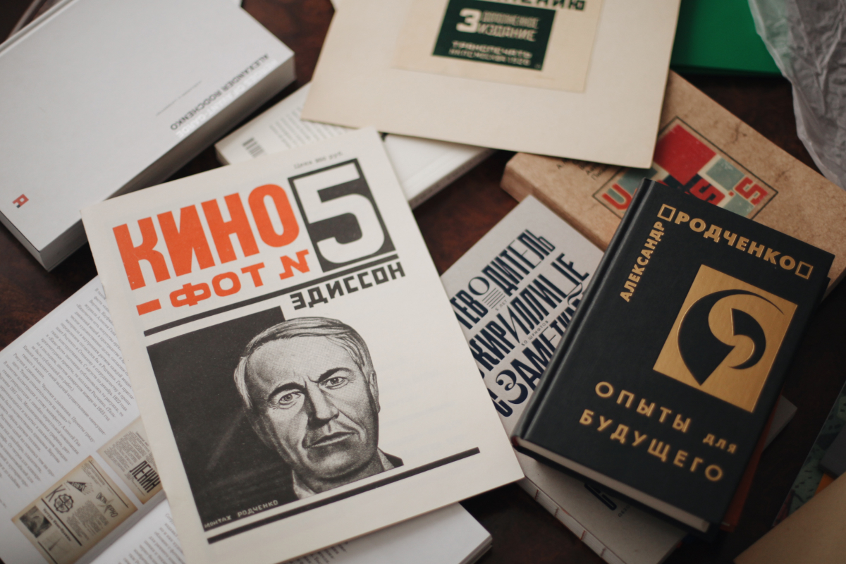
I found yet another surprising thing for myself in the journal Kino-Phot, No. 5. In an article about documentary films and a bit about Rodchenko’s subtitles, there is a startling phrase: “Sign like an electrical cord, a wire through which the screen is nourished with glowing reality.” It occurred to me that such subtitles were already being thought of as adaptable for advertising. Of course, such ads didn’t yet exist in Moscow, but the Constructivists knew about Broadway.
Yes, in the letters to Stepanova from Paris, Rodchenko does, in fact, mention advertising in lights.
Yekaterina Lavrentieva: This involves a special relationship to text. It seems to me that, on this, Rodchenko moved away from Lisitsky. El Lisitsky thinks in terms of books, he tries to present things as a series of pictures, one succeeding another, “self-speaking creations.” With Rodchenko we have a great many works with levels and impositions of one word on another: for him, lettering was the equivalent of detailed blueprints for something with volume. Let it be that these things were never made material in the newsreels in the planned animated form, but the system of movements existed in them. The letters are of varying heights; something can happen in them; they hold, as it were secretly, a potential dynamism. “Type is a three-dimensional construction within a given field.”
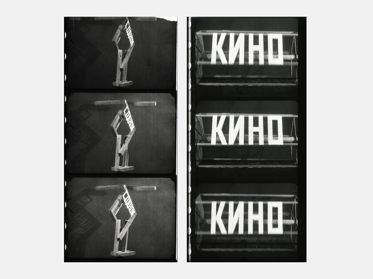
Captions for Dziga Vertov‘s Kino-Pravda. 1922. On the One Hand. On the Other Hand. Those two titles were fastened on two sides of the spatial construction rotating during filming; The word Kino was fixed to one facet of the rotating hexahedral prism, followed by the word Pravda and then, most likely, by the consecutive number of the newsreel issue.
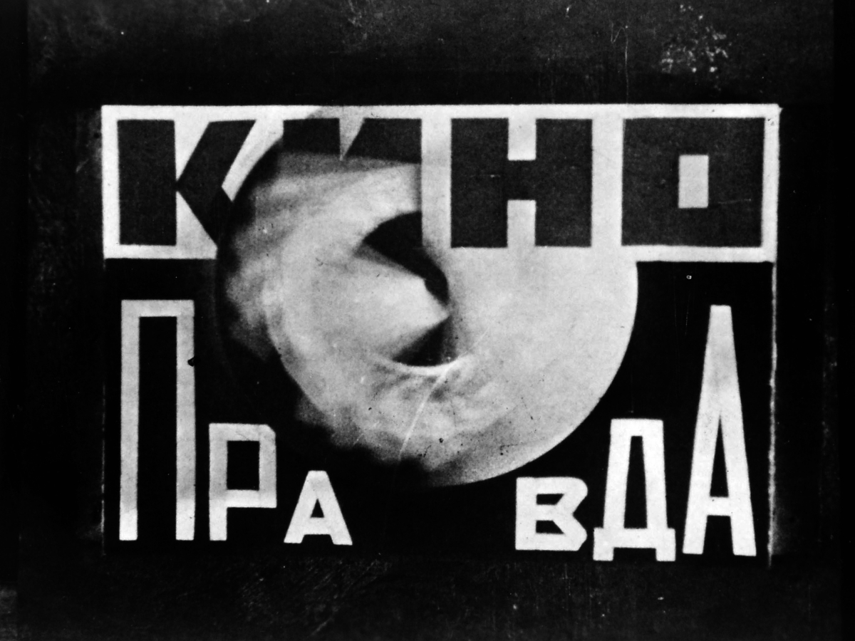
Captions for Dziga Vertov‘s Kino-Pravda. 1922. Dynamic still. A rotating disk is located in the center of the typeface composition.
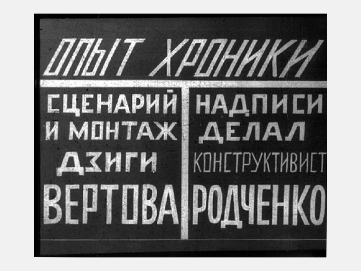
Captions for Dziga Vertov‘s Kino-Pravda. 1922. Chronicle Experiment.
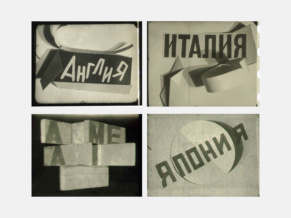
Captions for Dziga Vertov‘s Kino-Pravda. 1922. England. Italy. France. China. Japan. America. Newsreel captions.
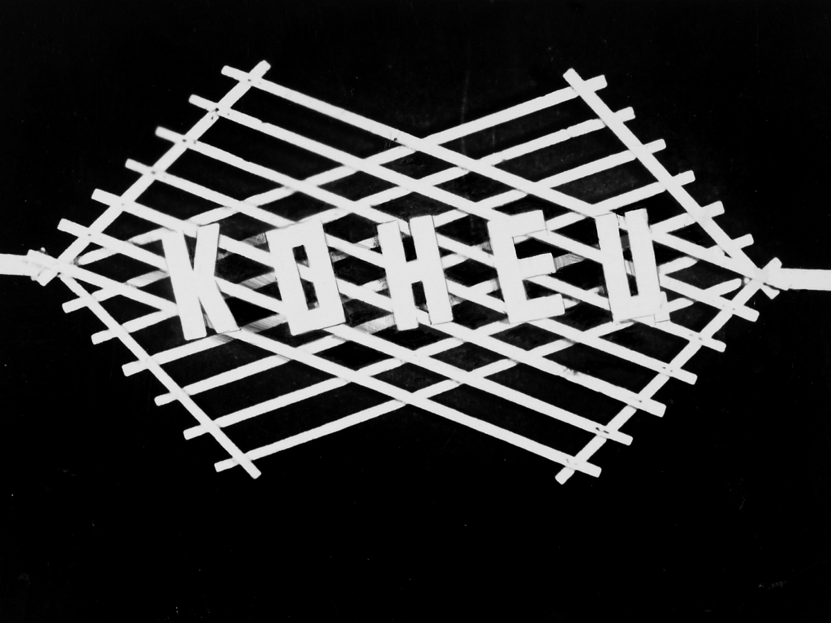
Captions for Dziga Vertov‘s Kino-Pravda. 1922. End. The final caption for the newsreel. Letters in End were fixed to rods of a transformable construction. In this way with changing the grid configuration (the slant of the parallelogram sides was changing), the slant of the letters was also changing.
How did Rodchenko react to changes in the cultural policies of the USSR, when it moved to socialist realism, while opposite processes were taking place in book design, and once again display serifs returned to book covers, and paperbacks were replaced by stamped covers? Could he adapt himself to this esthetic?
Yekaterina Lavrentieva: Rodchenko’s notes from the postwar years are shot through with pessimism. My grandmother recalls once asking my mother: “Why is our papa so sad?” She took a breath and said: “Imagine a machine that can do anything and stands idle.” Up to 1941 the movement was still alive, as was the idea that it was necessary and desirable. Finally, there was the periodical, SSSR na stroike [USSR in Construction], the last edition of which Rodchenko and Stepanova submitted on June 21, 1941 (it was never published for obvious reasons). Everyone went in for pomposity in printing: Lisitsky, Ilyin, Telingater…
The endless 1930s’ books of photographs about the Moscow subway system, about aviation, they saw as very interesting projects. We went through one of the packets in the archive and found little books of this kind and sheets of paper folded in half. This was a step-by-step scenario for a future publication, which surprised me in that it was not accompanied by any content. How, after all, do we work now? We start from the material and consider what we are given: what kind of text, what selection of illustrations. Rodchenko started from the formalities of composition; that is, he drew the full-page spreads with his beloved geometric forms. Only later would he lay out the text and other materials.
Alexander Lavrentiev and Ekaterina Lavrentieva. Stroganov Academy. Moscow, February 2020.
Alexander Lavrentiev and Ekaterina Lavrentieva. Stroganov Academy. Moscow, February 2020.
Alexander Lavrentiev and Ekaterina Lavrentieva. Stroganov Academy. Moscow, February 2020.
Alexander Lavrentiev and Ekaterina Lavrentieva. Stroganov Academy. Moscow, February 2020.
Alexander Lavrentiev and Ekaterina Lavrentieva. Stroganov Academy. Moscow, February 2020.
Alexander Lavrentiev and Ekaterina Lavrentieva. Stroganov Academy. Moscow, February 2020.
Alexander Lavrentiev and Ekaterina Lavrentieva. Stroganov Academy. Moscow, February 2020.
Then, Stepanova, like a director, would literally cover the pages with writing in the way that the material was to be developed. At that stage, they already had in hand some photographs. For example, the issue of USSR in Construction devoted to Kiev was put together this way, with full emphasis on how readers would react to each portion of the publication. The esthetic of the photo albums of the 1930s was largely based on cinematic and photographic montage.
The 1950s was a difficult time. Today we understand that Rodchenko died just a few years before his general recognition. I always think of the film, The Cranes Are Flying, which won the Palme d’Or at Cannes. The cinematographer for the film was Sergei Urusevskiy – a student of Rodchenko. He believed he was formed as a professional in the photography circles at VKhUTEMAS, which were organized in 1928–1929 by Rodchenko. Creative work for Rodchenko and Stepanova was a means for improving communication in the space in which they lived. And their influence on the younger generation of artists was not just significant. It was a system.
Literature (in Russian)
- Адаскина Н. Л. ВХУТЕМАС–ВХУТЕИН: Москва, 1920–1930 // Энциклопедия русского авангарда / Под ред. В. И. Ракитина и А. Д. Сарабьянова. — М.: Глобал Эксперт энд Сервис Тим, 2013.
- Лаврентьев А. Н. Роль Родченко в формировании пропедевтической дисциплины «Графика» во ВХУТЕМАСе // Художественные проблемы предметно-пространственной среды. — М., 1978.
- Лаврентьев А. Н. Пропедевтическая дисциплина «Графика». ВХУТЕМАС. 1920–1922 годы. // Техническая эстетика. — 1984. — №7. — С. 16–21.
- Лаврентьев А. Н. Школа прикладного искусства и дизайна на переломе. Подготовка рождения ВХУТЕМАСа // Материалы Всероссийской конференции, посвященной 100-летию образования Свободных государственных художественных мастерских (СГХМ) / Отв. ред. Есаулов. — М.: МГХПА им. С. Г. Строганова, 2018. С. 14–20.
- Лаврентьев А. Н. Лаборатория конструктивизма. — М.: Грантъ, 2000.
- Lavrentiev, A. Alexander Rodchenko. Book Series Heroes of Avant-garde. — M.: Sergey E. Gordeev, 2011.
- Малясова Г. В. Первые СГХМ в Москве 1918–1920: к истории формирования // Вестник CПГУТД, №3, 2013. С. 21–23.
- Ракитин В. И. Ахтырко Анастасия Ивановна // Энциклопедия русского авангарда. Изобразительное искусство. Архитектура: в 3 т. М.: Глобал энд Сервис Тим, 2013. Т. 1. С. 28.
- Родченко А. М. Опыты для будущего. — М.: Грантъ, 1996.
- А. М. Родченко. Статьи. Воспоминания. Автобиографические записки. Письма. Под ред. В. А. Родченко. — М.: Советский художник, 1982.
- Степанова В. Человек не может жить без чуда. — М.: Сфера, 1994.
- Хан-Магомедов С. О. ВХУТЕМАС. — М.: Ладья, 1995.
In the spring of 1914 Stepanova, not having graduated from the Kazan Art School, went to Moscow to Dmitry Fyodorov, to whom she was married after graduating from high school. — Editor
In 1918 in the course of the first art education reform all art schools in Russia were transformed into Free State Art Studios (SGKhM). In Moscow the First SGKhM was the former Imperial Central Art and Industry School (Stroganov School). The Second SGKhM used to be the Moscow School of Painting, Sculpture and Architecture. In 1920 during the second reform the First and Second Studios were merged. In documents and programs that new institution was often referred to as VGKhM. On December 19, 1920 by the Sovnarkom (Soviet of People’s Commissars) decree the formation of VKhUTEMAS (Higher Art and Technical Studios) was approved.
See more: Alexander N. Lavrentyev. Heroes of Avant-Garde. Alexander Rodchenko. M.: Seregey E. Grodeev, 2011.