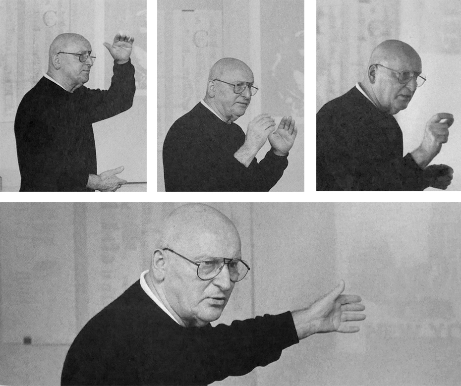
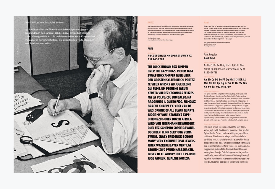
We just like to print — one can find the statement on the spreads of the journal PAPER, which Erik Spiekermann publishes with a small team of type-enthusiasts at the letterpress workshop p98a. At 70 years of age, having stepped down as chairman at Edenspiekermann and switched between FontShop to p98a—after the acquisition by Monotype in 2014—he doesn’t seem to be retired (although he mentions the word repeatedly). Today, commuting between various continents and countries, he spends his time conducting print experiments, giving workshops, publishing researches and essays, and designing typefaces. “I wish it was as rosy as it sounds” he says when asked about his enviable retirement setup, surrounded by printing presses, wood types, and professional admiration.
Erik, a question just to warm you up. You are definitely a rock star for many designers, but who were or are rock stars for you?
Oh, God, what a question… Well, I’ll give you an example of a really important person for me. I worked with Günter Gerhard Lange. The first thing I did with him was, I don’t know, maybe back in the 1960s. I attended his class on typography when he was still in Berlin. Then he went to Munich and I did a lot of work for Berthold.
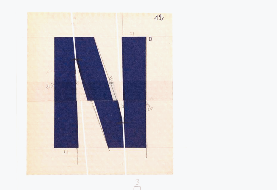
I had a print shop until it burned down in 1977. So I had all those old typefaces like Lo-Type and Block, and when it was accidentally burnt down, I had an interest in preserving them. I thought, “Why doesn’t someone redesign this stuff for phototypesetting?”, since in the 70s phototypesetting was happening. So I started off by redesigning the old-method type for phototypesetting, before digital. I corresponded with Günter, who sent me a lot of specimen books. And then he invited me, but I hadn’t designed typefaces before. I did those old-fashioned drawings and he made corrections—that’s how I got into type design. That’s how it started.
Günter Gerhard Lange (1921–2008) was a remarkable university teacher and rare communicator, because he was true to his convictions and values. He was an example to many, a beacon of light. In analogy to American preacher Billy Graham’s “God’s machine gun” Manfred Klein dubbed him “Das Maschinengewehr Gutenbergs” (Gutenberg’s machine gun) in an article published in a special annual edition of the Typographische Gesellschaft München e.V. (Typographic Society Munich) at the occasion of Lange’s 60th anniversary. — Yves Peters •Photo from the cover of the special issue of Typographische Monatsblätter (2. 2003), devoted to G.G. Lange.
I lived in London at that time and he came to visit. He didn’t speak any English, so I was like a translator and assistant for him. Then we became friends and in the early 80s, when he was about to retire, he suggested that I should become his successor and be an artistic director at Berthold. I did not want to do that because Berthold was already done—by then the Mac had arrived and photosetting was kind of finished. I didn’t take the job also because nobody could actually be his successor. He was not just a type designer, he was a prominent figure and a great orator. But I turned down this offer. He was really annoyed. He was “Herr Lange” to me for a long time and then almost 20 years later we shifted to first names. We were on first name terms, which is rare in Germany. When I said I didn’t want to be his successor, he went back to “Herr Spiekermann” for a couple of years, which meant he cancelled our friendship for a couple of years. And then we became friends again, which was very ironic. He was my teacher and my mentor mostly. Having him correct my drawings was great, as you can imagine.
So you learned from Lange and developed your approach to type design in general?
It’s not an approach, it’s just drawing and looking closely at what’s important. Also, you can’t do it unless you know something about the history. Maybe this is not a fashionable view today. He didn’t come from the school of writing like Gerrit Noordzij, even though he took calligraphy as a student, but he didn’t come from Hermann Zapf’s school either. Actually, they didn’t like each other at all. Lange knew a lot about the history, even though he didn’t really speak any English or French, like most of his generation. It was a disadvantage, but he knew all the German sources and read a lot. His library is incredible and now it is a museum. I was supposed to get his library, but I didn’t in the end.
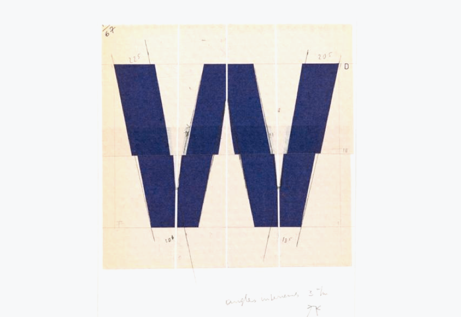
He collected a lot of stuff and gave me a lot of books. The biggest thing I learnt from him was also going back to the sources and looking at why people did things and how they did it. Basically, his first designs were for metal typesetting and when he came to phototypesetting, he was one of the first people to know that you have to change things. For them to look the same, you have to make them differently, because the technology is different. For example, we had to add spikes to the edges of the letters which would disappear after the type had been copied between various stages of production – paper artwork, negative film, printing plates; and ink traps where strokes meet to avoid dark spots when ink filled in the gaps. I think this is probably the most important lesson to learn. Also, whatever we read hasn’t really changed much, but we have to make it differently, because of the technology.
The film master of original Haas Unica. It features light traps pointing inside and outside of the corners, which was a specific solution in phototypesetting in order to maintain sharpness.•The photo from the article New from old: the why and how of reviving a typeface, Monotype blog
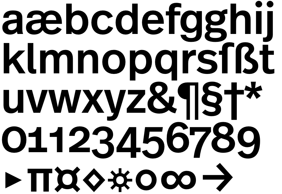
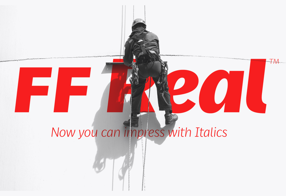
Your last typeface Real, which you designed for the book Hello, I am Erik, is a kind of tribute to Akzidenz-Grotesk, but I suppose we could also consider it to be something personal? Is it?
I grew up on Akzidenz-Grotesk and on Block, because wherever I worked, that’s what people had. It’s Berlin, it’s Berthold. I mean, type is like food, so you get the local stuff. So if you have a printer in Berlin, you buy from Berthold. It’s cheaper, because you don’t have to move it on a train. If you live in Leipzig or in Leningrad… The stuff is heavy, so you make it there and you should have a warehouse to keep it in. Nobody wants to wait for six weeks. If a printer needs a type, he wants it tomorrow, even 100 years ago. That’s why all big foundries had not just local offices, but also warehouses, because type is shit heavy. If you were in Frankfurt, you had Bauer type, if you were in Leipzig you had Schelter & Giesecke. The agents sold it and I knew all the Berthold salesmen and type specimens at that time. So I grew up on the stuff that people had at that time and that’s why I have a great feeling for those faces. And Akzidenz-Grotesk was always my favourite, because it had that liveliness and uncoordinated weights that didn’t really belong together. Historically, they weren’t together—it was marketing. Theinhardt Grotesk and Kristall Grotesk eventually became Akzidenz-Grotesk. It was all mixed together, so some of this liveliness was very nice and it was also very useful.
Akzidenz Grotesk Halbfett. Akzidenz Grotesk medium on the cover of »Die “klassische” Grotesk« (specimen no. 462). Further reading on p98a website.
Akzidenz Grotesk Halbfett. Akzidenz Grotesk medium on the cover of »Die “klassische” Grotesk« (specimen no. 462). Further reading on p98a website.
And the medium weight (Halbfette) was always my favourite and you could see what Swiss typography was like. All the stuff from Zurich in the 60s was in AG-Halbfette. There was this one size… Do we have the specimen book here? I grew up with this sort of typeface. To me this is the essence of 1960s Swiss typography. I always wanted to redraw it for myself and that’s what I did. Mine has a little Anglo-American accent in there. It has the three-storey g, for example, and the 8 with a more defined loop. So I looked at it for a long time, it’s my copy, but it looks different because I drew it from scratch. What I especially like about Akzidenz-Grotesk is that the regular, light and medium are not related to each other, they are not connected. If you look at the family that Ralph Du Carrois drew, now we have those big nine weight families again. But I don’t like it that way. I really like them to be different, but it is unpractical, though.
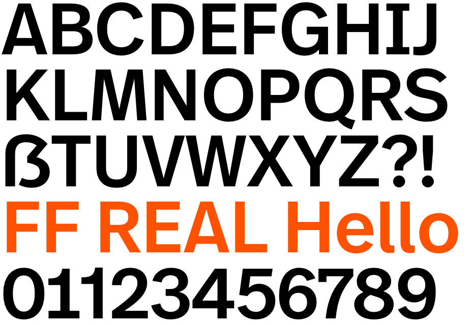
Today, everybody wants these different weights, styles for negative and for positive typesetting, to have these little differences between book and regular, medium and demi and so on. And this destroys the character of its Akzidenz-Grotesk origins, because the fact that they don’t belong together was kind of nice, but it’s not practical. So this is my practical appropriation of Akzidenz-Grotesk for the 2020s. I’ve been meaning to do this for 40 years and I always needed a reason. The book was the reason— and it was four or five years ago and took a long time. It was a very emotional project, it’s difficult when someone else designs a book about you. Did I want to help to design it? No, that would be a really bad idea. But how could I get involved? So I told Johannes [Erler, the author of the book] that I had only one request: “You do whatever you like, but you can use only one typeface and two colours”, and he agreed.
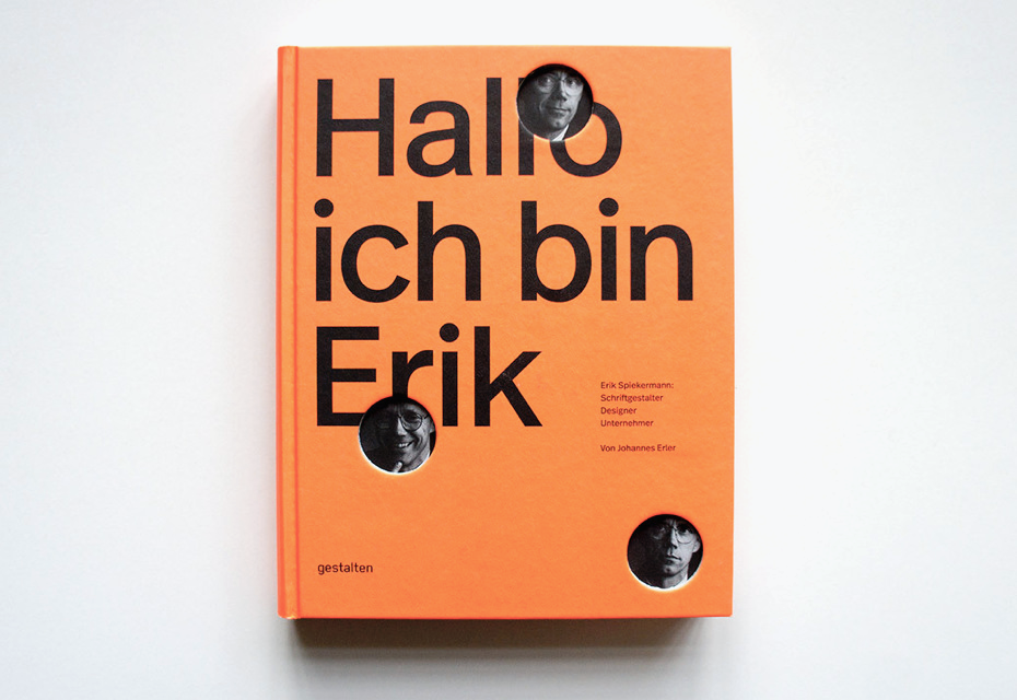
The visual biography Hello, I am Erik (Johannes Erler, Gestalten, 2014) is the first comprehensive exploration of Spiekermann’s more than 40-year career, his body of work, and his mindset. Contributions by Michael Bierut, Neville Brody, Mirko Borsche, Wally Olins, Stefan Sagmeister, Christian Schwartz, Erik van Blokland, and others round out this insightful publication.“I met Erik more than 20 years ago. Since then, our paths have crossed countless times. Consequently, this is not only a book about a great designer, but also about the man whom I’ve gotten to know over the years.” Johannes Erler•The images and the abstract from the publisher’s web-site.
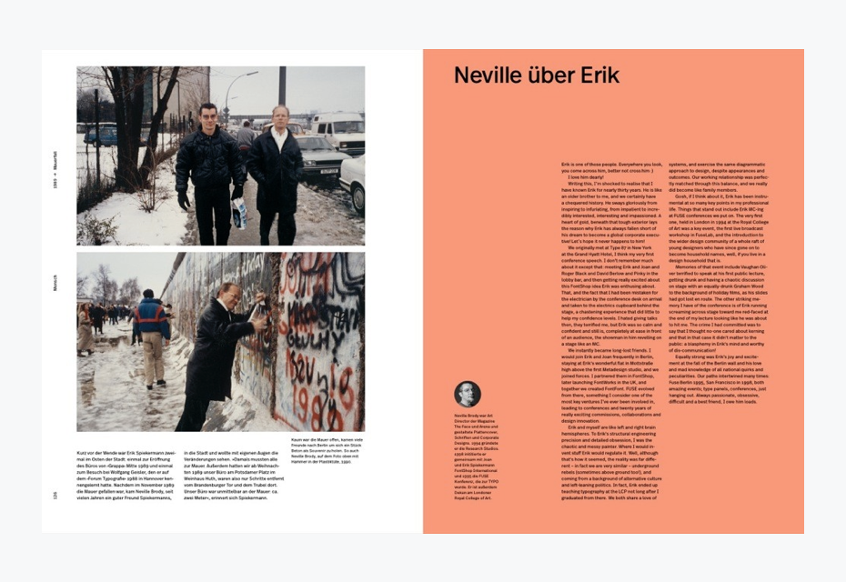
The visual biography Hello, I am Erik (Johannes Erler, Gestalten, 2014) is the first comprehensive exploration of Spiekermann’s more than 40-year career, his body of work, and his mindset. Contributions by Michael Bierut, Neville Brody, Mirko Borsche, Wally Olins, Stefan Sagmeister, Christian Schwartz, Erik van Blokland, and others round out this insightful publication.“I met Erik more than 20 years ago. Since then, our paths have crossed countless times. Consequently, this is not only a book about a great designer, but also about the man whom I’ve gotten to know over the years.” Johannes Erler•The images and the abstract from the publisher’s web-site.
The visual biography Hello, I am Erik (Johannes Erler, Gestalten, 2014) is the first comprehensive exploration of Spiekermann’s more than 40-year career, his body of work, and his mindset. Contributions by Michael Bierut, Neville Brody, Mirko Borsche, Wally Olins, Stefan Sagmeister, Christian Schwartz, Erik van Blokland, and others round out this insightful publication.“I met Erik more than 20 years ago. Since then, our paths have crossed countless times. Consequently, this is not only a book about a great designer, but also about the man whom I’ve gotten to know over the years.” Johannes Erler•The images and the abstract from the publisher’s web-site.
The visual biography Hello, I am Erik (Johannes Erler, Gestalten, 2014) is the first comprehensive exploration of Spiekermann’s more than 40-year career, his body of work, and his mindset. Contributions by Michael Bierut, Neville Brody, Mirko Borsche, Wally Olins, Stefan Sagmeister, Christian Schwartz, Erik van Blokland, and others round out this insightful publication.“I met Erik more than 20 years ago. Since then, our paths have crossed countless times. Consequently, this is not only a book about a great designer, but also about the man whom I’ve gotten to know over the years.” Johannes Erler•The images and the abstract from the publisher’s web-site.
The visual biography Hello, I am Erik (Johannes Erler, Gestalten, 2014) is the first comprehensive exploration of Spiekermann’s more than 40-year career, his body of work, and his mindset. Contributions by Michael Bierut, Neville Brody, Mirko Borsche, Wally Olins, Stefan Sagmeister, Christian Schwartz, Erik van Blokland, and others round out this insightful publication.“I met Erik more than 20 years ago. Since then, our paths have crossed countless times. Consequently, this is not only a book about a great designer, but also about the man whom I’ve gotten to know over the years.” Johannes Erler•The images and the abstract from the publisher’s web-site.
Jost Hochuli in one essay about Adrian Frutiger said: “Every good type designer not only holds strong views regarding letters, but their curved strokes also have a highly personal quality.” I wonder, whose personal quality of strokes does Erik Spiekermann admire?
I’m a great fan of Frutiger, who is the best type designer. Maybe the most important thing about his typefaces is that he is a problem solver and most of his designs were done for a project, for a purpose. Univers was a real success, Frutiger was a great project and then there was Avenir and so on. Most of the great Latin typefaces come from handwriting and they all have their historical precedents, while Frutiger is much more analytical. He didn’t draw, he cut with paper, while I’m better with a pencil. That’s why his shapes are the way they are. He is a lot more modular, because he takes a couple of shapes and then just combines them. He made different letters using the same paper. He drew a, c and then an e out of it and so on. I do the same with a pencil. I make one master copy with all the shapes on it and then I take tracing paper and draw on it. Such drawing with a pencil adds my own style to it.
Adrian Frutiger. Alphabet Métro. A drawing for phototypesetting. 22.2 × 15.9 cm•The images from the digital archive of The Museum of Design ZurichArchive of the Zurich University of the Arts
Adrian Frutiger. Alphabet Métro. A drawing for phototypesetting. 22.2 × 15.9 cm•The images from the digital archive of The Museum of Design ZurichArchive of the Zurich University of the Arts
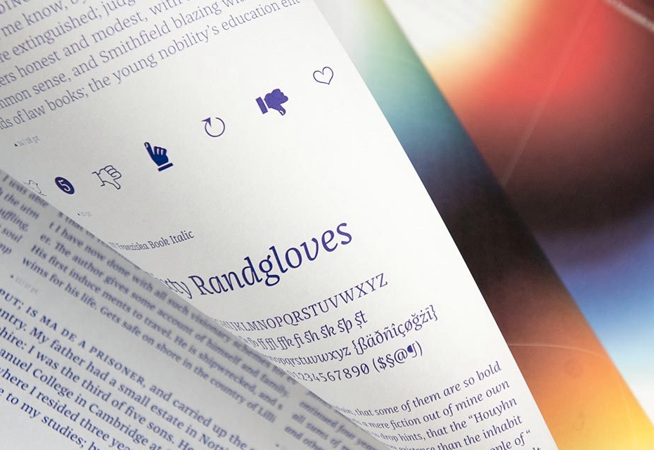
So everybody has their own handwriting in a typeface. It was the same for Frutiger and for Zapf, etc. You can see it in Frutiger’s Avenir, which is based on Futura, but it is Frutiger’s typeface. It has his inherent shape, you can always recognise it. The same with me—my typefaces, for example, are always narrow, and Real is my only non-narrow typeface.
You recently designed an italic version for it?
Yes, and it is quite controversial, because it is very italic. Actually, it is quite extreme and almost like handwriting. The first time that I made those drawings, they were very narrow and oblique, very contrasted. We have already used it in Paper.
I had that discussion with Adrian Frutiger. We took his Frutiger Condensed and made it into the typeface FF Transit for the BVG (Berlin Verkehrsgesellschaft) and we did a real italic for it, which Lucas de Groot designed back in 1991. So I sent it to Adrian Frutiger—who never made real italics for his sans-serifs, he always did obliques—and he wrote back, “I wouldn’t have done it, but I like it”. This was his blessing. Then a few years later Linotype did Frutiger Next and it also had real italics. But Frutiger himself never did it, he designed obliques, and that’s his philosophy, which I don’t subscribe to. So why not do this? There is no law that says you can’t do it. In any case, italic sans-serifs are historically a contradiction. Anyway, I like this typeface.
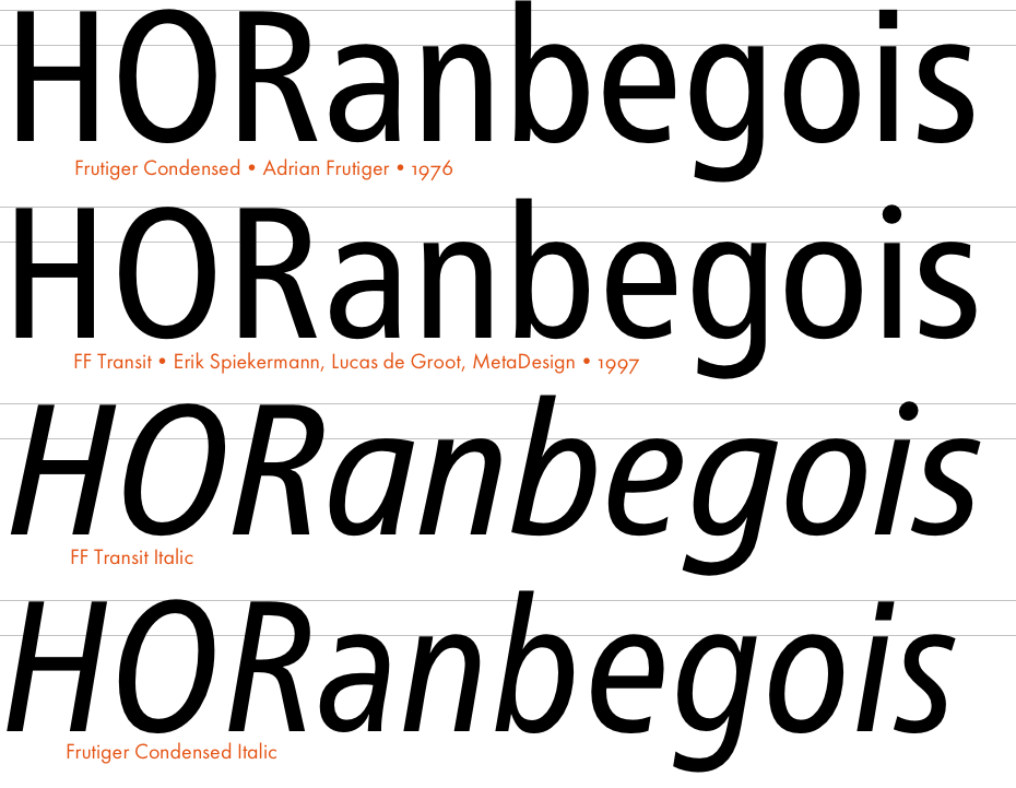
A comparison of Frutiger 57 Condensed and FF Transit with matched italics.
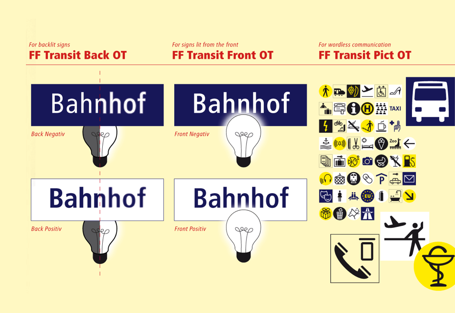
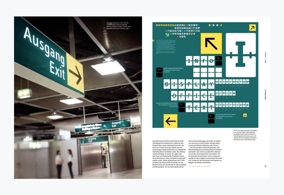
FF Transit Back for backlit signages, FF Transit Front for signs lit from the front.
FF Transit Pictograms were designed to blend aesthetic quality with legibility. Originally designed by MetaDesign in Berlin for the official use of the Berlin Public Transportation Services (BVG) and the Düsseldorf Airport. FontFont by Monotype, 2016
Tracing the history of your typefaces, it seems—besides Meta Serif, Deutsche Bahn Serif and, perhaps, LoType—there are no other serifs in your pocket. Why is that?
Because I’m not very good at it. I tried for about ten years to do Meta Serif, but I couldn’t do it. Then I had Christian Schwarz and even he had problems, and then we got Kris Sowersby and he finally did it. I’m not good at serif faces—it doesn’t really interest me, because I didn’t come from writing.
Do you have the Russian edition of Stop Stealing Sheep? Surprisingly, it has a cover similar to Hello, I am Erik and, to be frank, there are a lot of questions about the book. How do you like it?
I’ve seen the previous Russian edition but not this one. Who did this? Why didn’t they ask me? Obviously, they got the data from the publisher [Adobe Press]. They changed the format, the cover, the typesetting. I see Meta Serif here, but we didn’t actually use Meta Serif for the English version… I never heard a word about this book. It’s quite ridiculous.
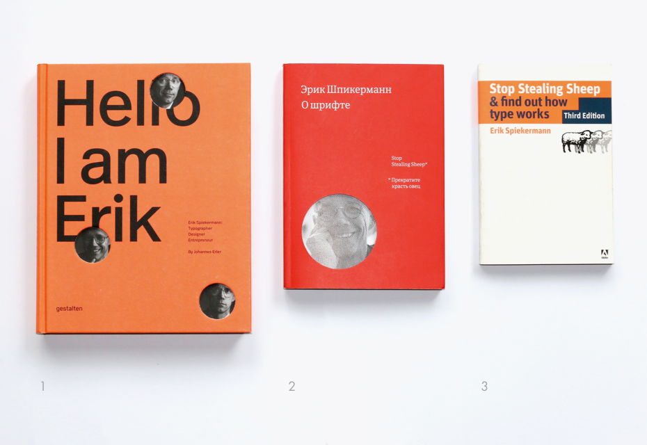
1 — Hello, I am Eri, Erik Spiekermann: Typographer, Designer, Entrepreneur. Johannes Erler, Die Gestalten Verlag, Berlin, 2015. 2 — О шрифте. Эрик Шпикерман, «Манн, Иванов и Фарбер», Москва, 2017. 3 — Stop Stealing Sheep & Find Out How Type Works (3rd Edition). Erik Spiekermann, Adobe Press, 2013.
I can’t not ask you about the acquisition of FontShop by Monotype. Many type designers were pretty upset when they found out about the deal. At this point, it is nearly three years since you sold the company in 2014. How have things changed over the years?
Don’t ask me, I’m not there anymore. I was never there, I was only an outsider. A typical thing happened. First, it becomes more and more bureaucratic, if you ask the Monotype people in Berlin. FontShop was always kind of easygoing—note that this is just my impression, I was never a manager. It was my ex-wife, Spiekerwoman, who was always the manager. It was always very comfortable and we were kind of young and very unbureaucratic. Not like now when people have their titles that are four lines long… At that time we didn’t have titles, we had names. Ivo was Ivo, Jürgen was Jürgen, Jens was Jens and so on. We kept it simple. Nobody had titles.
Then at the same time they have not always recognised local talents, because it is so far away. But I think they are just beginning to recognise that Berlin is different from Boston and from New York; that’s why there seems to be a lot more work happening here in Berlin, because we have a specific approach. We are even starting to realise that our own foundry FontFont was different—we had a different approach to it. I still think that FontFont is one of the best libraries out there. We sold things that maybe they didn’t see. We had talent that they didn’t have. We had a different approach, because it was very much what we liked. There was no market research ever. Most of the time when I was around we made bestsellers. For example, DIN was always a bestseller, and it has been since 1998. It is totally amazing. I regret not doing it myself (laughter). I was too lazy, it was too much work and it was boring. Albert-Jan Pool did it and it’s good for him.
Now they realise that we have some talents. It has nothing to do with that stupid American marketing, like this specimen that was sent to us last week. What is it, Mascararo or Mascalino… It gets sent by this expensive mail service from the USA in a special envelope. So this is a very expensive silkscreen and a very expensive four-colour embossing. It is incredibly expensive to produce. They probably guess I should hang it on my wall. However, there is no information about the typeface and it really annoys me. I have no idea about the number of weights, about the character set and so on. If you look at the specimen that Alex Roth did, you can see a specimen that I value. In comparison, this specimen is just useless for graphic designers.
Презентационные материалы шрифта FF Franziska (2014) Якоба Рунге. Дизайн — Александр Рот.
Презентационные материалы шрифта FF Franziska (2014) Якоба Рунге. Дизайн — Александр Рот.
That’s why many type designers were pretty upset by this acquisition.
Of course, the last bit of independence went away. When we did it in the late 80s, there were a few big foundries and one or two type designers. Three years ago there were already hundreds of foundries and brilliant people like Commercial Type or Type Together, and we were already quite big. We had libraries with our own faces. The main reason for the deal was that I simply wanted to retire, I couldn’t do this forever.
Besides, at that time there were also a few crises in the business and we knew that next time maybe we wouldn’t survive all alone, because it became very difficult. There were never big profits: the business ran, but nobody was going to become a millionaire. To make it safe, most of the jobs were kept, because you can imagine that a lot of people were employed. My main concern was that most people had been there for over 20 years and some of them are still there. Some of them have gone, following Christoph Koeberlin [link] and Jens Kutílek [link]. But they went because they wanted to go, not because they were thrown out. Some stayed. Jürgen Siebert [Marketing Director at Monotype] has been there for 20 years, Andreas Frohloff [Head of the Type Department at FontFont] has been there forever. I know it was a shame. People thought we were big independent rebels, but we weren’t.
It looks like Monotype is becoming an international monopoly?
They are not a monopoly, they are just a big company. There are so many companies out there—there is a new foundry opening every day. Even the small ones are bigger, like Commercial Type or Optimo Type Foundry or Grilli Type. There are hundreds of them, thousands of them! Among them you have small ones and really good ones with good stuff out there. There are so many good foundries out there: Hoefler & Co., Frere-Jones Types, FontBureau. So Monotype is not a monopoly. They are big and a good thing about them is that despite being big, they are not going to lower their prices. It won’t do them any good. It’s almost the opposite. Because they are so big, you have to buy certain things from them: if you buy Helvetica, Frutiger or Futura, you have to buy it from Monotype now. So the opposite is good. It’s good to have a big company with high prices and the little ones can survive because they do original stuff. They have to be good though and we know there are some really good people out there. I think it’s quite useful to have a big company—it does the market good.
Have you been surprised by any typeface recently, saying, “Wow, that’s amazing work”?
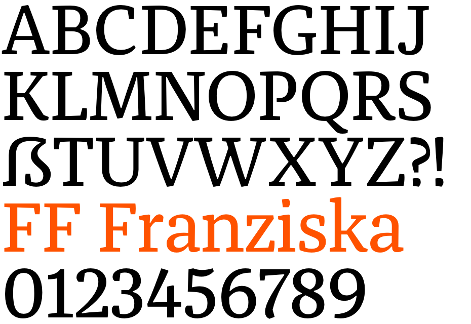
Oh, yes. There’s always something. Our favourites for a while were FF Franziska by Jakob Runge—it is just fantastic—and FF Hertz by Jens Kutílek. They have a little different approach. FF Franziska looks like a 1920s newspaper typeface, but it has a little edge to it and FF Hertz also looks like an old-fashioned typeface, but it works perfectly on low-resolution screens, as well as in Riso printing. There is a long list and every year we find something unusual. There are not so many models, but if you look at the whole picture, I’m always surprised that so much is going on and so many new faces are appearing.
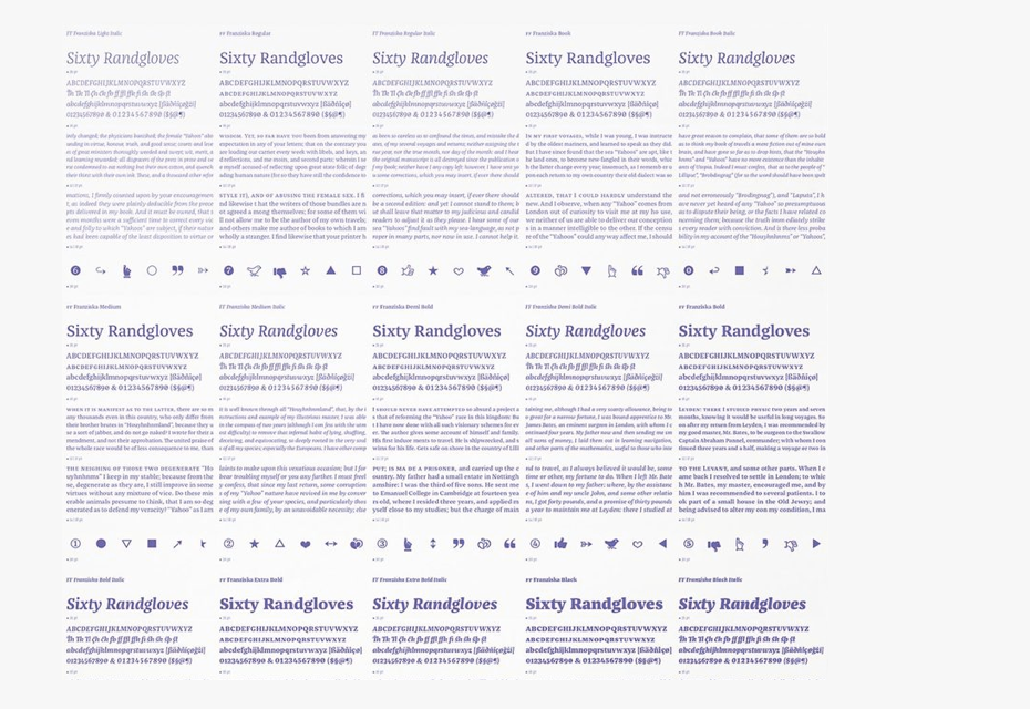
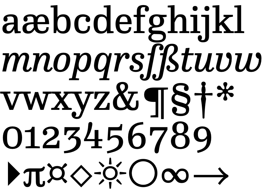
FF Franziska (Jakob Runge, 2014). Started as a master thesis at Muthesius Academy of Fine Arts and Design in Kiel (Germany) under the guidance of Albert-Jan Pool and Prof. André Heers in 2012, FF Franziska is a robust serif type family for setting body copy as well as headlines using Hairline and Black. The typeface has been conceived as a hybrid of a serif and slab serif which becomes evident when comparing the weights from Hairline to Black. It has a generous x-height and short descenders. The italics have a rather slight angle of slope and playful shapes derived from handwriting•Courtesy of Monotype
FF Franziska (Jakob Runge, 2014). Started as a master thesis at Muthesius Academy of Fine Arts and Design in Kiel (Germany) under the guidance of Albert-Jan Pool and Prof. André Heers in 2012, FF Franziska is a robust serif type family for setting body copy as well as headlines using Hairline and Black. The typeface has been conceived as a hybrid of a serif and slab serif which becomes evident when comparing the weights from Hairline to Black. It has a generous x-height and short descenders. The italics have a rather slight angle of slope and playful shapes derived from handwriting•Courtesy of Monotype
FF Franziska (Jakob Runge, 2014). Started as a master thesis at Muthesius Academy of Fine Arts and Design in Kiel (Germany) under the guidance of Albert-Jan Pool and Prof. André Heers in 2012, FF Franziska is a robust serif type family for setting body copy as well as headlines using Hairline and Black. The typeface has been conceived as a hybrid of a serif and slab serif which becomes evident when comparing the weights from Hairline to Black. It has a generous x-height and short descenders. The italics have a rather slight angle of slope and playful shapes derived from handwriting
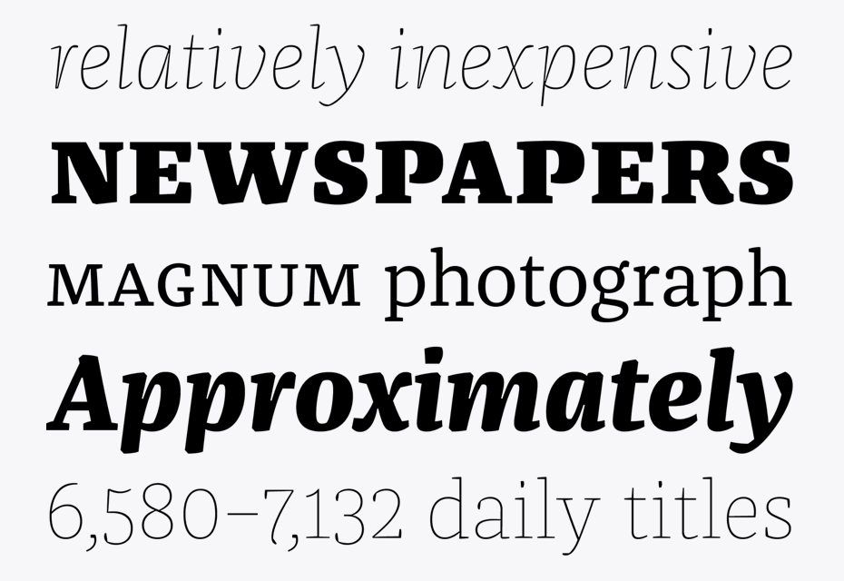
FF Hertz (Jens Kutilek, 2015). Low stroke contrast, generous spacing, and fine-grained weights from Light to Extra Bold make FF Hertz a workhorse text typeface which holds up well under today’s widely varying output conditions from print to screen. The quite dark Book style works well on e-ink displays which usually tend to thin out letters, as well as in print when you want to evoke the solid letter image of the hot-metal type era•Courtesy of Monotype
FF Hertz (Jens Kutilek, 2015). Low stroke contrast, generous spacing, and fine-grained weights from Light to Extra Bold make FF Hertz a workhorse text typeface which holds up well under today’s widely varying output conditions from print to screen. The quite dark Book style works well on e-ink displays which usually tend to thin out letters, as well as in print when you want to evoke the solid letter image of the hot-metal type era•Courtesy of Monotype
FF Hertz (Jens Kutilek, 2015). Low stroke contrast, generous spacing, and fine-grained weights from Light to Extra Bold make FF Hertz a workhorse text typeface which holds up well under today’s widely varying output conditions from print to screen. The quite dark Book style works well on e-ink displays which usually tend to thin out letters, as well as in print when you want to evoke the solid letter image of the hot-metal type era.
Things have changed dramatically in the last 20 years: now a lot of young type designers are working at a pretty high level because of developing type design technologies.
Type designers have never been the problem. The problem is the users. We make it very complicated for users who can chose from maybe 50.000 typefaces but everybody uses the same 80. The use changes over time. You know, now everybody uses Circular or whatever else, they don’t use Avenir, Helvetica and so on because there is this fashion. They will also follow fashion and some typefaces of the last generation will probably come back in 70 or 80 years.
Now we have a different fashion, but there is still fashion for types, this is obvious. It’s very strange and it’s not about details. Most graphic designers unfortunately don’t appreciate the details that we provide as type designers. I’m not a type designer, I’m a graphic designer. That’s the main difference: most type designers are type designers. That’s all they do and most of them are actually really bad graphic designers. And I just design some type on the side—I’m not a type designer and I have never called myself type designer. I’m a graphic designer. I use type. And because I have designed type, I have an eye for the detail in it. It also helps to digitise a type, because once you’ve done that, it gives you appreciation for the detail and knowledge. I think it’s great for all the graphic designers today to design their own typeface at least once, even if it turns out shit and never gets successful. Once you’ve done that, you appreciate the detail and how important that is. Then you go back and become a graphic designer, which is much more important, and you understand that the whole thing is good, not just the detail.
Erik (Looking at the pages of the book Two Types of One Revolution by Schrift Publishers): “What is it, Georgia and Verdana? Hmm, the Cyrillic looks not bad at all there”.
And that is a question of education. How do you see the education of graphic and type designers in Europe and the US today? The level is obviously rising.
Well, it’s definitely getting more complicated. One has to know a lot more about technology today. When I started, we had printers, photographers and repro-people, and you did your part—now we have to do it all ourselves. I have to use Photoshop, InDesign, Illustrator and so on. I just made mockups and someone else did the typesetting and reproductions and it looked good, because they are experts. And now we are all the experts: we have to know about technologies, resolution, HTML, Javascript, different media and all that shit. My God, 50 years ago when I started we just had paper. And now there is paper, different screens, different media…
…and we’ve got more division of labour. For a while, a graphic designer also had to be a coder: you had to make your own website. Now they are so many specialists like back in the old days. We can do a mockup for a web page and give it to the specialist like I would give it to a specialist in the 70s. And they know what to do to make it look good for me.
What do you expect from modern technologies, how do they affect the design process and what do you expect from the variable fonts?
It’s a boring question. It’s obvious that the technology changes things. But on the other hand it doesn’t. Look—two hands and two eyes—nothing has changed. Technologies are developing, systems are getting smarter, but there are still a lot of issues to fix If you go, for example, to typesetting today in InDesign, there very well might be a simple extension, like sensitiveness to optical sizes. So using 16 point, you could get zero tracking, and as the size goes down, it would automatically get more space. But you still can’t do this automatically with InDesign, which annoys me. As far as I’m concerned, InDesign should put it in there by default. With the variable fonts, machines will learn not only to switch the tracking for different type sizes automatically, but modify typefaces, for instance, at 14 point a typeface would be normal and at 6 point it would be more open and wider and so on.
But it also depends on type designers, because a lot of type designers look at a typeface in large sizes and it looks great this way, but at 6 point it looks shitty—they don’t think about the purpose. There is so much going on with the software, but if you start to think about it, remember that a lot of people have trouble finding simple OpenType features. At this point, machines can’t even manage tracking automatically and we’re trying to speak about variable fonts! Life is too short for that, that’s the problem.
Back in the 90s you brought corporate design from Britain to Germany. How do you feel about the modern state of corporate design these days?
I think it has pretty much died. Corporate design today rather means branding, which is a different thing. The whole technology has changed. Basically, corporate design made sure that everything in the company looks the same and consistent, so you had your colour, your logo, your typeface, your typographic style and you had manuals. You could control it from the central standard. You can’t control it anymore, because there are too many media. It’s too diverse, so the whole business has become quite different.
I’m not even sure if corp design exists any more. It does, but it’s much more about the attitude and what a company is, rather than what it looks like, because the look can change. The last and really big one I did was in the 90s and it was for Audi and Volkswagen. It took two years to design it, then it took two or three years to implement it and then it had to change again. These days it is also changing and it’s much quicker—you could do a new logo today and introduce it tomorrow. You just send the data and that’s it, because there is not so much printing around and you don’t make big guidelines anymore, so the whole business has become much more flexible, which also makes it complicated. But how a brand survives depends much more on how it is than what it looks like.
You can have the best logo in the universe and behave like an asshole. Luckily, nowadays people have more ways to resist and not buy shit. I’ve always hated the company Uber, and now they are getting a lot of flak and it’s good, because they are a bunch of assholes. I’ve always said that and I’ll never use them for anything in the universe. I also hate Amazon, which is a very bad enterprise that is just killing all the retail people and now they have started their own retail shops. No one from corporate design can make that better.
Switching to your workshop p98a. Is what are you doing here actually your business or a hobby?
We are actually supposed to work here and you have come for an interview (laughs). The idea was to make experiments. It is my hobby that costs me a lot of money. That’s why we can’t do this much longer, because soon I will just be bankrupt. Initially, I needed to find a space for the printing presses. I found the space and it’s big—this space always fills itself somehow. We have lots of ideas and lots of type, lots of cool stuff, but at the same time we also have to make money, which is really boring.
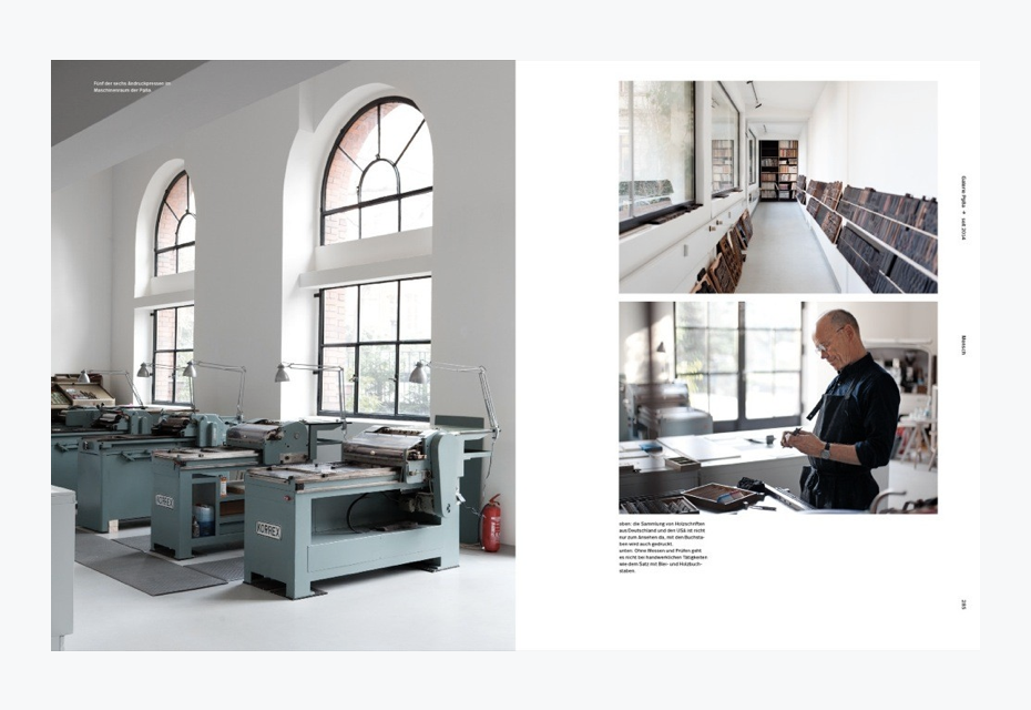
Anyway, we are trying to do cool stuff. We make wood type, we print posters, but posters are actually a sideline to make some money. What we really want to do are projects, like we have a monograph about Louis Oppenheim that we are trying to do this year. We are also trying to bring back letterpress printing, but on a higher technical level—not nostalgic, not monotype and linotype setting, but digital. That is what really interests us.
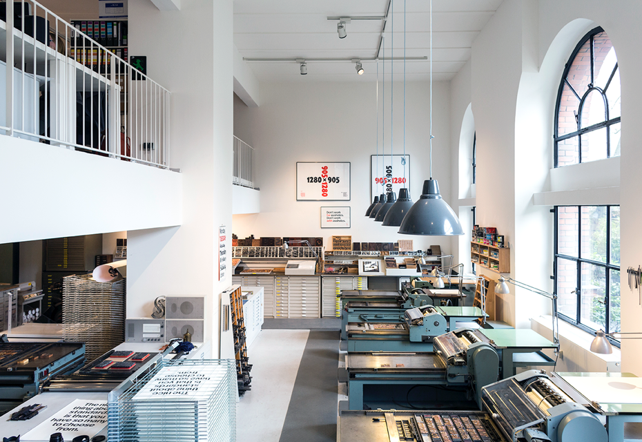
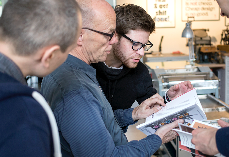
At the letterpress workshop p98a. Photo by Dawin Meckel, OSTKREUZ
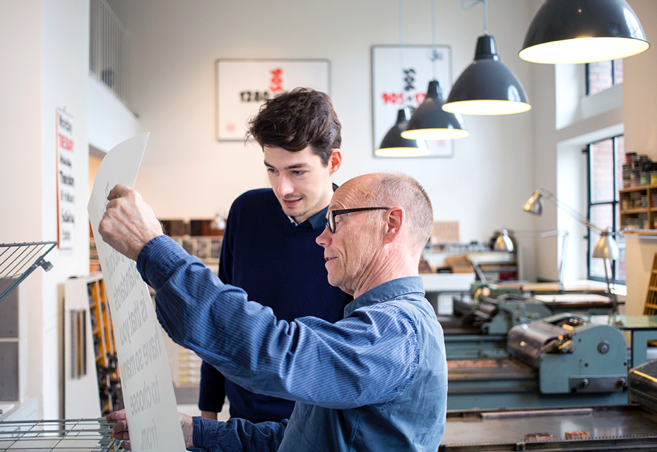
Ferdinand Ulrich and Erik Spiekermann at the letterpress workshop p98a. Photo by Dawin Meckel, OSTKREUZ
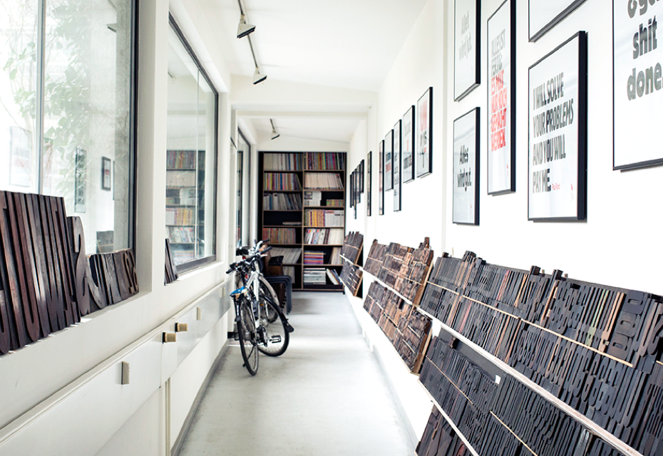
At the letterpress workshop p98a. Photo by Dawin Meckel, OSTKREUZ
For any designer, especially these days, it is very important to remember where it all came from physically, that it is all still done by people who have two hands and two eyes. And the rules that we all still use come from this metal background, from the grid. You can see it when you see that metal type. It’s just good discipline for any modern designer to learn this, not for nostalgic reasons, but to understand how the systems and constraints work. It must be very difficult if you are twenty now to go out there and suddenly be able to do everything: print in different sizes, colours, use nearly fifty thousand fonts. There is too much messing around. That’s why we have only one size of type for posters and if we run out of certain letters we have to figure out what to change. It actually provokes you to make decisions, it makes you modest and appreciative—sometimes it’s quite refreshing.
Here at p98a you publish a journal called Paper and some stuff about typography. Could you tell us about your publishing ideas? Do you feel any lack of present-day literature about type and typography?
We just want to print. We said that in the foreword of the journal. It’s in English, because the editor [R. Jay Magill Jr.] was an American guy, but it could be in German. We just want to print stuff. For some reason I bought this Risograph about five years ago and the next one might be done in letterpress or digital, I don’t know. Physical printing is still nice.
How do you chose what to publish?
We have an editor who is from an American academy; he is a journalist and writer, and he found all this stuff so far. We print a few hundred, so it doesn’t matter if it is in English or German. It’s just that people like to write stuff and we like to print.
We are almost an iPad magazine, but iPad magazines last about one summer. Because it’s crap. If you read an iPad, you want to read news. You don’t want to read a long book or a magazine on an iPad. When I’m in the USA, I read it once or twice a week, because I want to read Frankfurter Allgemeine and I can’t get a physical copy. If I want to read the New York Times, I can buy it. And I can read Frankfurter Allgemeine on my iPad in PDF, which is very stupid, but also good. I can zoom in or out as I read.
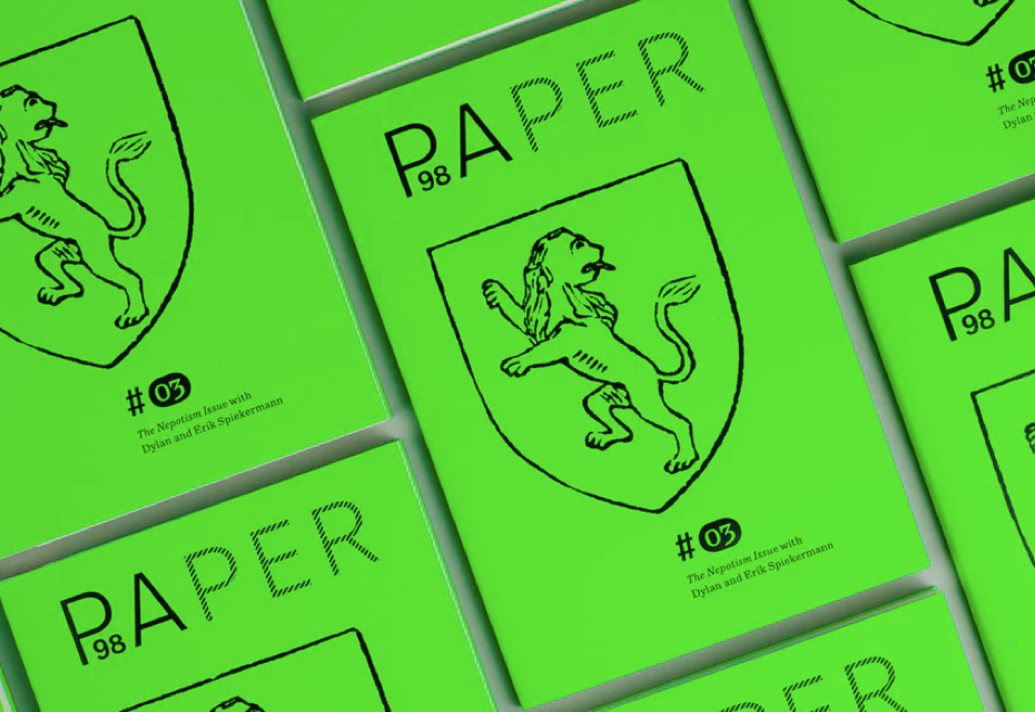
PAPER #03. Photo by Norman Posselt
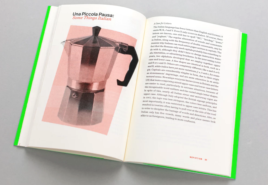
PAPER #03. Inside: Una Piccola Pausa: Some Things Italian by Erik Spiekermann. Photo by Norman Posselt
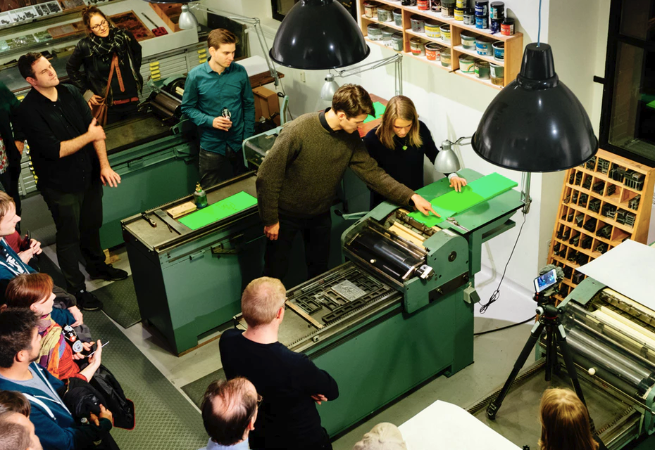
Ferdinand Ulrich instructs our friends on the Korrex Nürnberg. Photo by Norman Posselt
People still like to read print if you have stories. Print is different. As you know, now there are more magazines than ever. They just don’t print 500,000. They print 1,000 or 5,000. You go to one of the shops here in Berlin and it’s amazing how many magazines there are, because everybody wants to publish, print and read. What’s wrong with that? It’s easier than ever. You could print digitally, it’s very cheap. You can print it in a day or an afternoon. It’s fantastic. But digital printing has become so affordable, you could print your Russian journal tomorrow.
So you think that there is no chance of developing reader’s habits so they read stories and longreads from screens?
There are longreads, but people are finding out it’s not the right place for longreads. When we were working on the Zeit Online magazine, we were surprised that people actually read longreads. They have 85% of their stories as longreads. But a longread still means that you scroll 4 or 5 times—it’s not 48 pages, it’s still from 4 to 5 pages and is called a longread, but not more. With a real longread it’s not that comfortable and never will be. It doesn’t work with daylight, for example. It’s good in a way that you can make it your own size, you can play with it if you have poor eyesight and you can scroll quickly.
It’s just a different medium for certain people, certain situations and certain content. It’s actually easier to read it on paper. That’s what I’m saying. If you really want to indulge in reading, it won’t be easy, because you have to scroll back and forth, which is just tiring. It’s not real reading. It’s good for a change and then we are back to normal. We have our iPads, our computers, and we have our books and magazines. These are alternatives and we all use them pragmatically. We are not anti-computers at all. We are very digitised. It doesn’t mean that we are dreaming of going entirely back to print. But there seems to be a human urge to publish and we have the machinery, so we might as well use it.
Paper is still a pretty decent medium.