 lexandra speaks impatiently, like someone taking a moment out of her busy schedule to reprimand a negligent student. She talks about her typefaces and her plans for the near future with a sense of humour. The scope of her activities begs a comparison to a one-woman band. A graphic and type designer with a number of original type families to her name, including Leksa, Leksa Sans, Circe, PT Serif и PT Sans (the latter two designed with Olga Umpeleva under the direction of Vladimir Efimov); a graduate of the Moscow State University of Printing (2006), a member of the school’s Type Workshop led by Alexander Tarbeev; a researcher, consultant and professor (although she had to let go of most of her teaching commitments after the birth of her daughter); a winner of international type design competitions (including TypeArt, Modern Cyrillic, Granshan and the ED Awards); Korolkova published a book introducing Russian readers to the basics of typography, Живая типографика (Living Typography) in 2007; she has led the design department of Paratype, Russia’s largest and best-reputed font foundry, since 2009; she is frequently invited to speak at major international conferences on type and typography (ATypI, TYPO Berlin, TypeCon etc).
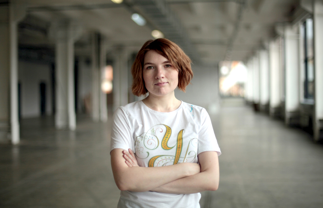
Alexandra Korolkova at the British School of Design. Moscow, 2013. Photo by Ksenia Plotnikova.
The Prix Charles Peignot was awarded to a designer from Russia for the first time in its history. What does that mean to you?
It’s a silly old dream of mine that unexpectedly came true. I knew about the Peignot Prize: I was at the ATypI conference in Brighton in 2007 when it was given to Schwartz (Christian Schwartz, American designer and co-founder of the Commercialtype studio, received the prize in 2007—Ed.) and was greatly impressed by both the prize itself and the specimen booklet with the winner’s typefaces. I decided I wanted to become one of these people. From time to time, I would evaluate overall results of my work: “Is there a chance?” Each time, of course, I concluded I had no chance. I designed too few typefaces, my Latin faces had not won any international competitions and besides, there were people much cooler out there. Later I got busier and various life’s challenges distracted me from these idle dreams. Suddenly–bang!–I got a message from Maxim Zhukov congratulating me. For the first five minutes I thought it was a prank, because the official message ended up in the folder set aside for my ATypI correspondence, which I rarely check.
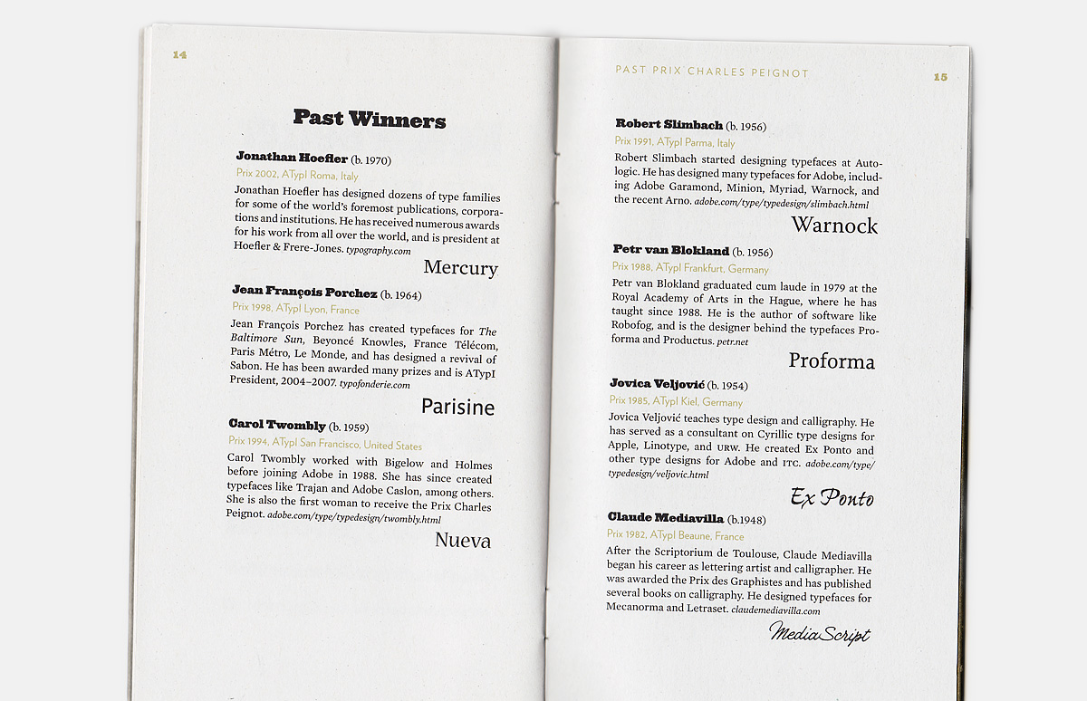
Presentation booklet with the typefaces of the winner of the preceding Prix Charles Peignot, Christian Schwarz.
Presentation booklet with the typefaces of the winner of the preceding Prix Charles Peignot, Christian Schwarz.
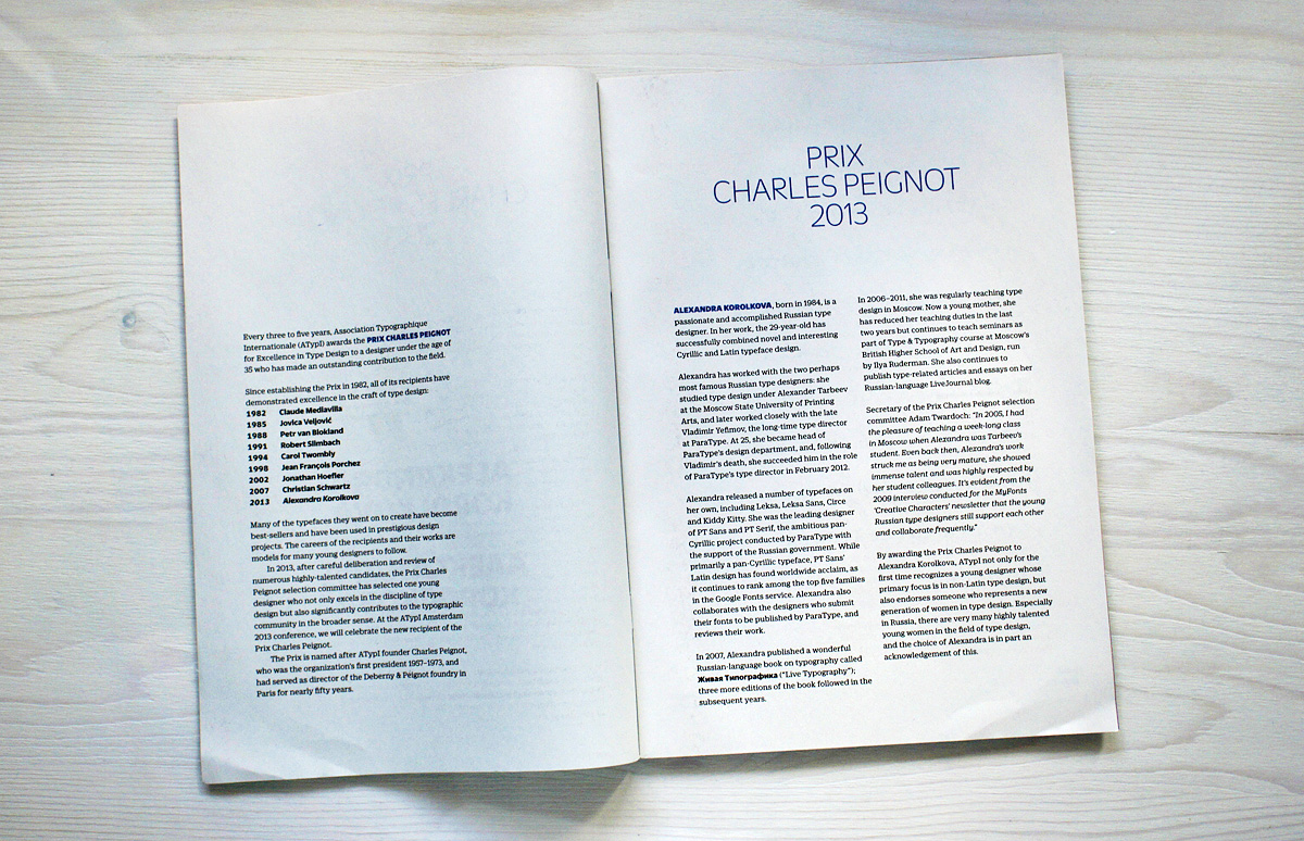
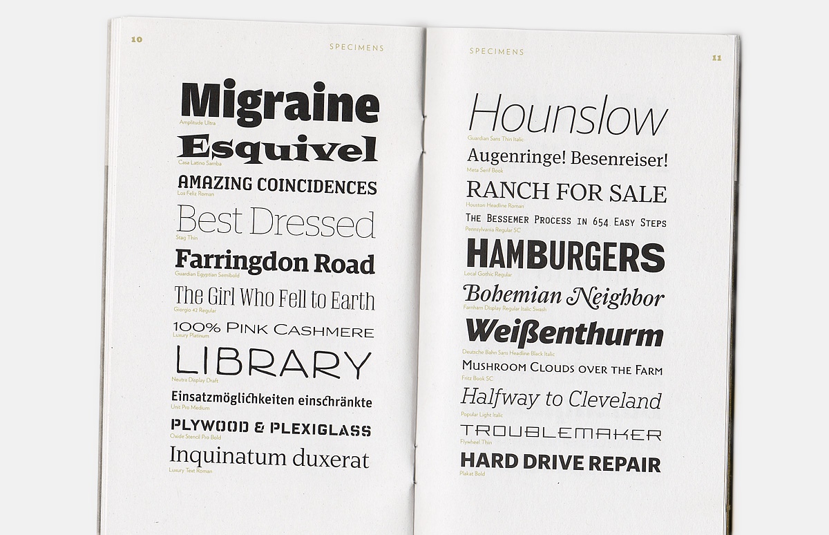
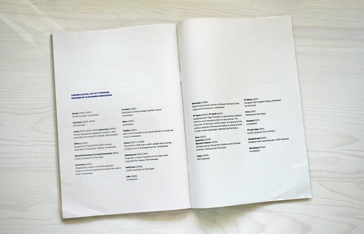
Two-page spread from the prize presentation booklet with Alexandra Korolkova’s typefaces. Designed by the winner of the preceding prize, Christian Schwarz.
Two-page spread from the prize presentation booklet with Alexandra Korolkova’s typefaces. Designed by the winner of the preceding prize, Christian Schwarz.
Two-page spread from the prize presentation booklet with Alexandra Korolkova’s typefaces. Designed by the winner of the preceding prize, Christian Schwarz.
Two-page spread from the prize presentation booklet with Alexandra Korolkova’s typefaces. Designed by the winner of the preceding prize, Christian Schwarz.
Two-page spread from the prize presentation booklet with Alexandra Korolkova’s typefaces. Designed by the winner of the preceding prize, Christian Schwarz.
Two-page spread from the prize presentation booklet with Alexandra Korolkova’s typefaces. Designed by the winner of the preceding prize, Christian Schwarz.
Two-page spread from the prize presentation booklet with Alexandra Korolkova’s typefaces. Designed by the winner of the preceding prize, Christian Schwarz.
Two-page spread from the prize presentation booklet with Alexandra Korolkova’s typefaces. Designed by the winner of the preceding prize, Christian Schwarz.
Two-page spread from the prize presentation booklet with Alexandra Korolkova’s typefaces. Designed by the winner of the preceding prize, Christian Schwarz.
Two-page spread from the prize presentation booklet with Alexandra Korolkova’s typefaces. Designed by the winner of the preceding prize, Christian Schwarz.
Two-page spread from the prize presentation booklet with Alexandra Korolkova’s typefaces. Designed by the winner of the preceding prize, Christian Schwarz.
Two-page spread from the prize presentation booklet with Alexandra Korolkova’s typefaces. Designed by the winner of the preceding prize, Christian Schwarz.
Two-page spread from the prize presentation booklet with Alexandra Korolkova’s typefaces. Designed by the winner of the preceding prize, Christian Schwarz.
Two-page spread from the prize presentation booklet with Alexandra Korolkova’s typefaces. Designed by the winner of the preceding prize, Christian Schwarz.
What does receiving the Prize mean to me? I still think that based on the usual criteria for the quality and quantity of typeface output, as well as their impact on global typography, I fall far short of the level of the last three winners. But the jury was pretty clear about the fact their decision was primarily based on recognition of my efforts to promote change and improve the typographic environment around me in every possible way, and to a lesser degree on the merits of specific designs. Besides, one of the obvious trends in type design globally right now is in favour of multilingual families and the non-Latins, and I just happen to fit into that nicely. To me this Prix Charles Peignot is a sign that the international type community is interested in non-Latin type designers, that they’ve started to take the Cyrillic alphabet and the people who specialize in it seriously, that we have come of age and they are willing to listen to us.
I feel a responsibility to produce both new typefaces (now being even more demanding to the results) and theory. I will have to do a lot of writing, perhaps primarily in English.
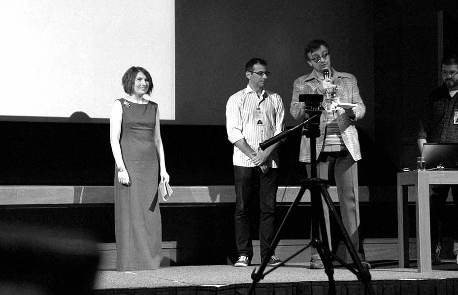
Alexandra Korolkova, José Scaglione, Adam Twardoch and one-half of Christian Schwartz on the stage of Grand Hotel Krasnapolsky in Amsterdam where the 57th annual conference ATypI took place in 2013. Alexandra Korolkova gave a talk which was intended to raise the awareness of the lack of authoritative sources on Cyrillic type design and to argue for the need of taking the fine differences in construction of some characters in the Latin and Cyrillic scripts seriously. Although the tone of the presentation may have been taken by some present as condescending, it was not meant to assert superiority of Russian designers over others, but simply to advocate for consulting with the experts who specialise in this script, wherever they may be found.
What is the process of designing the Cyrillic character set for multilingual type families like today for the designers less experienced with this script? Do they have a good grasp of its history and how many liberties do they take in interpreting its forms? What sources are they informed by?
Our Western colleagues have a hard time finding sources on design of the Cyrillic. Ultimately, they can only read a relatively small number of articles on the subject by Maxim Zhukov—and that’s excellent that these articles exist, but that’s still not enough. I would say far from it! To hell with it, I’m going into branding! They can browse illustrations in Russian-language books (mainly Soviet, which are few and far between, or Yuri Gordon’s Книга про буквы (Book of Letters) and scour the internet in search of disparate sources, relying on automatic translators, but there’s still no single authoritative resource on the subject. Historical examples are easier to come by, but the situation with up-to-date sources is poor. It is extremely difficult for a person who doesn’t read Russian to study Cyrillic type design independently. Most resort to analysing existing Cyrillic typefaces, often unable to judge their quality. I even heard the opinion voiced that “these Russians hide everything from us on purpose.”
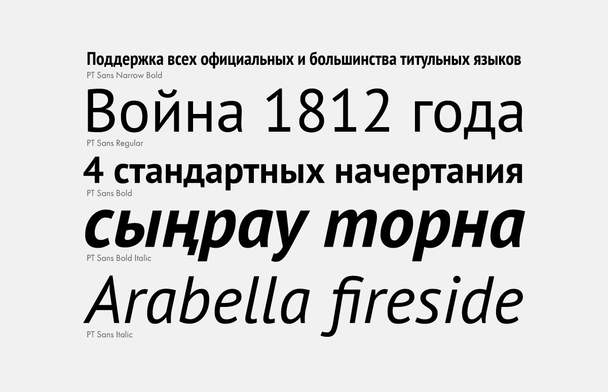
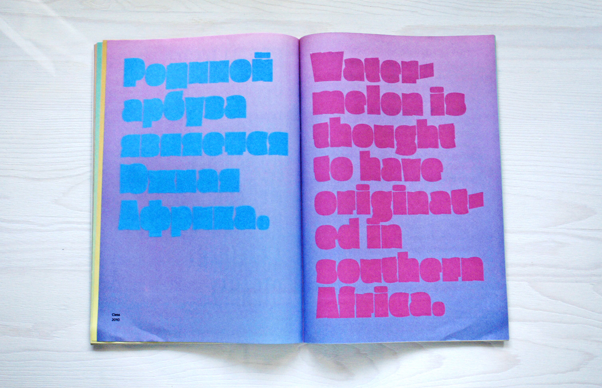
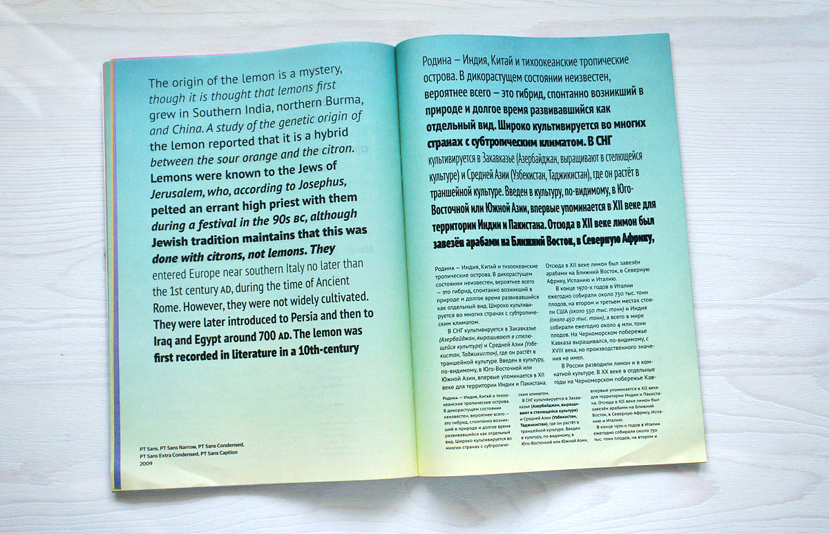
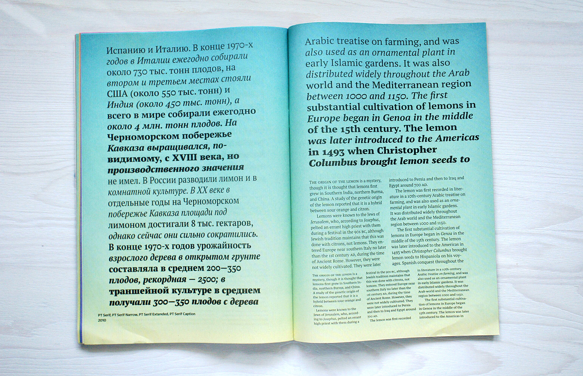
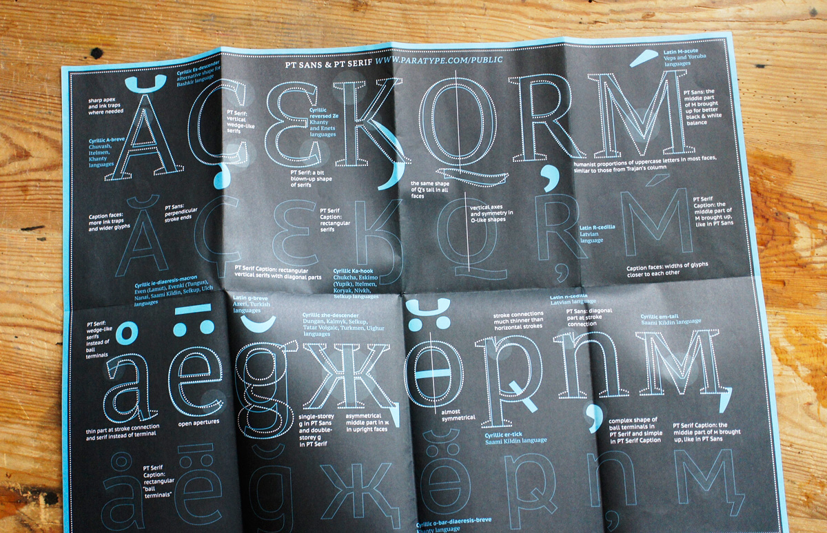
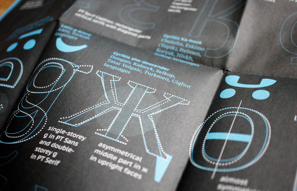
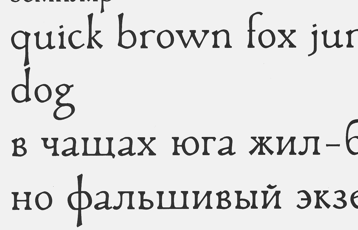
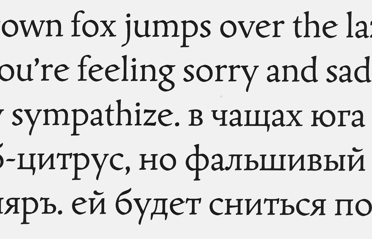
PT Sans is a contemporary humanist sans. Its shapes, proportions and metrics are harmonised with those of PT Serif. Designed by Alexandra Korolkova with Olga Umpeleva (under direction of Vladimir Efimov).
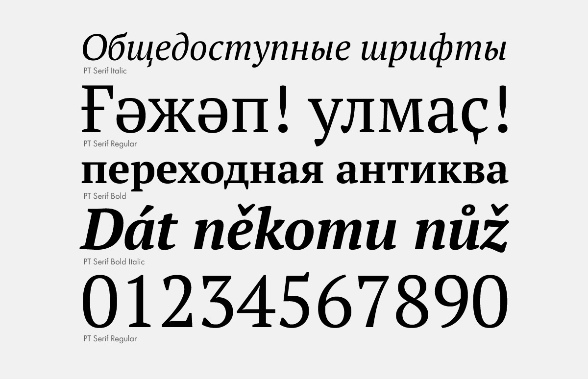
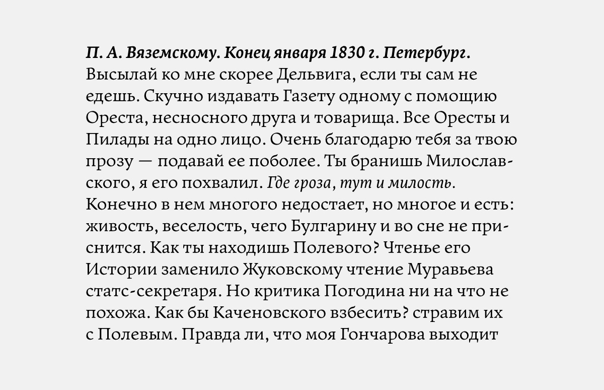
PT Serif is a transitional serif with six weights, including two small optical sizes. Designed by Alexandra Korolkova with Olga Umpeleva (under direction of Vladimir Efimov).
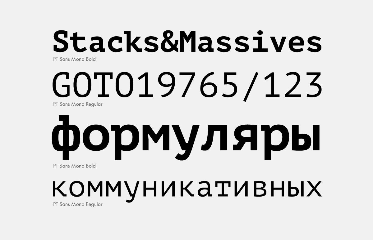
Monospaced PT Mono was released to complement PT Sans/PT Serif super family at the end of 2011. Developed by Alexandra Korolkova with Bella Chaeva; financial support by Google.
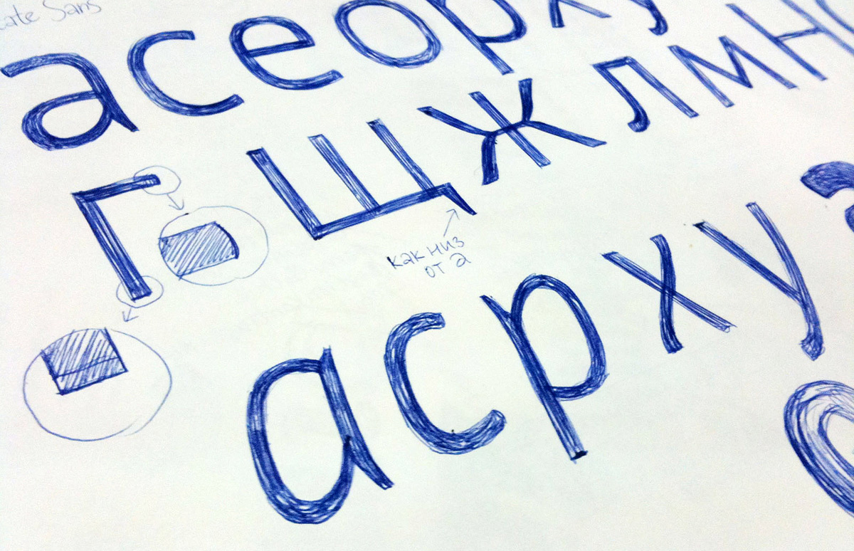
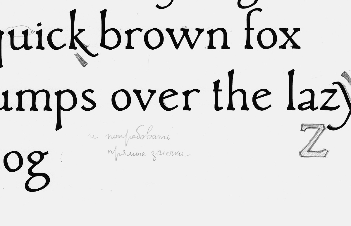
Sketches for PT Sans.
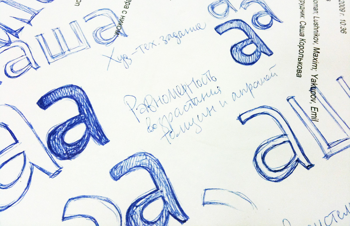
From sketches to PT Sans.
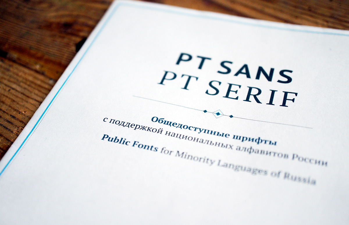
PT Sans and PT Serif are distributed under an open user licence (press release).
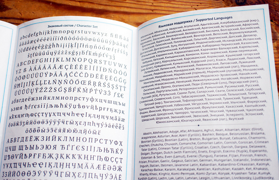
Important feature of the fonts is the support for all official and most minority languages of the diverse ethnicities of the Russian Federation.
Developed by ParaType with the financial support of the Federal Agency for Press and Mass Communications of the Russian Federation in 2009–2010.
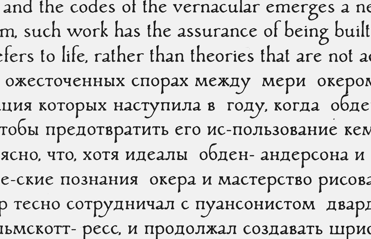
Promotional specimen booklet for the PT Sans/PT Serif project.
So if a Western designer takes a responsible attitude to the Cyrillic alphabet, then, as a rule, they feel pretty insecure and ask someone else how they can do a better job. Although, unfortunately, it often happens that the designer has enough confidence and few doubts, but insufficient knowledge in the field of Cyrillic. We can all see the result of this.
As a result of this shortage of information, the most responsible of the foreign type designers who need to tackle Cyrillics will consult an expert. Unjustified self-confidence gets the better of many others. Unfortunate consequences of this braggadocio are in plain sight.
Do you have a methodology for consulting foreign font designers? What do you stress? Which of the living designers display the best mastery of the Cyrillics?
I don’t do enough consulting to talk about a specific methodology. My ultimate objective is to end up with a usable Cyrillic that retains the spirit of the original Latin reasonably well, while my basic goal is not to end up with a monster. I first look at the Latin set to understand what sort of effect the designer was after, whether there are any dominant emotional and stylistic cues, or if the typeface is neutral in character. I then think about how to convey a similar feeling in Cyrillic. I share links to similar typefaces or specimens of lettering with the designer for reference and, naturally, make comments on the design of specific characters. I note the designer’s reaction: how ready are they to make changes, how sensitive are they to the difference between forms. At this point it becomes clear whether I should go all the way or settle for technical comments: “narrower here, wider here, shift this element to the left” for each character, and the like. The more sensitive the designer is to the typographic subtleties, the more informed are their design choices, and the less minute guidance of this sort they need. For example, I took a long time deliberating which shape of K and Ж to recommend to Veronika Burian for Adelle (using the Latin form of the K in this case was not an option), but as I was thinking, she came up with a good solution and the problem resolved itself. I imagine, in a short while Veronica will do just fine on her own, as she’s keenly interested in Cyrillics and is looking to gain a deeper understanding of the different scripts she works with. A designer who is seriously focused on multilingual typography is in a whole different league for me, compared to someone who designs the the non-Latin characters just to complete the set.
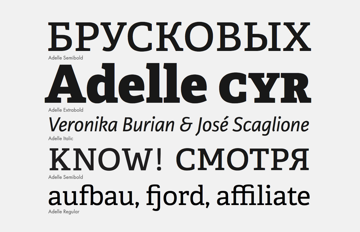
Slab serif Adelle was designed by Veronika Burian in 2009. Cyrillic was added by the author in 2012 in close collaboration with Alexandra Korolkova.
Slab serif Adelle was designed by Veronika Burian in 2009. Cyrillic was added by the author in 2012 in close collaboration with Alexandra Korolkova.
Slab serif Adelle was designed by Veronika Burian in 2009. Cyrillic was added by the author in 2012 in close collaboration with Alexandra Korolkova.
As for the type design heavyweights, Matthew Carter designs the best Cyrillics hands down, although he acknowledges that he constantly consults Maxim Zhukov. Carter Cyrillics are unequivocally good. Georgia, to take one example, could serve as a model for any Russian-speaking type designer. I don’t know how important multilingual type design is for Carter, perhaps the quality of his non-Latin characters is just a sign of his superlative professionalism. In any case, he is a kind of person you look up to and is impossible not to admire.
You’ve taught at various schools, including the Moscow State University of Printing Arts and the British School of Design.What are some common mistakes of type design students?
Every type design student has made at least one big mistake: they decided to go into type design, in full knowledge of the fact that out of a class of ten or fifteen people in Moscow each year who choose this concentration, about half a person will end up doing it for a living. Jokes aside, the decision is not exactly a mistake, but the situation is unfortunate. Let’s say, someone makes their first typeface for a class project, depending on where they studied, they may even complete the design and release it, or may not. If they went to the British School, most likely it eventually released. If they went to the University of Printing, they probably would keep it to themselves. They did it, more or less got it into shape and now have one proud solitary typeface. At this point they realise, “To hell with it, I’m going into branding!” The basic course starts off with pen letteringWhat’s the point of putting all this time and effort into type design? I can’t blame them, but it seems to me it would be wiser to concentrate in something only once you’re sure that it is what you want to do and plan to continue doing in the future. I don’t know if the general exposure to the subject is worth the investment of years of professional training.
How did you get into type design?
At my first type class, right at the beginning of my second year, the average age of the group was eighteen. We were all so “green”, had had been out of high school for only a year and barely began to realise that we weren’t on track to to become fine artists, but something else. Enter the charismatic Alexander Tarbeev (type designer, teacher, founder of the Type Workshop at the Moscow State University of Printing, author of many original typefaces and Cyrillic versions of Latin typefaces that have been awarded with Russian and international prizes. —Ed.). And right off the bat: “Who knows what boustrophedon is?” Ivan Vasin who has three generations of designers in his family knew the answer right away, and I was sitting there with my “straight-A student” superiority complex, intimidated, “Hmm, this professor is definitely not going to pay any attention to me…”
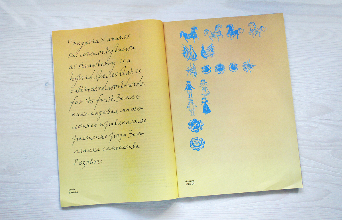
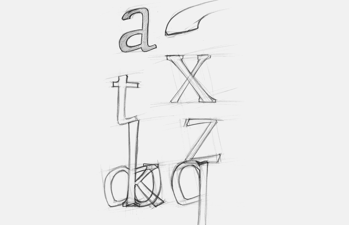
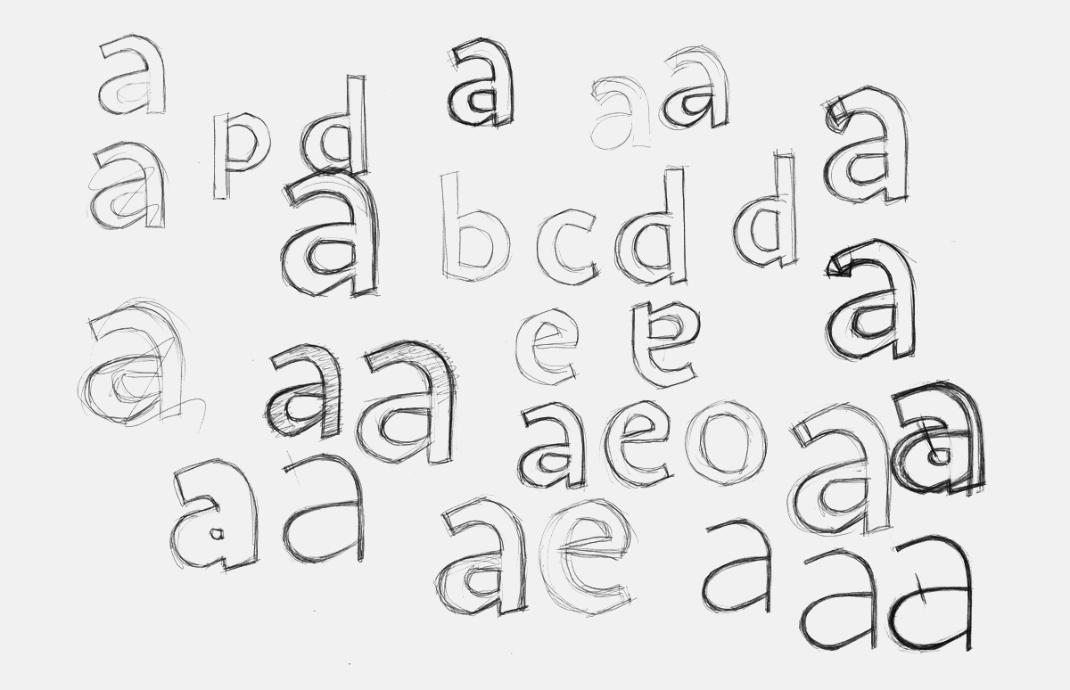
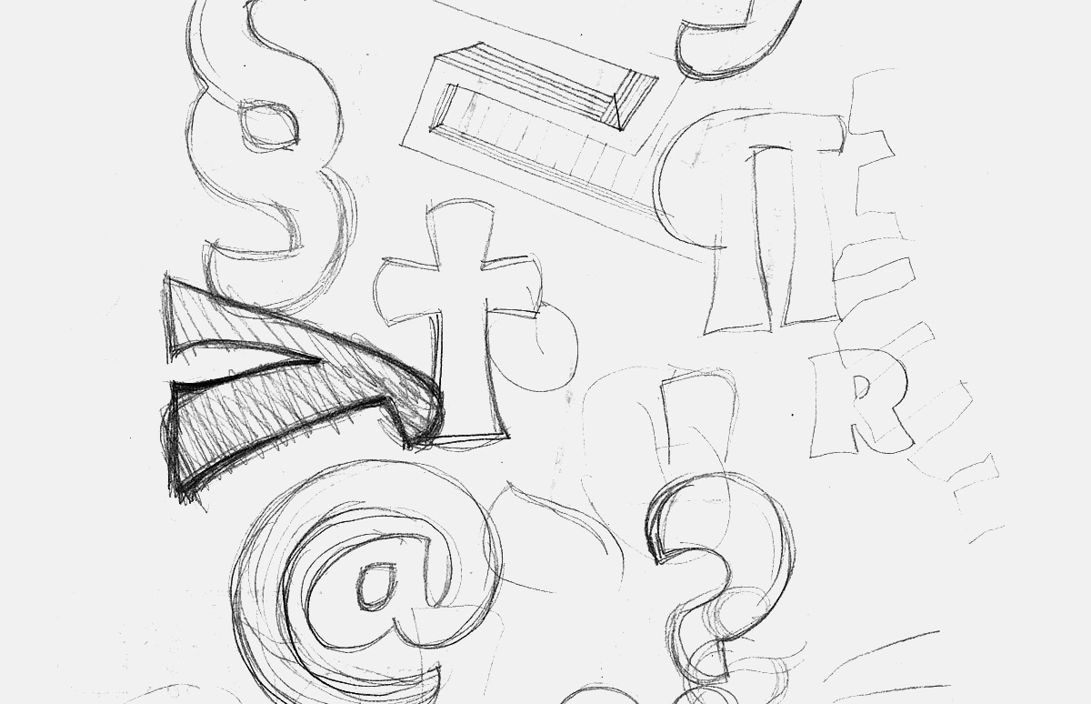
The first sketches of Leksa, summer 2003 (after the first year of the type course at the Moscow State University of Printing Arts).
The first sketches of Leksa, summer 2003 (after the first year of the type course at the Moscow State University of Printing Arts).
First attempt of digitising the sketches (“Obviously awful”—A.K.).
First attempt of digitising the sketches (“Obviously awful”—A.K.).
First attempt of digitising the sketches (“Obviously awful”—A.K.).
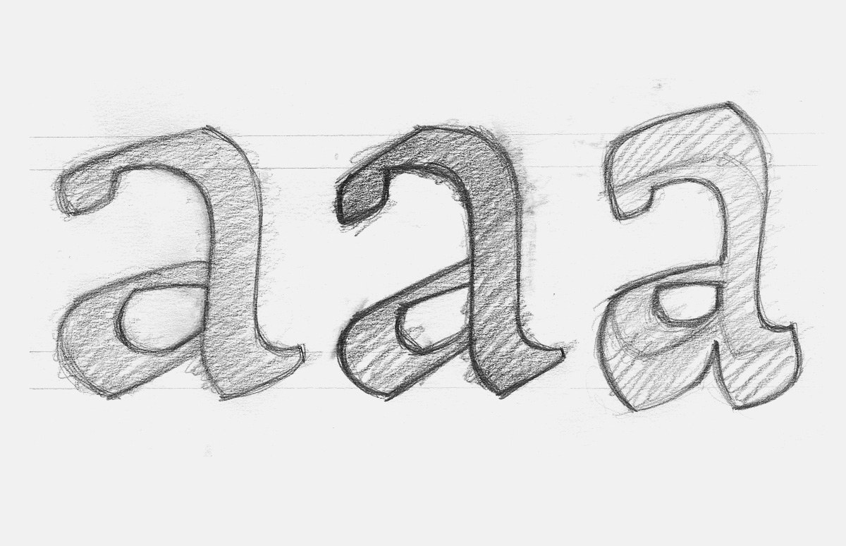
Sketches for the second version of lowercase characters.
A.K.: “…almost as bad as the first one.”
Version of the Roman face, 2004
Variation from 2004-2005.
Sketches for another version (2004-2005).
In this version, according to the designer, it is already possible to recognise some of the final design. From this point on, all writing by Alexandra was set in Leksa whenever possible.
First version of the italics.
Second version of the italics.
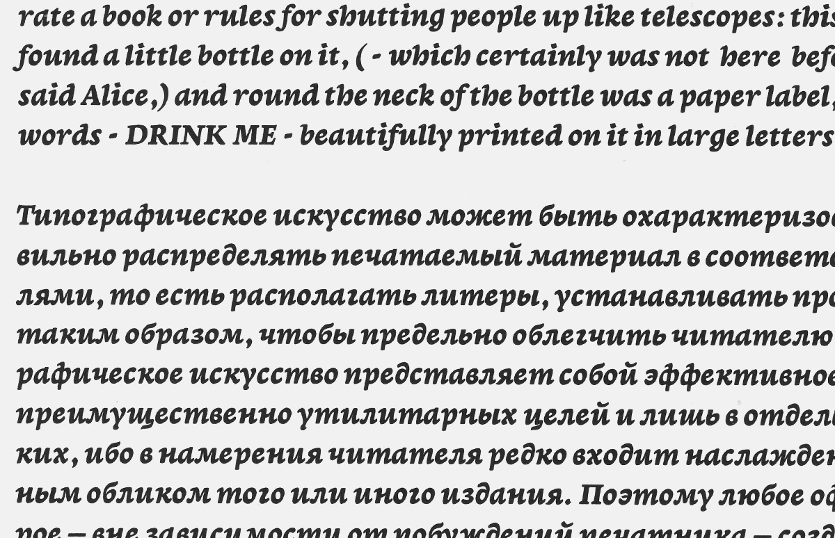
Teaching aid, entirely set in Leksa!
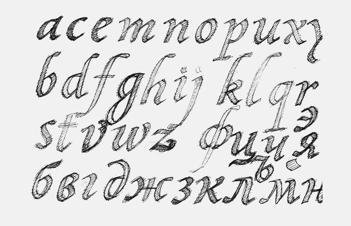
Sketches for the italics.
The third version of the italics, which was used for Alexandra’s degree project. “You can tell that I was into František Štorm at the time,” —A.K.
The fourth version of the italics, refined in the final release.
The first sketches of a sans serif version to complement Leksa.

The first printouts of the digitised Leksa Sans sketches (abandoned).
Sketches to Leksa Sans.
After the first year of the foundation course (in the second year at the University of Printing Arts, four hours a week, with professor dividing his attention among thirty students), I decided to design my own typeface. Of course, I had to choose the most difficult thing out there to cover as much ground as possible in one shot, a Venetian oldstyle. This project evolved into Leksa.
There was a two-year basic course at the university, then whoever wanted went on to the Type Workshop. The basic course starts off with historical calligraphy for the first six months, mainly with a broad nib. As far as I know, pointed pen calligraphy has also been introduced recently, but the bulk of the program is still mostly historical scripts from Roman square capitals and Rustica to humanist minuscule and italic done with a broad-nib pen. The second semester was dedicated to the history of typography, including type-based lettering. Diagrams were drawn by hand on a sheet of A3 paper comparing shapes of each character from various historical periods with distinguishing features of each style explained in the captions. The third was
What was your degree project?
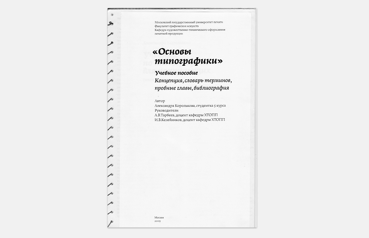
It consisted of two parts: designing a typeface and writing the Living Typography book. It may sound like a bit much for a school project, but this was not entirely my fault. The faculty used our class as guinea pigs and introduced this so-called “specialisation” for the first time right when I was there. About a year and a half before the graduation we were told, “Sit down and come up with a degree project”. I thought about what I could do for a year and a half without regretting it later and chose a book.
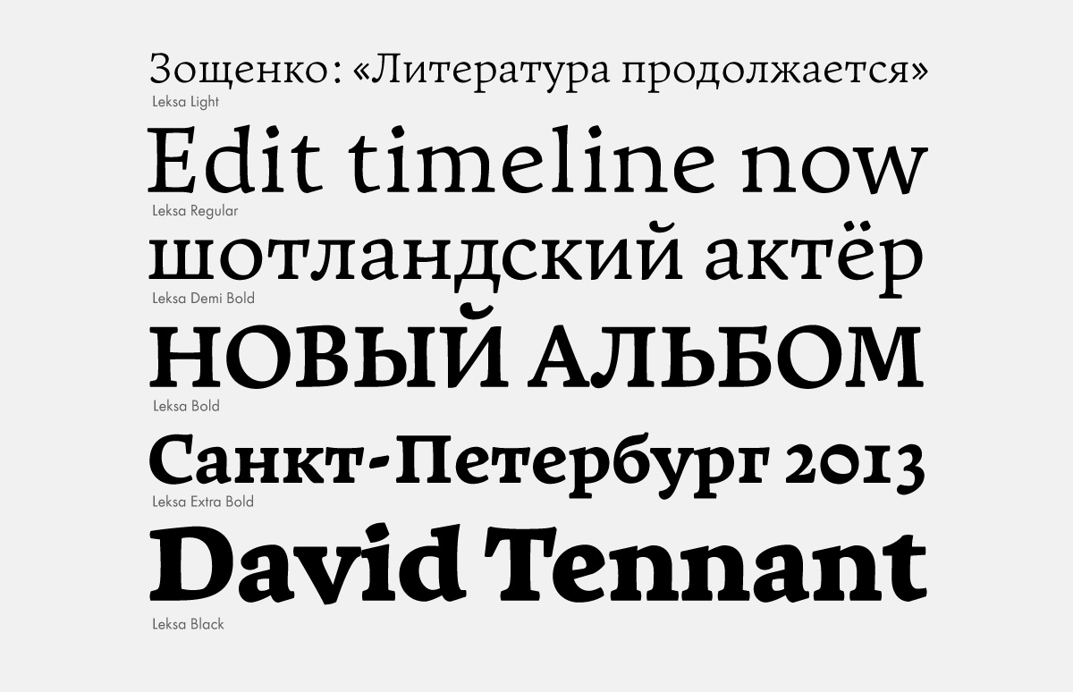
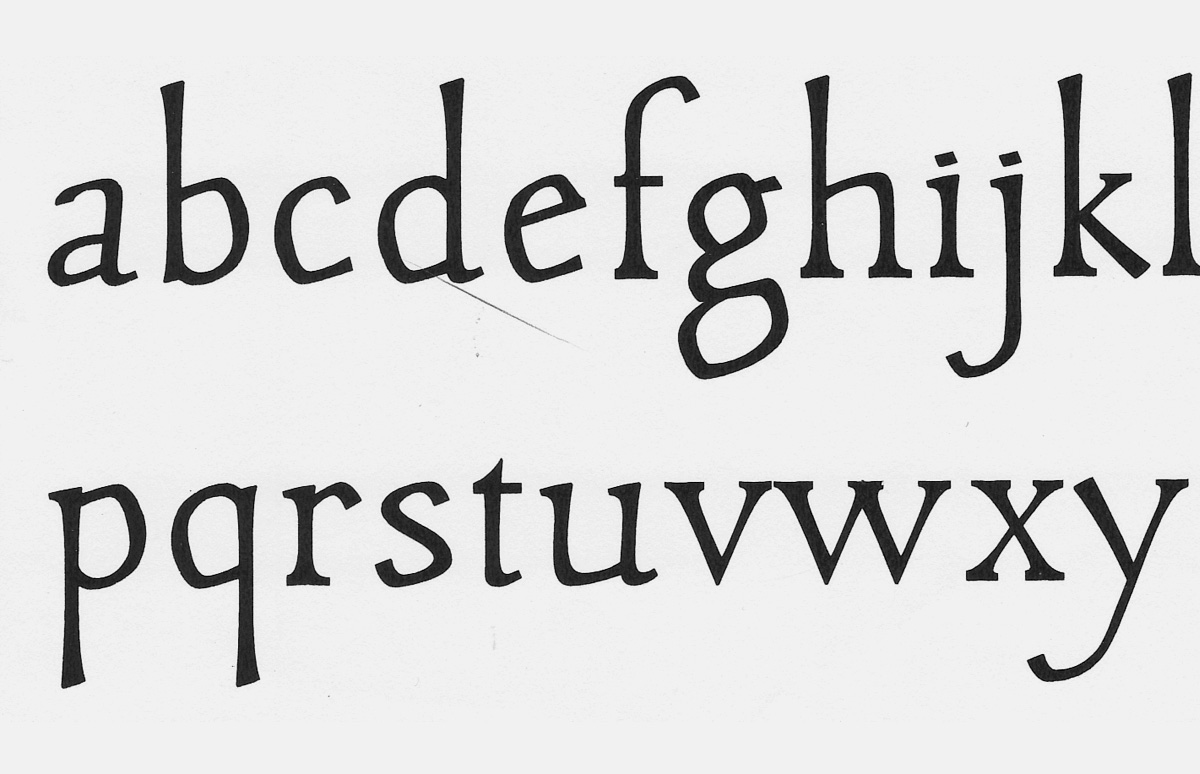
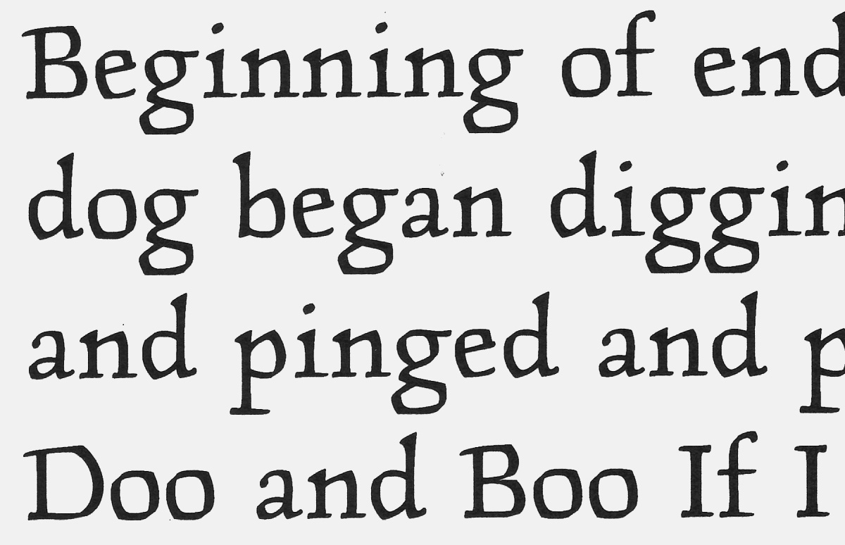
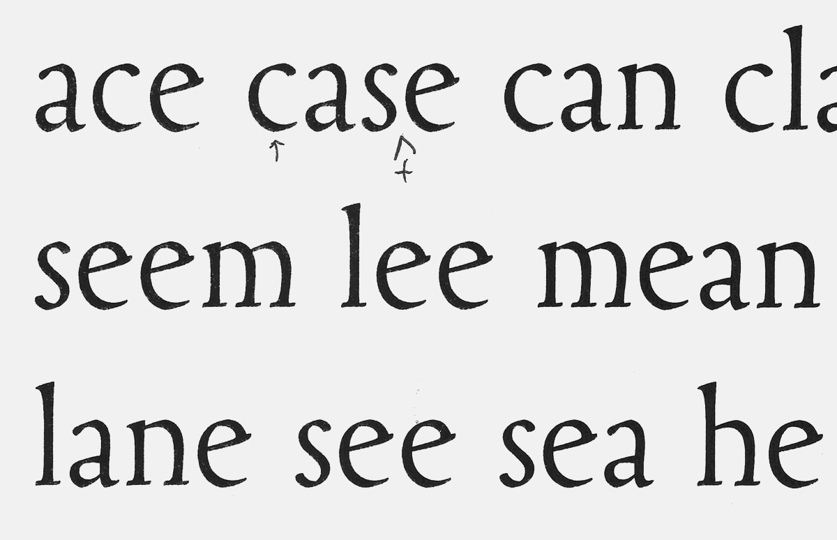
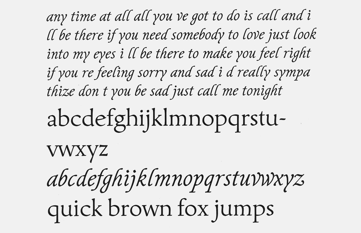
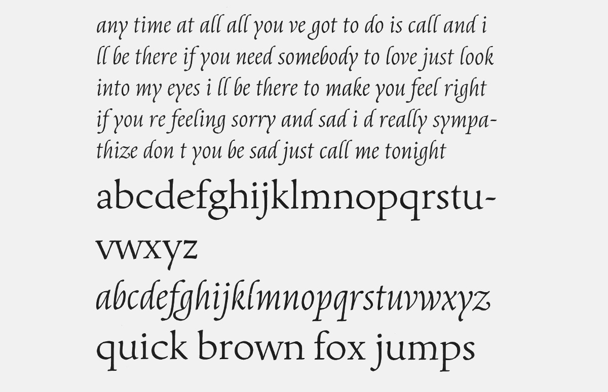
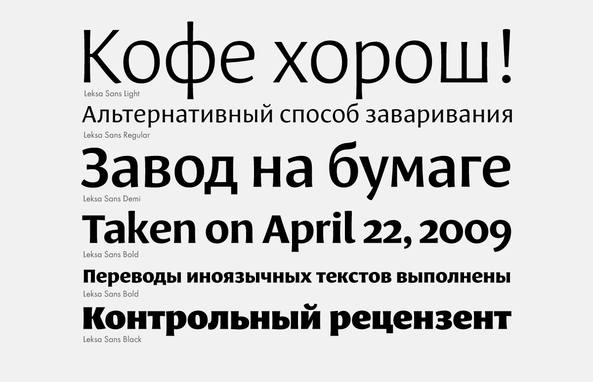
Leksa is a serif with a wide range of styles from light to extra bold.
Leksa is classified as a Venetian oldstyle.
Leksa’s forms produce an effect of fluid rhythmical movement. A careful eye will pick up a certain archaic quality of its characters.
Leksa with its companion sans received an award from Modern Cyrillic competition in 2009.
Leksa with its companion sans received an award from Modern Cyrillic competition in 2009.
Leksa with its companion sans received an award from Modern Cyrillic competition in 2009.
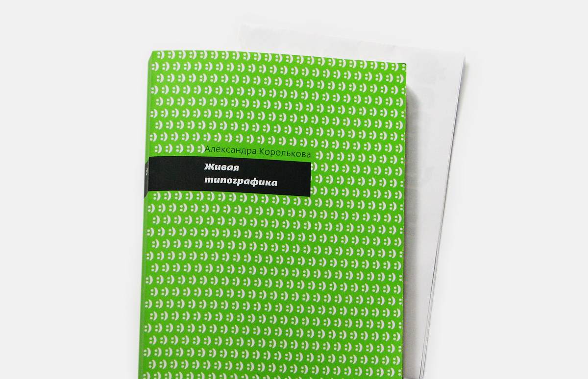
Alexandra Korolkova. Living Typography. Moscow: IndexMarket, 2012.
Alexandra Korolkova. Living Typography. Moscow: IndexMarket, 2012.
Alexandra Korolkova. Living Typography. Moscow: IndexMarket, 2012.
Alexandra Korolkova. Living Typography. Moscow: IndexMarket, 2012.
Do you ever revise typefaces that have already been released, such as Leksa?
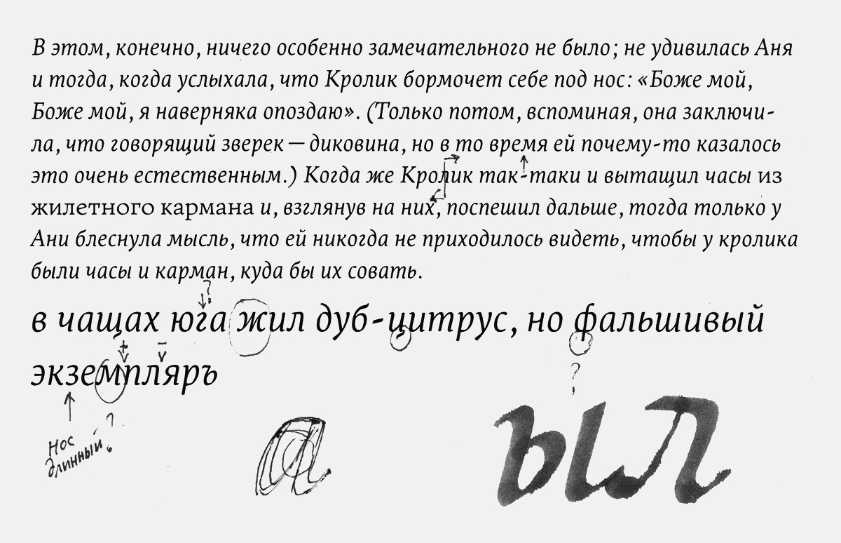
I do, but only if someone finds a mistake and alerts me of it. Otherwise, tinkering with released fonts is a can of worms: one thing leads to another and there is no end in sight… Recently someone wrote to me about a problem with the colon in one of my fonts. It wasn’t exactly wrong, but I’d made the left side bearing slightly wider having text setting in mind and not considering properly how it would appear elsewhere. This person pointed out the way “18:00” looked in this font and I realized I botched up.
How do you begin the process of designing a typeface?
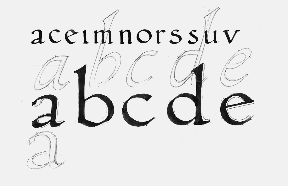
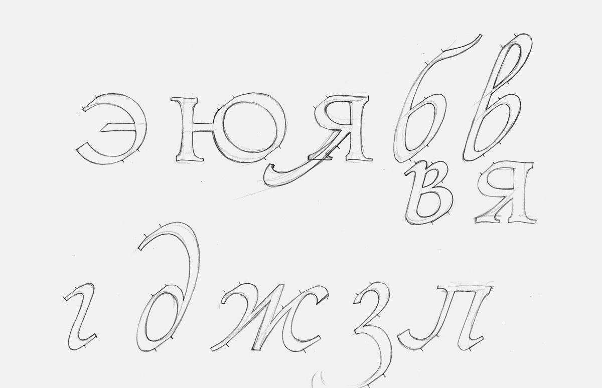
This may be unusual, but I hardly prepare any sketches. At most, I do a very rough drawing. After four years of sketching Leksa I discovered the more carefully I tried to draw, the worse the result. Here is my workflow now: I come up with the concept for a typeface, decide on its character, then I start coming up with shapes directly in Fontlab. Once the basic set of characters is drawn, I make the first printout, look for mistakes, correct them, print again, and so on.
The first test proof of a typeface with the designer’s notes.
Have you considered going to school abroad?
I got into Reading (prestigious university in England, the University of Reading, MA Typeface Design programme chaired by Gerry Leonidas. – Ed.), but I could not find enough money to pay for the course (laughs).
By the way, in our interview with Gerry Leonidas, we asked why they did not have any students from Russia, aside from Sophia Safaeva (Reading,2007). He thought the unfair system that did not allow for foreign student scholarships for was to blame.
At the time, around the end of 2008, I could not afford to pay the tuition myself: higher education in the UK is very expensive for non-residents. I tried to get a grant from the British Council. I filed out all of the paperwork and took the entrance exams. I passed and got some letters from Reading, but was not given the grant.
Why were you interested in the University of Reading programme and not the popular Type & Media course at the Royal Academy of Art in The Hague?
I wanted to go to Reading from the get-go. It was only later that I found out that you had to spend the second half of the year writing writing a dissertation. It seemed to me that KABK had a more entertaining course. But for me education was not so much about fun; I didn’t need to go anywhere to have fun. Personally, I think it’s more important for a type designer to be able to produce a good text typeface than to be able to carve letters in stone or to write code. Perhaps I’m old-fashioned.
Vladimir Krichevsky always says there is over abundance of typefaces and a lack of quality typography in our world today. What are your thoughts on this? Is it type designer’s business to try to also be a typographer and set the bar of using type properly in the graphic design industry?
I think it depends on the position of the designer. There is plenty of historical precedents of people that designed the type, the book, and the rest of it single-handedly.
The golden age?
Depends on how you look at it. I wouldn’t want to be in Bodoni’s shoes and work only on type design in the same style my entire life. Even as times changed, in the pantograph era, people could design their types quietly without worrying about the world beyond their room. Vladimir Efimov, to take another example, was perfectly content being just a type designer and did not feel an urge to set any sort of a bar for graphic designers. Would it be a good idea to get involved in typography and layout as well? I can’t answer this question objectively. Personally, I do. One simple reason is that I was trained to do it, and it would be strange to ignore these skills and forget all about my five years at the University of Printing Arts and about the esteemed Alexander Konoplev who taught me book design.
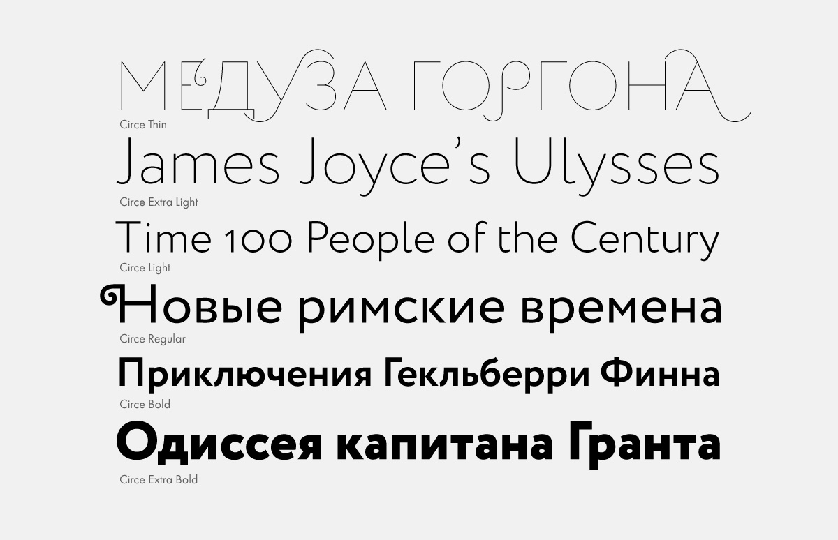
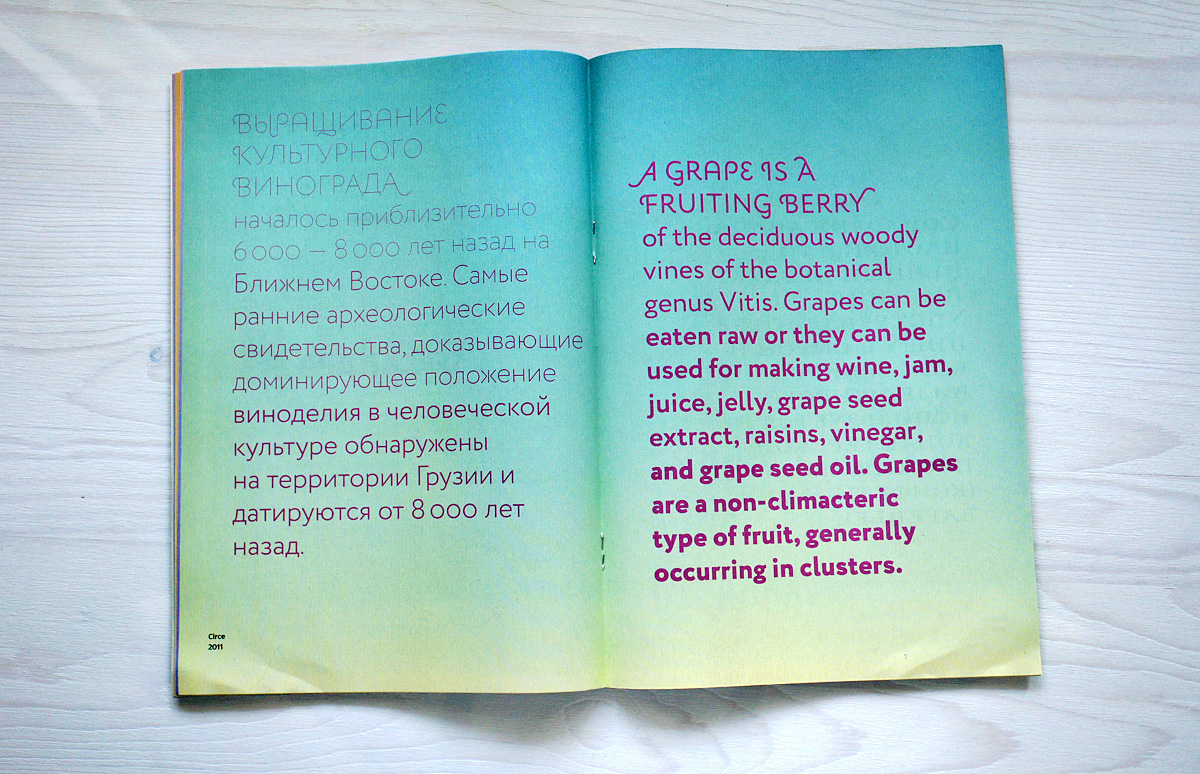
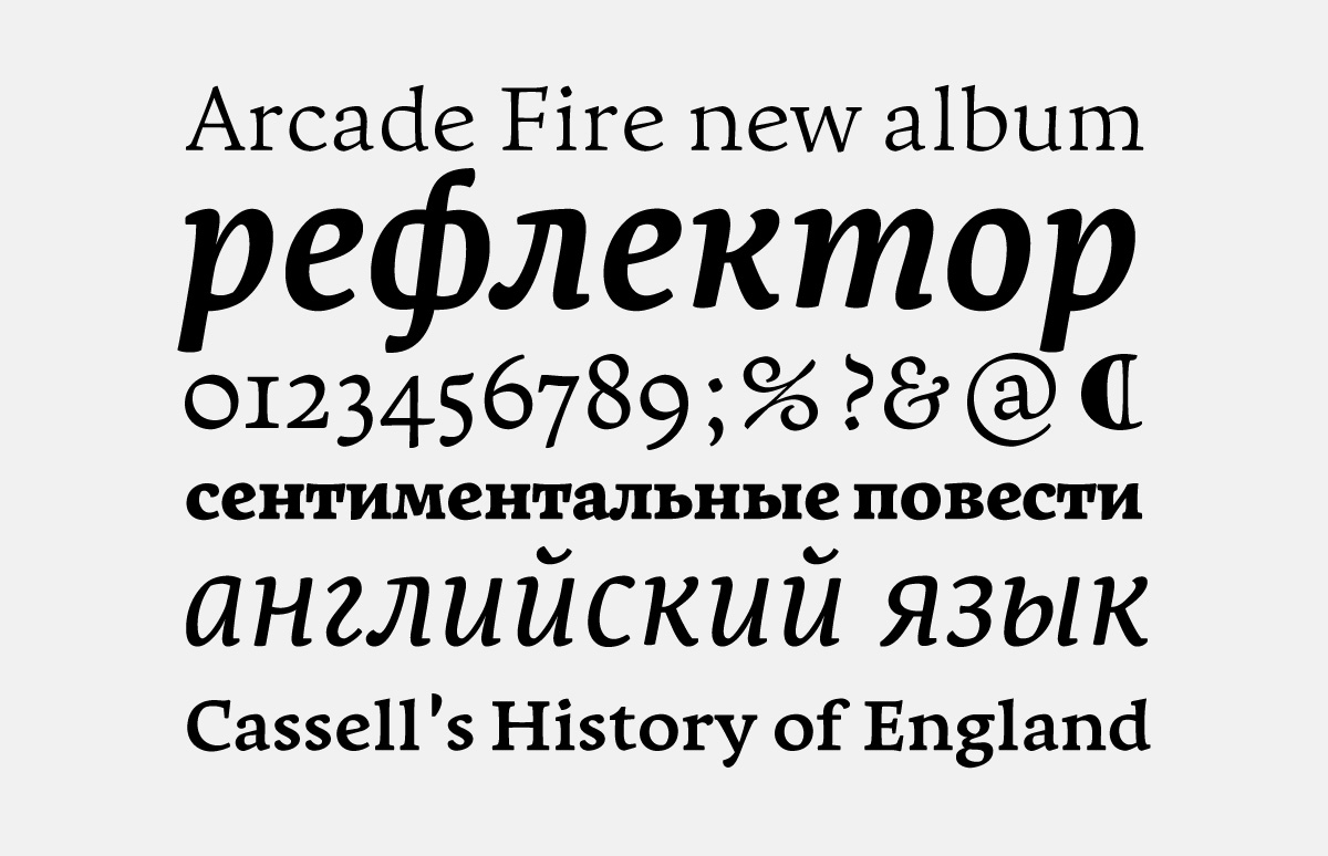
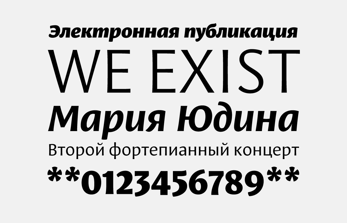
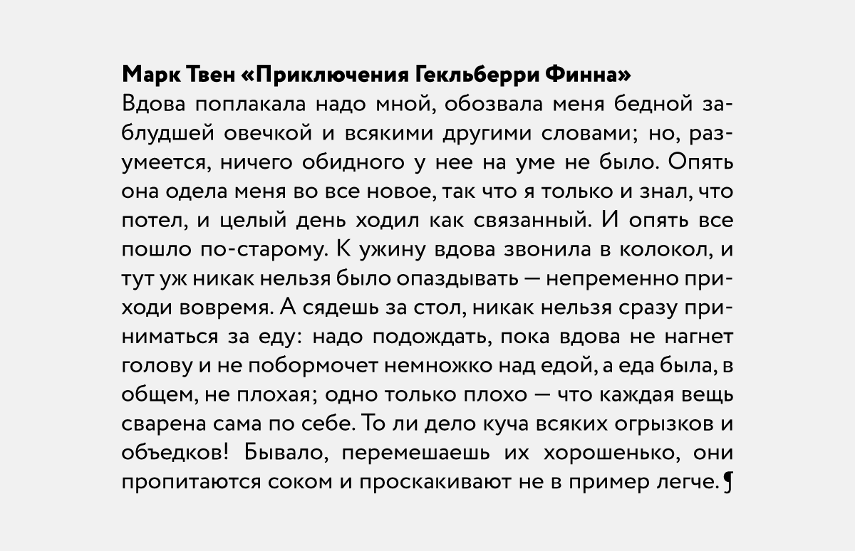
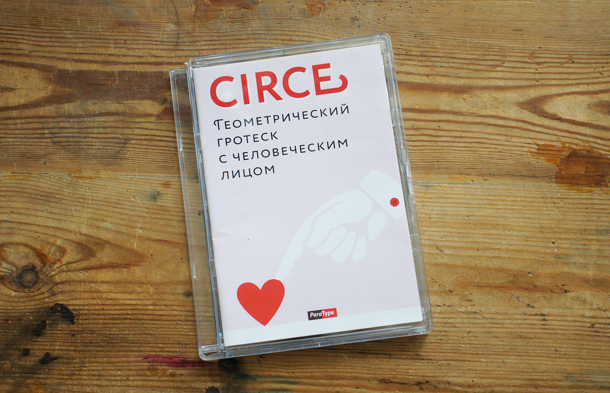
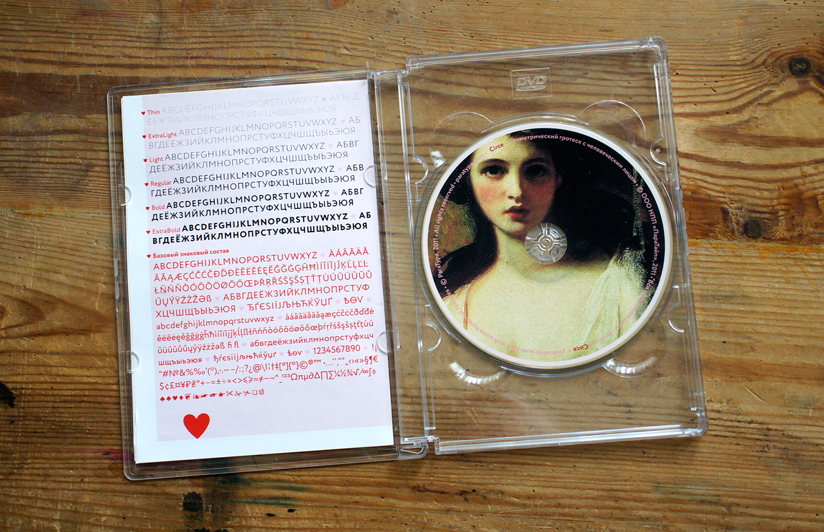
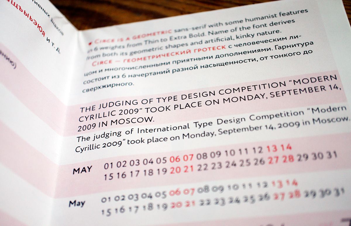
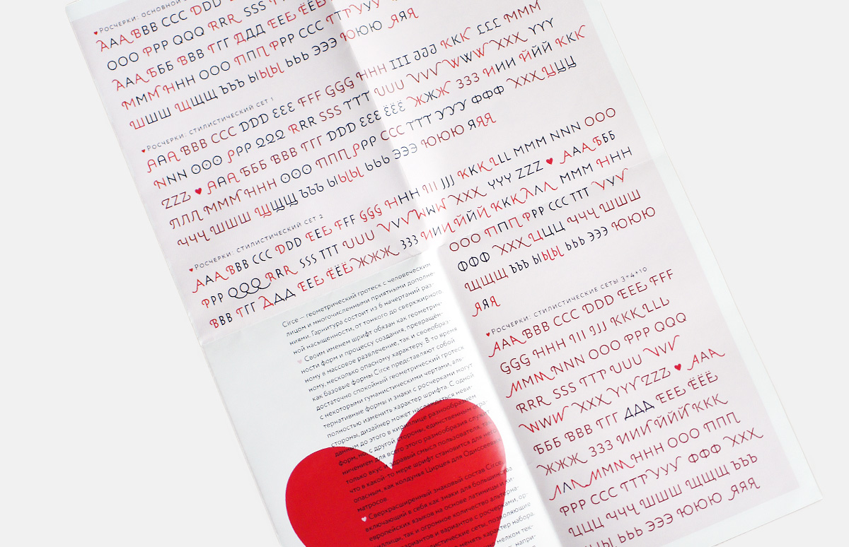
Circe was released by ParaType in 2011. The typeface includes six styles of varying weights, from light to extra bold.
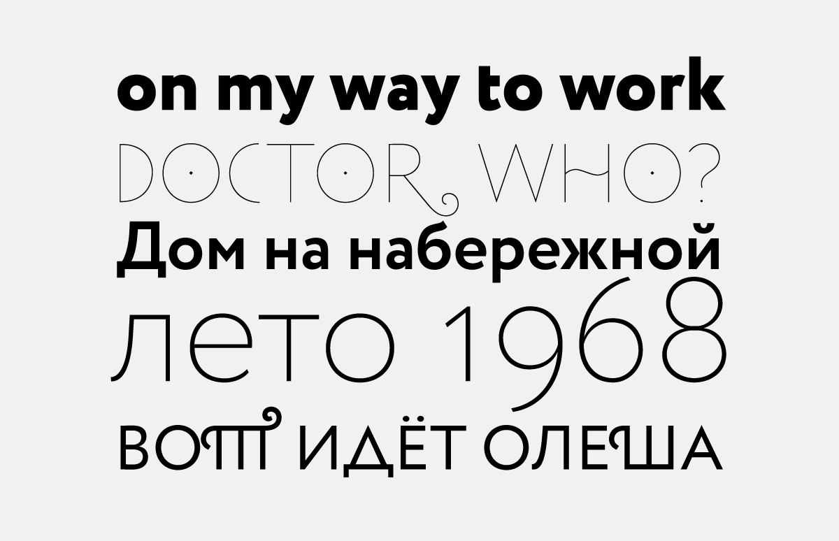
The structure of this sans serif is pronouncedly geometric, but the great number of whimsical alternate characters and swashes allows to change its effect drastically.
The typeface is suitable for setting both text and display. The array of alternates makes it possible to create novel typographic compositions and striking headlines.
As envisioned by the designer, the abundance of character variants, on one hand, gives the user great freedom, but on the other hand could lead them into a treacherous maze, not unlike the one Odysseus’ companions encountered on the sorceress Circe’s island, hence the name.
As envisioned by the designer, the abundance of character variants, on one hand, gives the user great freedom, but on the other hand could lead them into a treacherous maze, not unlike the one Odysseus’ companions encountered on the sorceress Circe’s island, hence the name.
As envisioned by the designer, the abundance of character variants, on one hand, gives the user great freedom, but on the other hand could lead them into a treacherous maze, not unlike the one Odysseus’ companions encountered on the sorceress Circe’s island, hence the name.
As envisioned by the designer, the abundance of character variants, on one hand, gives the user great freedom, but on the other hand could lead them into a treacherous maze, not unlike the one Odysseus’ companions encountered on the sorceress Circe’s island, hence the name.
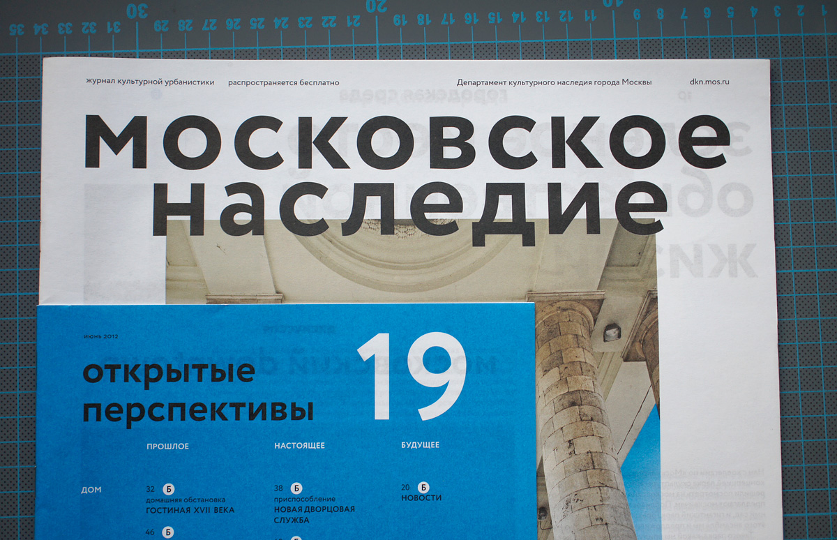
Circe as used in Московское наследие (Moscow Heritage) magazine. Designed by Shuka Design Bureau.
Circe as used in Московское наследие (Moscow Heritage) magazine. Designed by Shuka Design Bureau.
Would you agree with a statement that an unjustifiably high number of typefaces is produced today? Many designers just never seem to stop.
Only a fraction of these designers (half, at most) release everything they design. Others keep most of their work to themselves. Many of those that constantly release fonts, unfortunately, have no market to speak of. This happens all the time. A person designs a typeface just because they feel like it; they sell a couple of licenses, give it away to friends, and that’s about it. At the same token, truly essential releases are few and far between.
Could you define essential?
Perhaps it’s an overstatement; what I mean is types that can be used effectively to solve a real-life problem. This would be a well-made typeface with distinctive features that make it the right one to specify in the right place. Occasionally, a design problem comes up which has no suitable typographic solution at hand. At times, there’s only one appropriate Cyrillic face in existence which has been around for years and overused. What is the great majority of Russian books set in? I can only name a handful of types: Charter, Swift, Times, Petersburg. It’s not because we have a lot of good text typefaces but typographers refuse to use them. It’s because there is a scarcity of well-made text faces. They are simply not there, and neither is quality typography. Typography does exist, of course, but it has to operate with a very limited vocabulary. Two things are needed to have truly rich typography: talented and well-trained typographers, as well as a full stylistic range of quality text types. I don’t mean to imply that every font on the market is bad, but the majority is. Anyone can easily download thousands of bad pirated fonts from the web. The quicker this typographic noise disappears, the sooner the quality of our typography at large will improve.
Will it go away on its own?
It’s gradually giving way – I’m looking outside (our interview with Alexandra took place in the centre of Moscow, at a cafe on Bolshaya Dmitrovka Street—Ed.) and I see decent signage. It’s clear that the situation will not improve by itself, but the number of people who are coming into the profession with at least some training is gradually increasing, while the number of people who just happened to be at the computer because someone asked them to “put together” some business cards or a sign is getting smaller. Now that that they are available, the Lebedev guidelines (in the summer of 2013, the Art. Lebedev Studio presented its design code for the city of Moscow, designed to regulate the placement of outdoor signs in the city and improve the appearance of its historic centre—Ed.) should make a difference. If they are adopted, our typographic environment will get at least a little bit better.
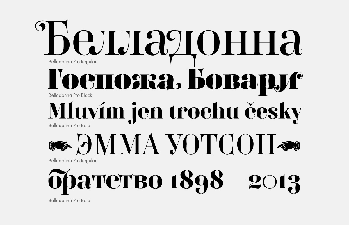
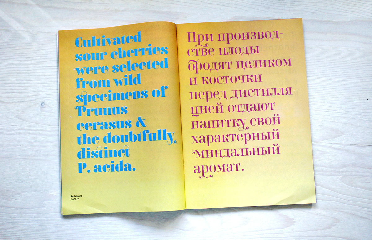
Belladonna revisits the features of Modern faces from the late 18th–early 19th centuries: high contrast, hairline serifs, compressed proportions. Among its idiosyncrasies are bulging ovals and unusually fluid swash and teardrop terminals. The design was first commissioned by Italia magazine for titles and drop caps.
Belladonna revisits the features of Modern faces from the late 18th–early 19th centuries: high contrast, hairline serifs, compressed proportions. Among its idiosyncrasies are bulging ovals and unusually fluid swash and teardrop terminals. The design was first commissioned by Italia magazine for titles and drop caps.
Belladonna revisits the features of Modern faces from the late 18th–early 19th centuries: high contrast, hairline serifs, compressed proportions. Among its idiosyncrasies are bulging ovals and unusually fluid swash and teardrop terminals. The design was first commissioned by Italia magazine for titles and drop caps.
Belladonna revisits the features of Modern faces from the late 18th–early 19th centuries: high contrast, hairline serifs, compressed proportions. Among its idiosyncrasies are bulging ovals and unusually fluid swash and teardrop terminals. The design was first commissioned by Italia magazine for titles and drop caps.
Many of your text faces can be used a wide range of projects thanks to their extended character sets: old style figures, small caps, optical sizes and other typographic enhancements. Do you have a sense of how often the users take advantage of them?
Actually, I don’t supply all of these niceties in every case. I base the scope of each project on what I would find useful if I was the user. A while back (in an online discussion on ru-typography.livejournal.com forum), there was a debate on usefulness of small caps and old style figures in italics. I could answer this question from my own experience: the footnotes in a book I designed were set in italics, while old style figures were used in the main text. As far as I know, these figures were added to the italic font later, but there weren’t any at that time. So I had to replace all numbers in the italic footnotes with upright old style figures, because I didn’t want to use lining figures. It sometimes simply gets annoying: small caps would fit the project, but they are not available. Meanwhile, it’s not that hard technically for the type designer to add them: with the help of macros and actions a minimum of hand work is needed.
Which designers inspire you?
My first love in type design was William Morris. Not so much even his type design, as his approach. Never mind Golden Type! I love his approach. He designed types, printed his own books with them, created wallpapers and textiles, designed furniture, built a house… He’s done it all. Now that’s a designer! Then there are the designers that you follow and envy. Jean François Porchez, Jessica Hische, Maximiliano Sproviero, their sense of typographic form is incredibly well-developed.
Your book Living Typography was addressed to young designers and students. Have you considered writing a book for fellow professionals?
I’ve been thinking about writing a second book for a while, and actually wrote a chapter and a half about two or three years ago. It now seems that it will consist of two volumes: the first volume about type would be addressed to the Russian designers. It would cover the bases: the history of calligraphy, historical overview of type design, design theory: the pen, negative shapes and so on. The second volume would be about the particulars of designing the Cyrillic alphabet; this would be addressed not only to the Russian speakers, but also to others. I would talk about what kind of a beast it is, how its characters are constructed, how to feel about various archetypes in Cyrillic type design… Now, all I need to do is to sit down and to write it.