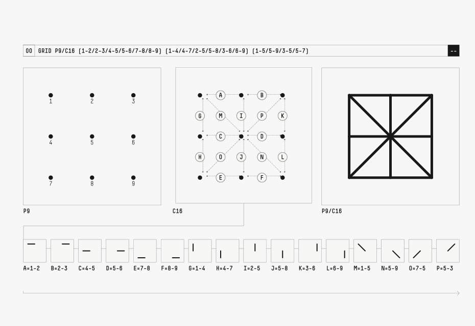
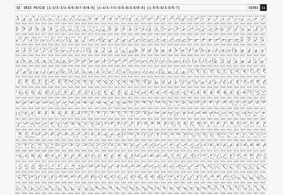
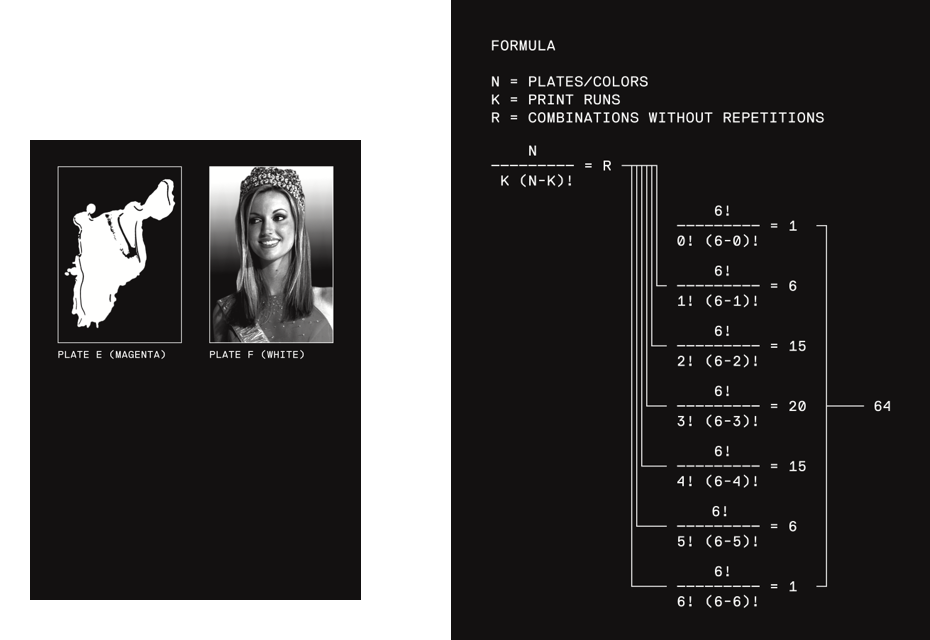
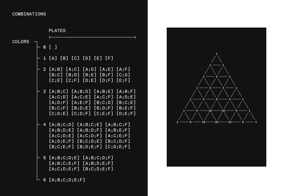
Back in 2016, NORM Studio gave a lecture at the Serebro Nabora conference in Moscow. It was a case-study presentation with the main focus on type design. The strongest impressions one could get from the stories presented (the typography for Cologne Airport and for Omega and Swatch, the watch manufacturers, among others) were the rigid logic and consistency of typographical approach that the Zurich-based graphic designers Dimitri Bruni and Manuel Krebs follow in their practice. Looking closely at the works, one could find oneself in a world somewhere between their Swiss predecessors’ experience: such as Adrian Frutiger’s systematic attitude to type design and Max Bill’s mathematical way of visual thinking.
Eugene Yukechev: The name of your studio, NORM, sounds like a statement. Could you tell us the whole story behind it?
Dimitri Bruni: When we started the studio in 1999, the tendency in graphic design was to be artistic, to have no rules. We wanted to be very different, to follow the principles established in the 60s. We were more interested in seeing ourselves not as artists, but as information engineers. We wanted to be a team, we wanted to have a name. We didn’t know exactly if we wanted to be a big company. We needed a name and looked for something cold, clear, sharp and very defined. We had this name “Norm” and we never discussed it, we just had it. We wanted to make a magazine called Norm (which later somehow turned into a book). When we finished school, we decided we’d use it for the name of the studio.
NORM: The Things, 2002, 210 x 260 mm, LL Simple
NORM: The Things, 2002, 210 x 260 mm, LL Simple
NORM: The Things, 2002, 210 x 260 mm, LL Simple
NORM: The Things, 2002, 210 x 260 mm, LL Simple
NORM: The Things, 2002, 210 x 260 mm, LL Simple
NORM: The Things, 2002, 210 x 260 mm, LL Simple
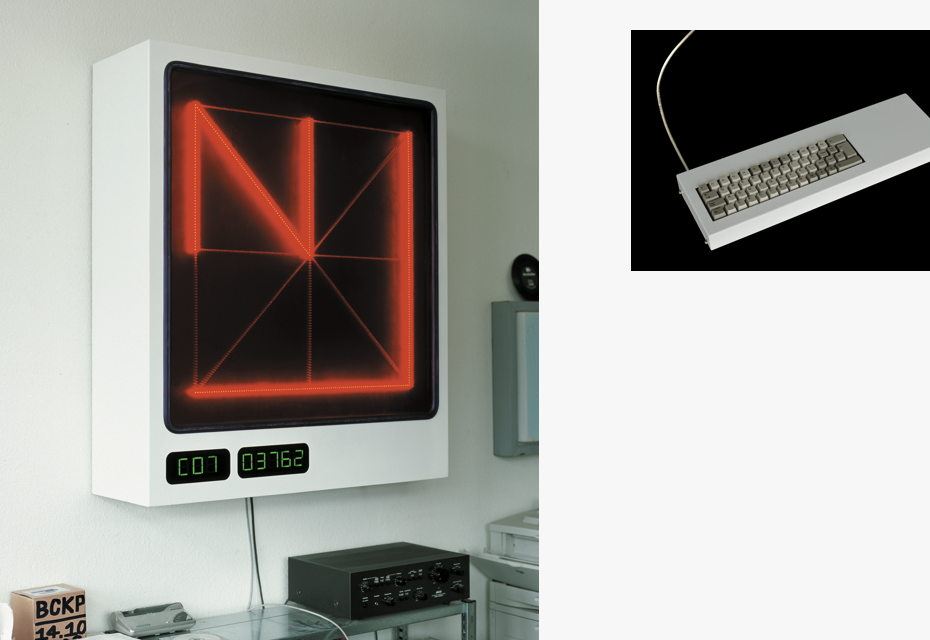
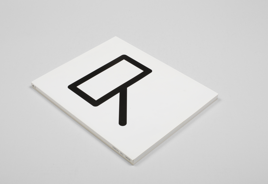
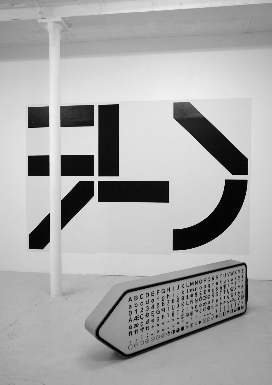
NORM: Sign-Genarator 1.0 EXT (+ Keyboard)
NORM: The Things, 2002, 210 x 260 mm, LL Simple
Gayaneh Bagdasaryan: Before speaking about your work, I would like to ask a question not related to graphic design, but your mindset and preferences in general. What of the world culture inspired you?
Manuel Krebs: We like different things. We certainly share that we like works that are related to a strong conceptual approach. We are influenced by Modernism. We are attracted to Russian Avant-Garde and Minimalism. Since we are related to contemporary art, a lot of people around us work within this field.
Gayaneh Bagdasaryan: When you collaborate with artists, do these artists have to be your soulmates or somehow close to your mindset, or it does not matter?
Dimitri Bruni: Collaboration with an artist is not about what they do. We like functionalism in our work, but we don’t expect that from the artists — it could be the complete opposite. Contrast is not about excluding one another, here collaboration is much more important. Of course, we like different works by different designers, but collaboration is the only thing that brings a project to a good ending. When we work for our own projects, it’s a completely different story, because we mostly discuss things between Manuel and me. As for collaboration, we don’t really select people we work with. Generally, the artists come to us because they find our work interesting; we don’t ask them to work with us. What we expect from collaboration is that people come to us because of our way of thinking.
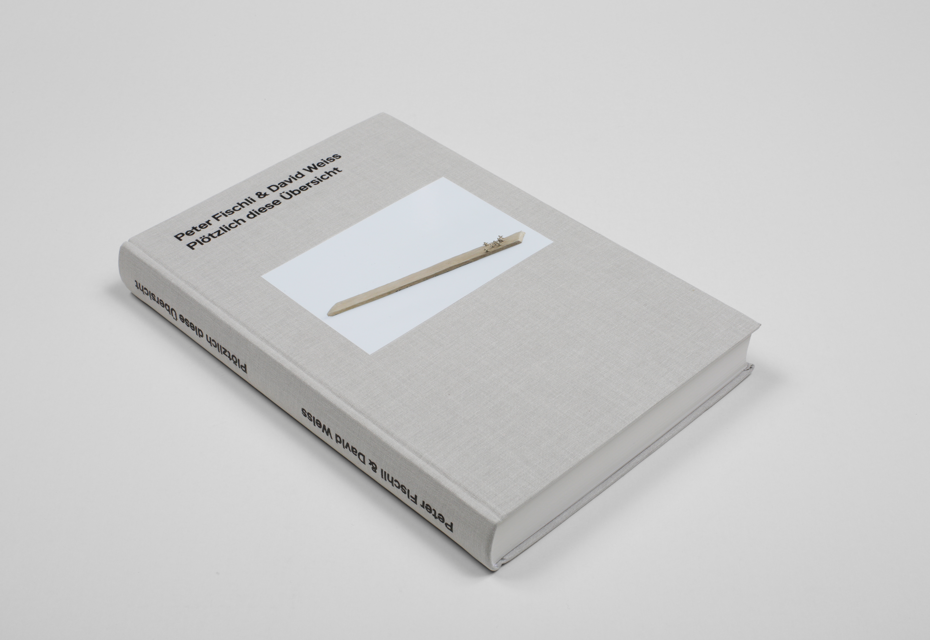
Plötzlich diese Übersicht, Peter Fischli & David Weiss, Laurenz Stiftung/Schaulager, 2015, 180 x 270 mm, LL Riforma
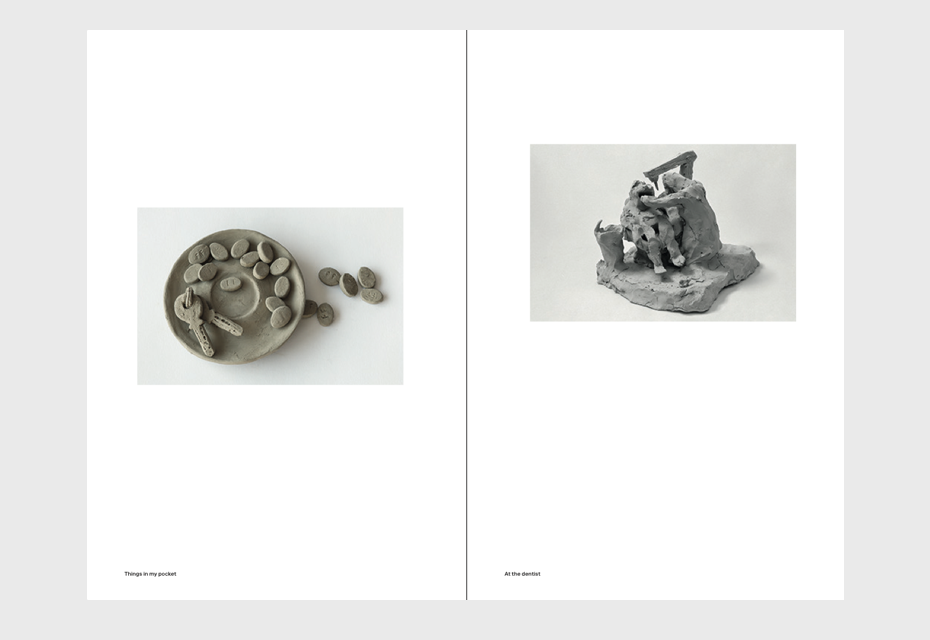
Plötzlich diese Übersicht, Peter Fischli & David Weiss, Laurenz Stiftung/Schaulager, 2015, 180 x 270 mm, LL Riforma
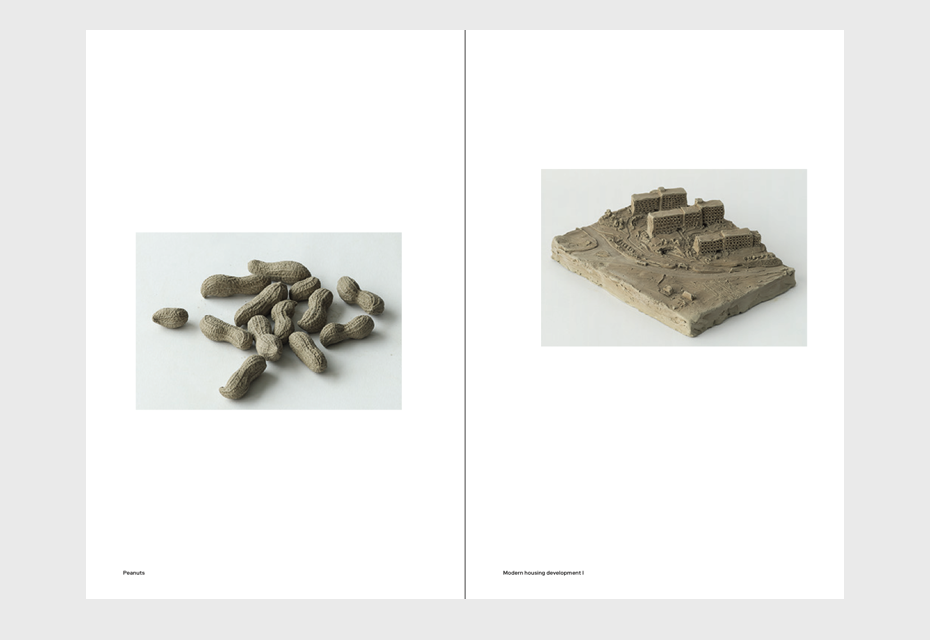
Plötzlich diese Übersicht, Peter Fischli & David Weiss, Laurenz Stiftung/Schaulager, 2015, 180 x 270 mm, LL Riforma
Plötzlich diese Übersicht, Peter Fischli & David Weiss, Laurenz Stiftung/Schaulager, 2015, 180 x 270 mm, LL Riforma
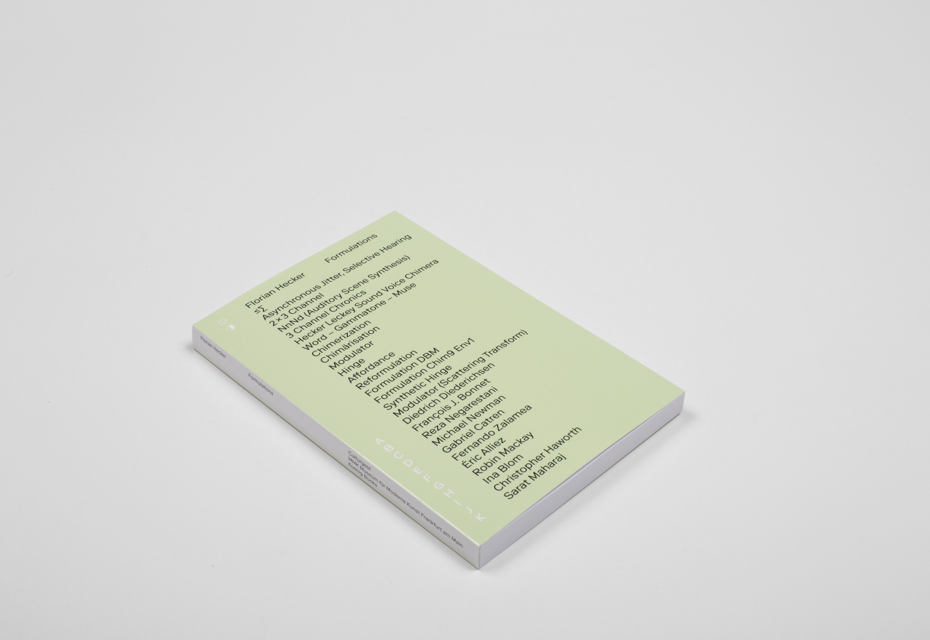
Formulations, Florian Hecker, Koenig Books, London, 2016, 140 x 210 mm, LL Riforma
Formulations, Florian Hecker, Koenig Books, London, 2016, 140 x 210 mm, LL Riforma
Formulations, Florian Hecker, Koenig Books, London, 2016, 140 x 210 mm, LL Riforma
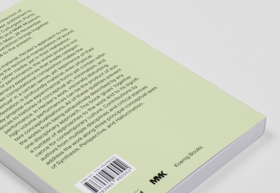
Formulations, Florian Hecker, Koenig Books, London, 2016, 140 x 210 mm, LL Riforma
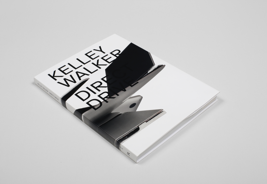
Direct Drive, Kelley Walker, CAM St. Louis / JRP RIngier, 2016, 204 x 272 mm, LL Riforma
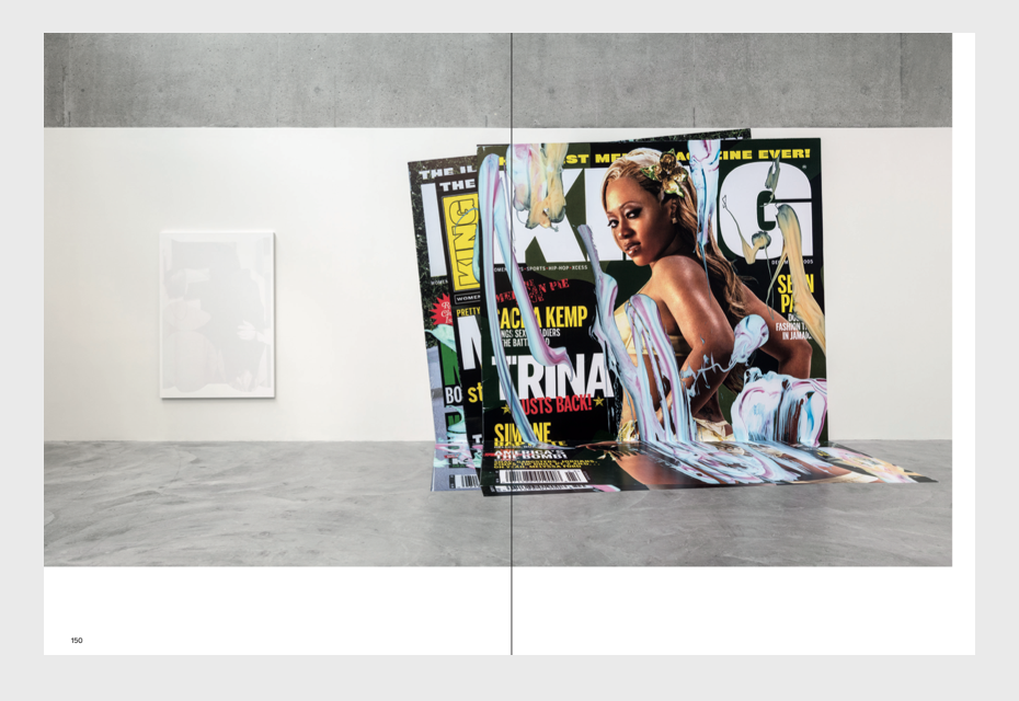
Direct Drive, Kelley Walker, CAM St. Louis / JRP RIngier, 2016, 204 x 272 mm, LL Riforma
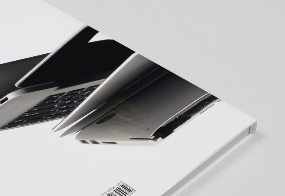
Direct Drive, Kelley Walker, CAM St. Louis / JRP RIngier, 2016, 204 x 272 mm, LL Riforma
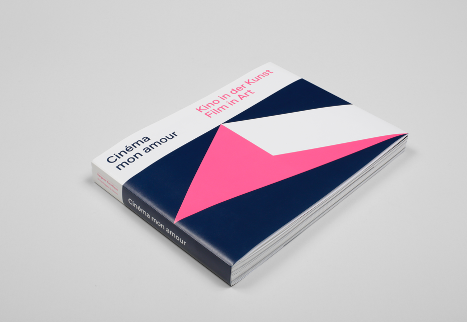
Cinéma mon amour, Madeleine Schuppli, Aargauer Kunsthaus, Aarau, Scheidegger & Spiess, Zürich, 2017, 264 x 198 mm, LL Riforma
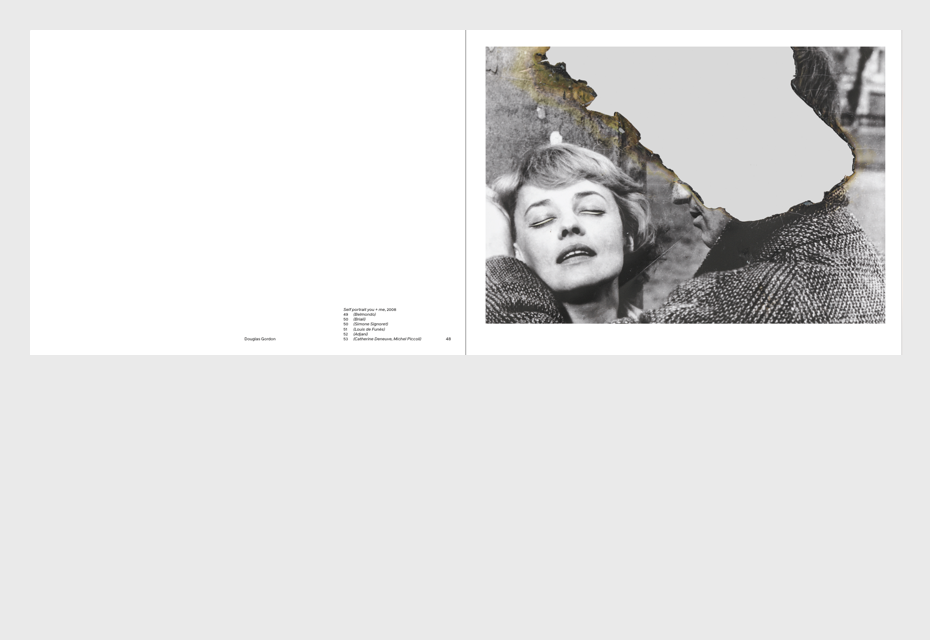
Cinéma mon amour, Madeleine Schuppli, Aargauer Kunsthaus, Aarau, Scheidegger & Spiess, Zürich, 2017, 264 x 198 mm, LL Riforma

Cinéma mon amour, Madeleine Schuppli, Aargauer Kunsthaus, Aarau, Scheidegger & Spiess, Zürich, 2017, 264 x 198 mm, LL Riforma
Gayaneh Bagdasaryan: Once in an interview you said “We narrow the fields of what is possible”. That sounds like a manifesto. Could you tell us a bit more about it?
Manuel Krebs: Sure. We try to avoid “multiple choice”, because you have to choose too much. We feel a little bit lost this way. We think that it also helps if you have restrictions and narrow limitations in your work. We made this choice of working with restrictions and we found a lot of possibilities within. If you determine the field of work, you can create maximum effects with minimum means.
Dimitri Bruni: A question that drives us is: When do you know that the work is done? How do you know where to stop? How do you know that you’ve reached the point when this design or typeface is good? When are you happy and satisfied with it? We’ve talked a lot about this and we have an impression that it is also an advantage of working together that we try to mark the end of a project by saying we are going to use certain elements and constraints. We say that we’ve explored everything we can do with these elements.
Gayaneh Bagdasaryan: For me, the idea of limitations sounds a bit religious, as if a person has guidelines and avoids everything they don’t need. Is that true for you?
Dimitri Bruni: I think everybody does it in a way. I have something that I can mix and play with. For us it’s not just conceptual, it’s also visual, and if we define certain things, it’s also because we are searching for a certain visual expression. We somehow know where we want to go and what expression it should have. We talk a lot about work that influences us and how we can reach something like this. If we work on projects, we try to define most things in a rational way. It turns fragile if you discuss something very subjective. We try to mostly have objective argumentation for our choices. It works for us because we can prove our choices. It’s difficult to talk, for example, about colours, and when we are questioned, we can say that there is logic, numbers and a system behind our choice. It gives security if we can rationally state that these are the rules and we played by them, but also with exceptions.
Manuel Krebs: We are talking here more about graphic design than type design, because we also have many more projects in graphic design. We have one type design project that we will occupy ourselves with for some years and we have one design project every month. Within graphic design, we are much more interested in continuity than in variety. We want to refine and sharpen our voice and our visual language. We are not looking for very different means of expression, but we have to get sharper in what we do. For example, in art school we had a task to make a logotype for ourselves. Everybody made one hundred variations during the semester and then the teacher would choose the nicest. We always hated it, because we wanted to know the reasons behind this choice and thus the steps that lead us to creating it.
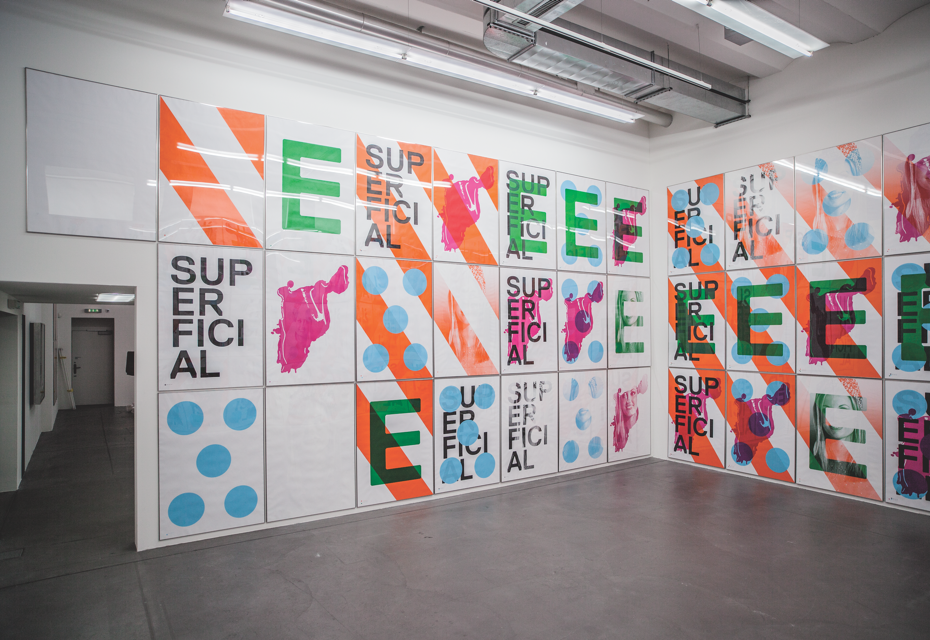
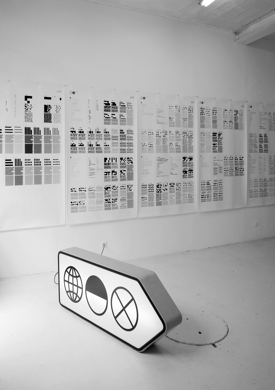
NORM: Superficial, 2010, 64 posters, Silkscreen, Edition of 9 Installation views, Haus Konstruktiv, Zürich, “Visionäre Sammlung Vol. 18: Das Haus des Künstlers”
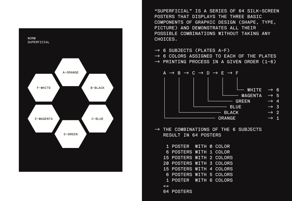
NORM: Superficial, 2010, 64 posters, Silkscreen, Edition of 9 Installation views, Haus Konstruktiv, Zürich, “Visionäre Sammlung Vol. 18: Das Haus des Künstlers”
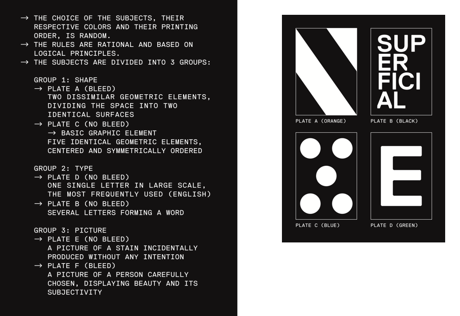
NORM: Superficial, 2010, 64 posters, Silkscreen, Edition of 9 Installation views, Haus Konstruktiv, Zürich, “Visionäre Sammlung Vol. 18: Das Haus des Künstlers”
NORM: Superficial, 2010, 64 posters, Silkscreen, Edition of 9 Installation views, Haus Konstruktiv, Zürich, “Visionäre Sammlung Vol. 18: Das Haus des Künstlers”
NORM: Superficial, 2010, 64 posters, Silkscreen, Edition of 9 Installation views, Haus Konstruktiv, Zürich, “Visionäre Sammlung Vol. 18: Das Haus des Künstlers”
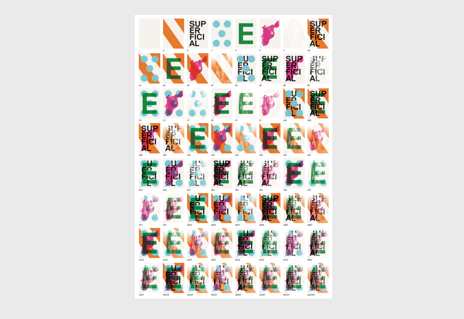
NORM: Superficial, 2010, 64 posters, Silkscreen, Edition of 9 Installation views, Haus Konstruktiv, Zürich, “Visionäre Sammlung Vol. 18: Das Haus des Künstlers”
Eugene Yukechev: You studied together at the Art School in Biel (Kantonale Schule für Gestaltung Biell). Who were your teachers? Can you share with us what kind of experience and values you absorbed from them?
Dimitri Bruni: This art school was very small and, if I remember correctly, we had some teachers of graphic design, drawing and theory. If I look back, we had more classes in drawing. Our teachers were local people. The way they taught graphic design was very traditional. There was a professor from Basel and we drew squares, lines and arrangements on paper for months. I think when I left the school I knew nothing about graphic design. We had to research what was going on ourselves. Our education of course gave us some basic references, but so much was lacking in the way we were taught.
Manuel Krebs: Indeed. Unfortunately, our teachers had lost their bearings, they didn’t know what to refer to. We quickly realised that the most important things would not come from the teacher. The most valuable thing at school was exchange among the students. One of the big advantages was that we could discuss things as we discovered them. For example, we would discover graphic design of the 30s or 50s and discuss it among ourselves, which was very valuable. We had a class of only eight students and we tried our own things, we judged things together and could be very enthusiastic about things. Our teachers were not confident with the whole heritage of 1960s Swiss design, so we discovered it ourselves. We discovered Josef Müller-Brockmann, Hans Neuburg, Vivarelli, Lohse and wondered why they wouldn’t talk about their work.
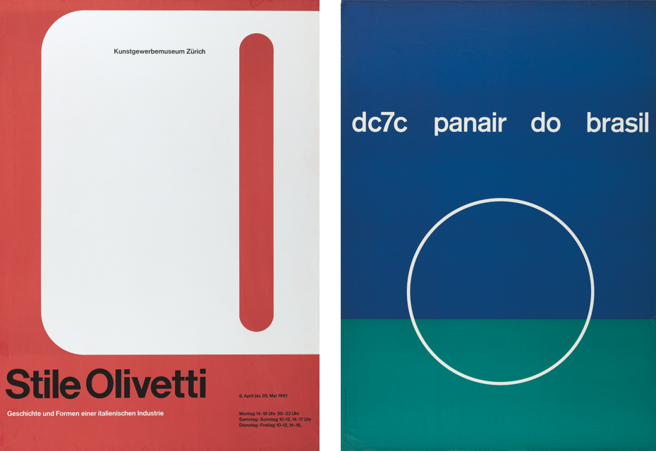
Left — Walter Ballmer; Stile Olivetti, 1961, Poster, 128 x 90,5 cm, Kunstgewerbemuseum, Zürich. Right — Mary Vieira; dc7c Panair do Brasil, 1954, Poster, 128 x 90,5 cm, Panair do Brasil.
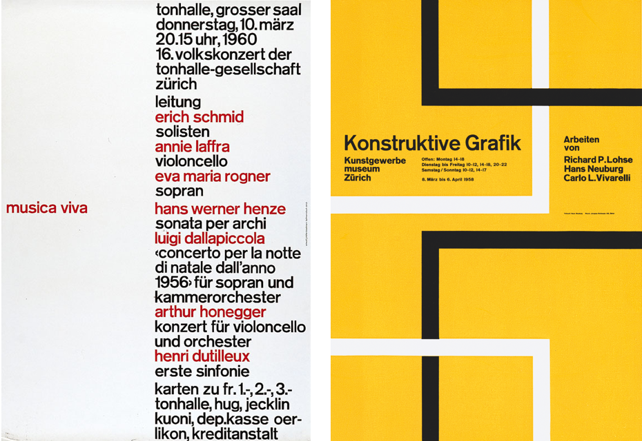
Left — Josef Müller‑Brockmann; Musica Viva, 1960, Poster, 128 x 90,5 cm, Tonhalle‑Gesellschaft Zürich. Right — Hans Neuburg; Konstruktive Grafik, 1958, Poster, 128 x 90,5 cm, Kunstgewerbemuseum Zürich.
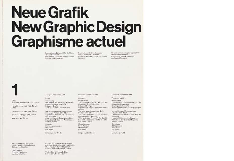
Carlo Vivarelli; New Graphic Design / Graphisme actuell,
1/1958, Zeitschriftentitel, 28 x 25 cm, Otto Walter Olten.
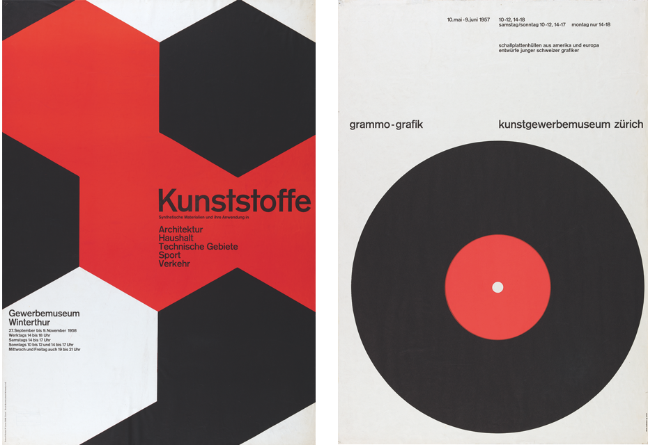
Left — Richard Paul Lohse; Kunststoffe, 1958, Poster, 124 x 87 cm, Gewerbemuseum Winterthur. Right — Gottlieb Soland; Grammo‑Grafik – Schallplattenhüllen aus Amerika und Europa, 1957, Poster, 100 x 70 cm, Kunstgewerbemuseum Zürich.
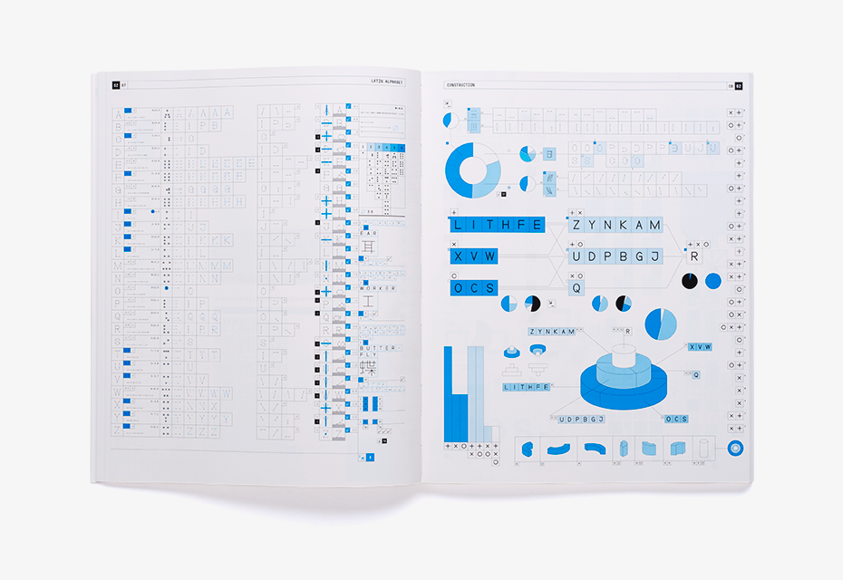
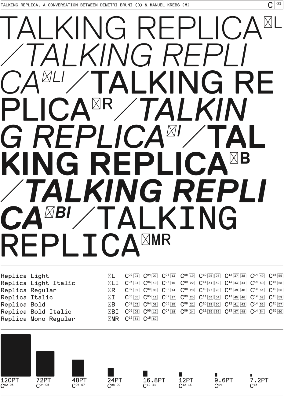
Gayaneh Bagdasaryan: We have all been taught in universities that letters should be drawn by eye, following your feelings and not using a ruler. All known historical attempts to create a scheme, a universal principle, always ended up as a kind of failure. Even Futura took a long time to fine-tune so that it could be used. And with such a historical background, you created the typeface Replica, which can be used not only in large sizes, but also for long texts. I wonder, how did you achieve that?
Manuel Krebs: It’s really important to know that we are self-taught in type design, we are not trained in it. We were just drawing Helvetica in lowercase on our studies. It would never occur to us to draw an entire alphabet for text type. Text fonts for us were always far away and we didn’t even think of doing one, until we realised seven years later that we could try doing something more suitable. The process of creating Replica was very long, there were many steps in between before we reached it. The constraint with the reduced grid made things easier and more difficult at the same time — every step would be drastic.
Dimitri Bruni: Maybe it doesn’t look good, but in the end you try to find a less ugly option that is possible within the given restrictions. That’s exactly what we liked in this project. Some letters were easy, some made our eyes hurt. Of course, in the end our evaluation was subjective. For us it was a long way, but we wanted to know that there was something behind, something hiding behind, these nice drawings. We wanted a really functioning typeface. We are still very attracted to graphic and expressive typefaces. It’s obvious in Replica. I have to say that we didn’t know that we would be using Replica so much when we were making it. If you are a pharmacist and you make a medicine, you test it on yourself. When Replica was finished, we started to think what we could do with it. We made books that we used as testers. We have the tool, it’s our tool, so let’s see what we can do, let’s use it now.
Replica Type Specimen, 2008, NORM, 216 x 288 mm
Replica Type Specimen, 2008, NORM, 216 x 288 mm
Replica Type Specimen, 2008, NORM, 216 x 288 mm
Replica Type Specimen, 2008, NORM, 216 x 288 mm
Replica Type Specimen, 2008, NORM, 216 x 288 mm
Replica Type Specimen, 2008, NORM, 216 x 288 mm
Replica Type Specimen, 2008, NORM, 216 x 288 mm
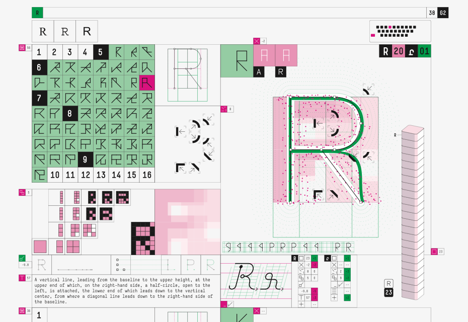
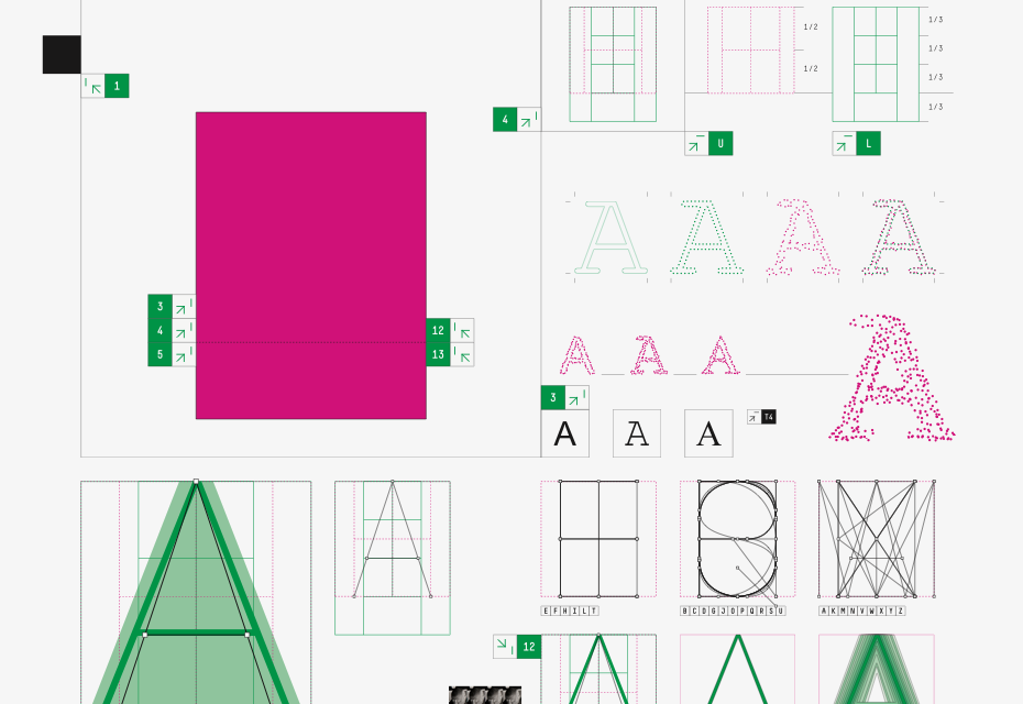
Gayaneh Bagdasaryan: Actually, when I asked the previous question, I had my own suggestion, because I examined Replica before. But I was wondering what your answer would be. I think you’re trying to fool people, guys! You draw all the characters by eye, like all type designers do, and afterwards you just add the grid underneath. As an example, the numbers 6 and 9 are drawn in different ways, with all optical compensations. So first you drew the letters and then you put them on the grid?
Manuel Krebs: (laughs) You mean, we just pretend to have a concept?
Dimitri Bruni: Yes, of course, we draw the letters by eye, but with those restrictions, you know. It was actually a process. The way you do it, before or after, is not really important in the end. You have an idea of what the alphabet should look like and you work towards it. For some designers, the grid happens before, for some after. And if the letters don’t look good in the end, we always can say “Oh, it’s because of the grid!”
Manuel Krebs: Replica was not on the grid in the beginning and the idea of Replica was not completely clear. Yes, we had some problems making decisions until we decided that if we do this, it would have such a good influence and justify so many decisions.
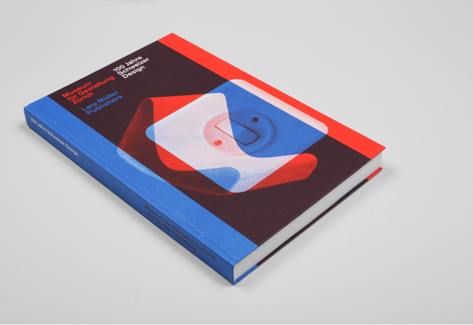
100 Jahre Schweizer Design, Zürcher Hochschule der Künste / Zürcher Fachhochschule / Lars Müller Publishers, 2014, 216 x 324 mm, Akzidenz Grotesk Next / Berthold Akzidenz Grotesk
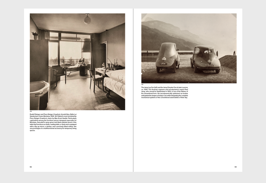
100 Jahre Schweizer Design, Zürcher Hochschule der Künste / Zürcher Fachhochschule / Lars Müller Publishers, 2014, 216 x 324 mm, Akzidenz Grotesk Next / Berthold Akzidenz Grotesk
100 Jahre Schweizer Design, Zürcher Hochschule der Künste / Zürcher Fachhochschule / Lars Müller Publishers, 2014, 216 x 324 mm, Akzidenz Grotesk Next / Berthold Akzidenz Grotesk
100 Jahre Schweizer Design, Zürcher Hochschule der Künste / Zürcher Fachhochschule / Lars Müller Publishers, 2014, 216 x 324 mm, Akzidenz Grotesk Next / Berthold Akzidenz Grotesk
100 Jahre Schweizer Design, Zürcher Hochschule der Künste / Zürcher Fachhochschule / Lars Müller Publishers, 2014, 216 x 324 mm, Akzidenz Grotesk Next / Berthold Akzidenz Grotesk
100 Jahre Schweizer Design, Zürcher Hochschule der Künste / Zürcher Fachhochschule / Lars Müller Publishers, 2014, 216 x 324 mm, Akzidenz Grotesk Next / Berthold Akzidenz Grotesk
Gayaneh Bagdasaryan: For me, graphic design is divided into Swiss design and non-Swiss. How do you see your own position? And how do you perceive the rest, non-Swiss design? For me, as a type designer, Switzerland seems to be the centre of the world. And looking at Swiss designers, I have the impression that they see their position in exactly this way. Is that true?
Manuel Krebs: It’s a fact that we are confronted with Swiss design. We work at the Museum of Design and it keeps coming at us. I would say the influence is strong and it’s all around. We cannot avoid it and we keep reacting to it. How could it be different? We are educated in Switzerland, we grew up here, we live here, we are surrounded by everything Swiss, so it’s our natural behaviour.
Dimitri Bruni: Sometimes Swiss designs created outside Switzerland look more Swiss. For example, there were Swiss style designs from the United States for a pharmaceutical company in Switzerland that also produced packaging in America. They were much fresher and people identified them with Switzerland. It looked more authentic. We also had designers working in the Swiss style in Paris (Jean Widmer, Adrian Frutiger) or Milan (Walter Ballmer) who did very strong designs.
Gayaneh Bagdasaryan: What do you think about Dutch graphic design?
Manuel Krebs: It’s very modern. It’s also more fun. Not like Swiss. I ask myself where this freshness comes from and they tell me that they learn from Swiss guys.
Dimitri Bruni: It’s close to Swiss graphic design, but they are easier, they have much more humour and freedom. I’m always amazed at how they can be so free. It’s very nice and deliberate.
Eugene Yukechev: It is also true of Dutch type design, isn’t it?
Manuel Krebs: First of all, they have serious education for type designers, which is lacking in Switzerland. There is a type design MA Programme in The Hague and it’s much better than anything we have in Switzerland. Therefore, we have deep respect for typefaces made in the Netherlands, they are more trusted. Especially with the influence of such people as Noordzij, Rietveld and those around him. It’s a fresher, but less classic type design.
Eugene Yukechev: Dutch type design is mostly based on strong calligraphic tradition and it seems to be the opposite of what you do.
Dimitri Bruni: Yes, that is true and we respect that. There is also a lack of people who can teach calligraphy in Switzerland. For example, the school in Zurich (Zürcher Hochschule der Künste) just started a programme in type design, but their experience is very different from a school that has been doing it for twenty or thirty years. They’ve just started and they are just checking it out, because the people also lack experience in teaching. They just started the Master’s programme in type design and we don’t know what’s going to happen.
Gayaneh Bagdasaryan: Did you ever use someone else’s typefaces in your projects?
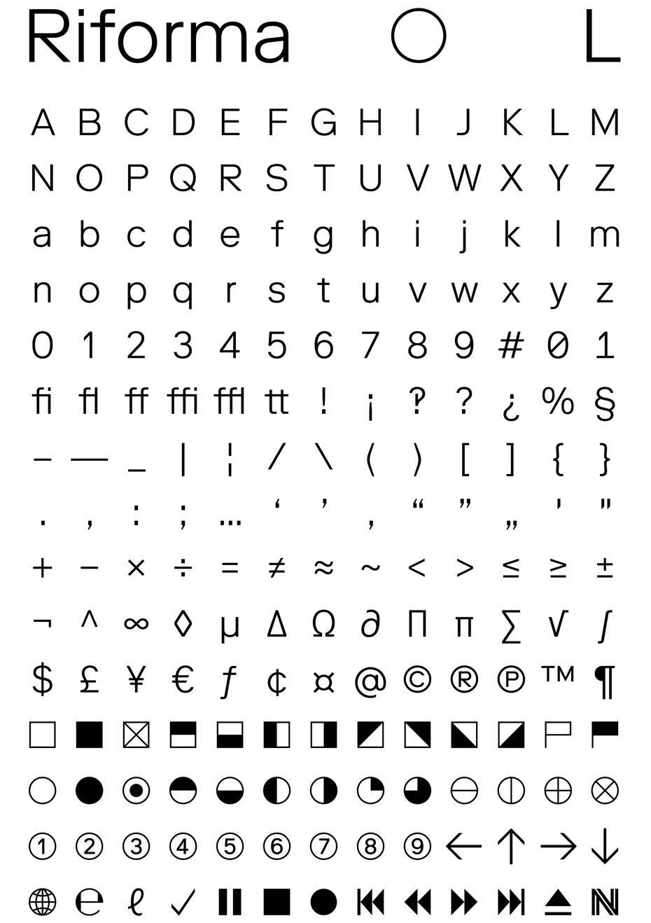
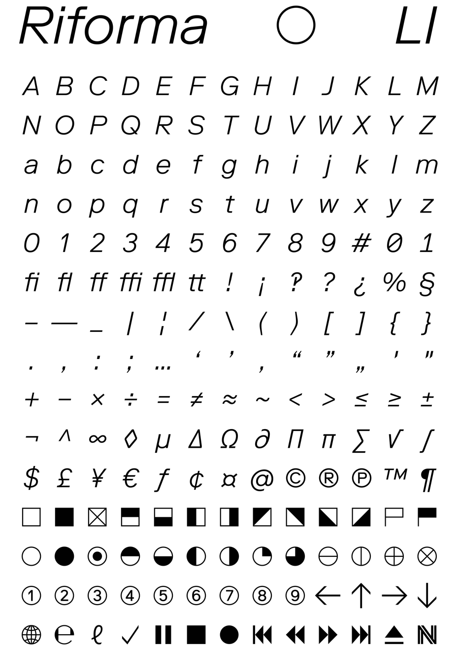
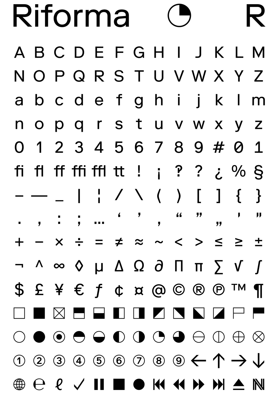
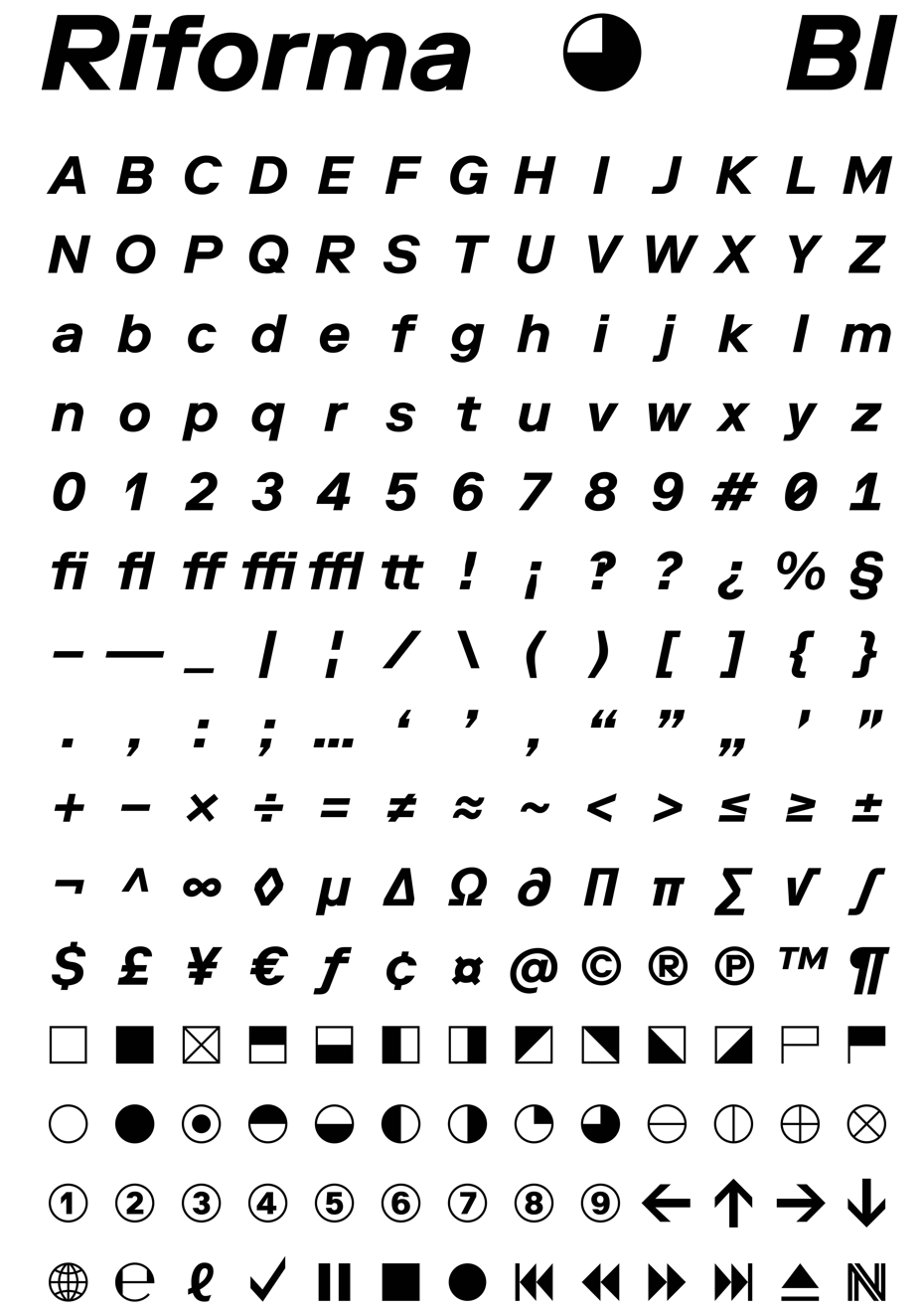
Dimitri Bruni: We only use our own typefaces. Considering the past 12 years, we have only made a few exceptions. This choice is not necessary a restriction, but more of a conviction. The typeface is the starting point, the core, the molecule of every design. A tool that we can trust and that must fulfill our needs. The typefaces we do are the ones we know the best. We have used Simple and Replica for over 6 years, and now Riforma for 2 years. It looks like a continuous process, so now looking at the past, we can guess the future… Deciding to work only with one typeface also solves the problem of choosing. But in the end, the real question is: What are we going to do with it?
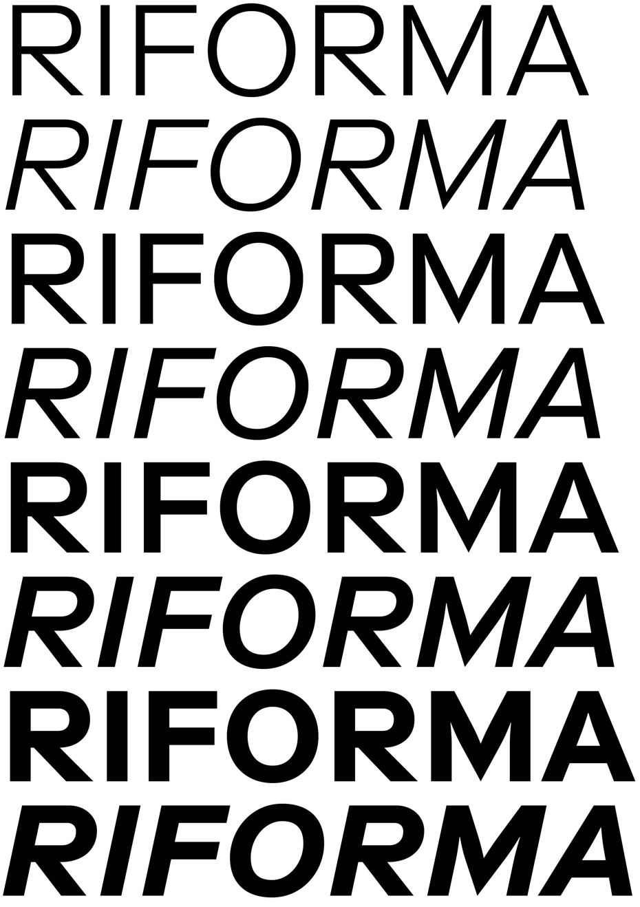
Riforma Typeface. The official release on www.lineto.com is scheduled to begin in the summer of 2017
Riforma Typeface. The official release on www.lineto.com is scheduled to begin in the summer of 2017
Riforma Typeface. The official release on www.lineto.com is scheduled to begin in the summer of 2017
Riforma Typeface. The official release on www.lineto.com is scheduled to begin in the summer of 2017
Riforma Typeface. The official release on www.lineto.com is scheduled to begin in the summer of 2017
Riforma Typeface. The official release on www.lineto.com is scheduled to begin in the summer of 2017
Riforma Typeface. The official release on www.lineto.com is scheduled to begin in the summer of 2017
Riforma Typeface. The official release on www.lineto.com is scheduled to begin in the summer of 2017
Eugene Yukechev: How do you react to the content of a book? What does your book design process look like?
Manuel Krebs: We’ve made a lot of books and their design is very diverse. It’s mainly related to the project and we always try to diminish our role as much as possible. We think it’s not a stage for us, but for the project, as an assignment. We don’t want to create a book cover just to impress our fellow designers. We changed our attitude and think it should serve the context. We are definitely not artists and we do not work as such. We see our job as a craft and not as an artistic creation.
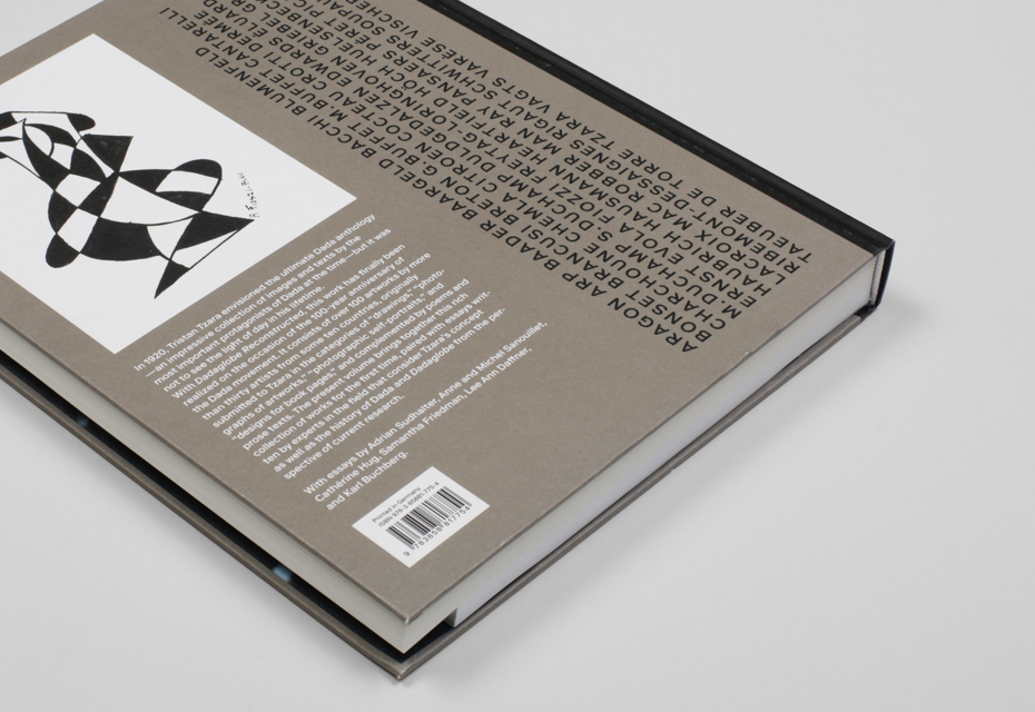
I can give you another example about Riforma. There was an exhibition in Zurich, it was called Dadaglobe Reconstructed. Tristan Tzara had a proposal for a book that he started in 1918 and was supposed to come out in 1921. He invited people from all over Europe and the US to send him texts and pictures. Tristan Tzara collected all these files, took the material and indicated the pages. The book was roughly designed, he determined the form and content. He made a description of the book format. Then it was forgotten. Tristan Tzara died. All of his collection went to auction and was sold. There was a woman from New York who heard about it for the first time. Only now, for the 100-year anniversary of Dada, that woman recollected it — she went to museums around the world and got everything together. There was an exhibition in Zurich and the idea to finally make a catalogue appeared. We thought we would use Riforma type for it anyway. It was immediately a very polemical situation. They said that we had to use the kind of typeface that Dada used.
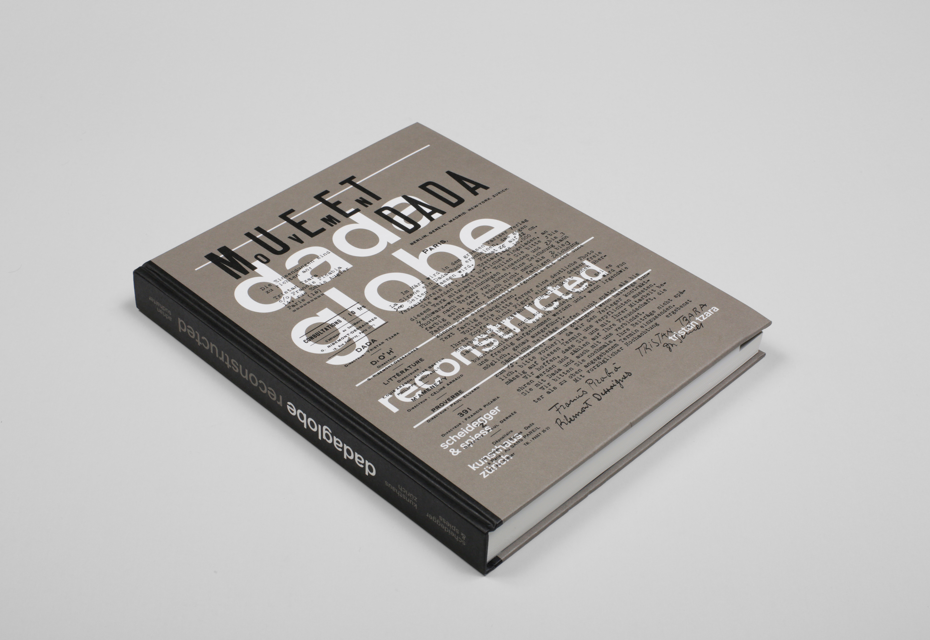
Dadaglobe Reconstructed, Kunsthaus Zürich / Scheidegger & Spiess, Zürich, 2016, 180/200 x 256 mm, LL Riforma
Dadaglobe Reconstructed, Kunsthaus Zürich / Scheidegger & Spiess, Zürich, 2016, 180/200 x 256 mm, LL Riforma
Dadaglobe Reconstructed, Kunsthaus Zürich / Scheidegger & Spiess, Zürich, 2016, 180/200 x 256 mm, LL Riforma
Dadaglobe Reconstructed, Kunsthaus Zürich / Scheidegger & Spiess, Zürich, 2016, 180/200 x 256 mm, LL Riforma
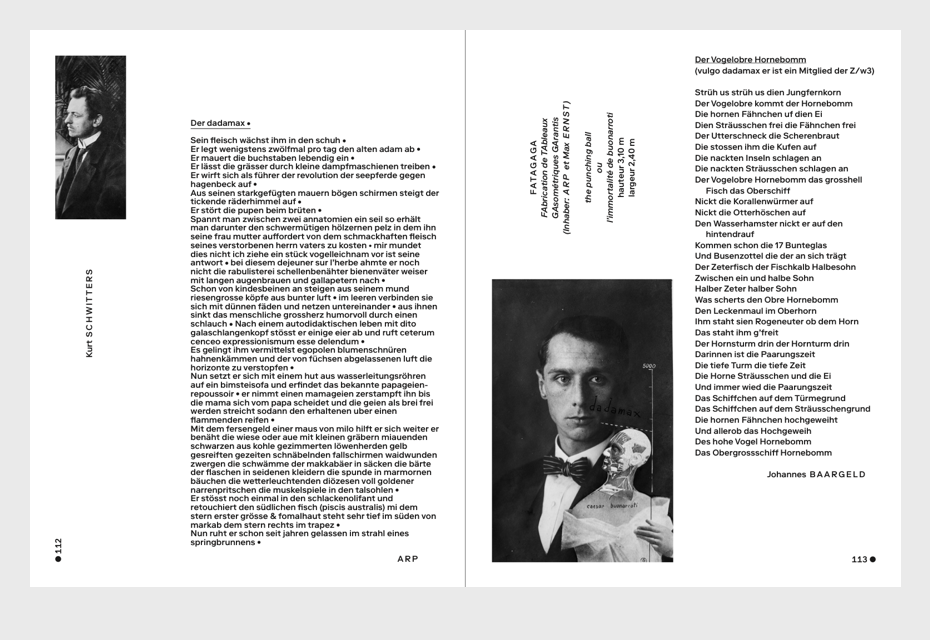
Dadaglobe Reconstructed, Kunsthaus Zürich / Scheidegger & Spiess, Zürich, 2016, 180/200 x 256 mm, LL Riforma
Dadaglobe Reconstructed, Kunsthaus Zürich / Scheidegger & Spiess, Zürich, 2016, 180/200 x 256 mm, LL Riforma
We started to do the layout and started to think what would happen if Dadaists could use a Macintosh computer like we do now. It would be crazy. There are so many possibilities, colours and types that you can stretch and squeeze. Another attitude might have been to try to imitate as much as we could. At the same time, we didn’t want pretend that we are Dadaists, because we are not and it’s a modern publication of today.
We could do a virtuous thing and show how skilful we are, but in the end it’s not about us. So we decided to use only the Riforma typeface and we decided we could have illustrations on a page, uppercase and lowercase. We needed some clear rules. It was more about how we use the typeface.
Gayaneh Bagdasaryan: But you write books about design, it’s something like das Glasperlenspiel (German for “glass bead game”). Is that not art?
Manuel Krebs: Yes, we have our own publications where we do what we want and it’s very different.
Gayaneh Bagdasaryan: Since we’ve started talking about art, what do design and art have in common in your opinion? How do they differ from each other? Do they depend on each other?
Manuel Krebs: I think both art and design work with the same material in the end. It’s all about the things you can see. The artists and designers can concentrate on art or on type, but the effect they have on the viewer is based on the same elements of expression. Of course, art and design are interrelated and inspire each other. Aesthetically, they are very close, but they have different functions.
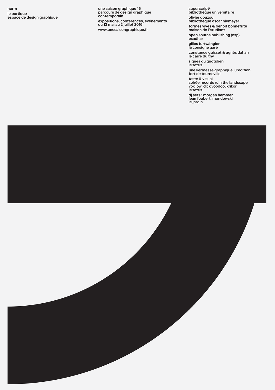
NORM exhibition at ‘le portique’ le havre, France 2016 in the frame of ‘une saison graphique’

NORM exhibition at ‘le portique’ le havre, France 2016 in the frame of ‘une saison graphique’
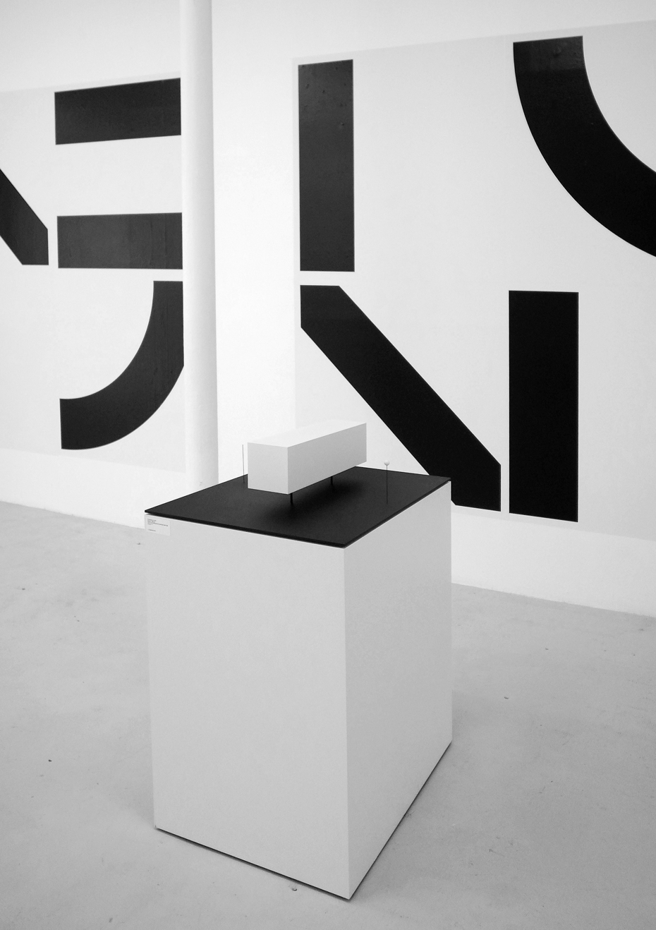
NORM exhibition at ‘le portique’ le havre, France 2016 in the frame of ‘une saison graphique’
NORM exhibition at ‘le portique’ le havre, France 2016 in the frame of ‘une saison graphique’
NORM exhibition at ‘le portique’ le havre, France 2016 in the frame of ‘une saison graphique’
Gayaneh Bagdasaryan: What attracts you in printed things? Do you feel the need to create physical stuff?
Dimitri Bruni: Yes, we feel this need. This partially comes from school. We are interested in creating physical things. Reading a printed book is very different from reading a book on screen. We like print, we like machines. We have to make an extension into the digital area, but we like this mechanical and physical aspect. I have an impression that if it’s only digital, it’s not true. For example, if the typeface is not printed, it’s not real, somehow. Seeing your typeface on the screen is very different too.
Eugene Yukechev: Speaking of digital technologies. Just a few weeks ago at the ATypI conference in Warsaw a new technology, Variable Fonts, was introduced. What do you think about that?
Dimitri Bruni: I love rigidity. Variable fonts sounds like the digital adaption of Karl Gerstner’s typeface in “Programme entwerfen”, based on a 3-axis spatial coordinates system with endless fluidity. Truly the nightmare of multiple choices. But still, it looks like the near future. Technically very interesting. Who knows, in a far-off future we might have Ultra-Variable fonts that will allow us to swipe between Times and Helvetica.
Manuel Krebs: I see this new font format as a tool, and if you have control of it, it could be excellent. But if you don’t know what to do with it, you won’t progress much. I’m sure people will make great use of it, when it comes out. I think it opens up some options for text fonts. For example, you can match the figures with a responsive screen, but you have to see the whole picture to finalise it. It depends on the users. There are certainly companies that need it.
Simple Type Specimen, NORM, 2004, Simple LL & Simple Koeln/Bonn
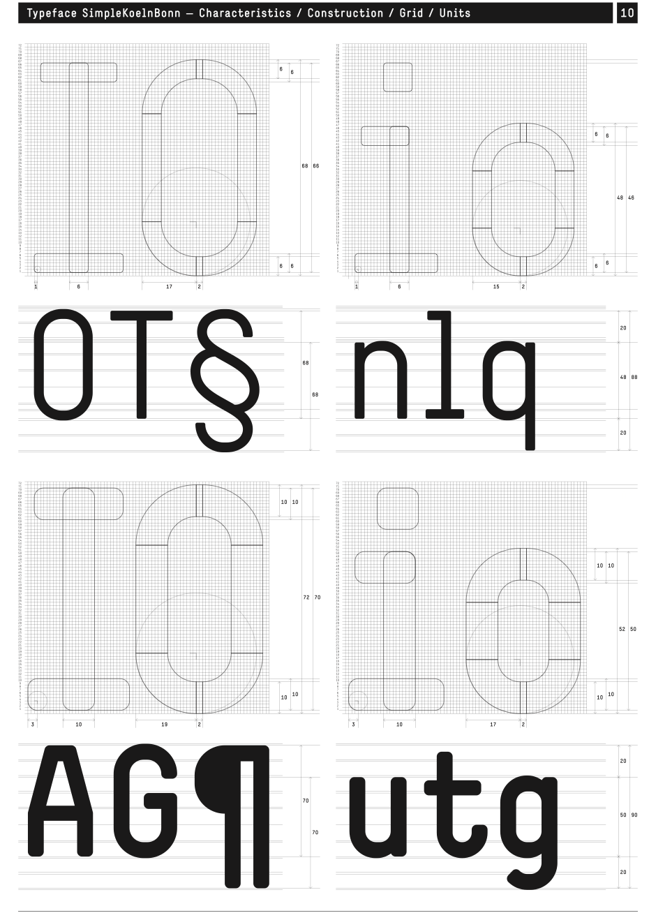
Simple Type Specimen, NORM, 2004, Simple LL & Simple Koeln/Bonn
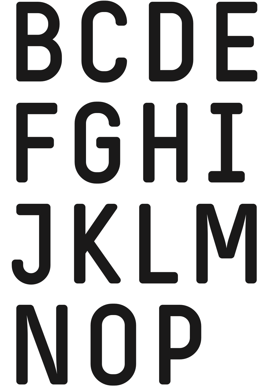
Simple Type Specimen, NORM, 2004, Simple LL & Simple Koeln/Bonn
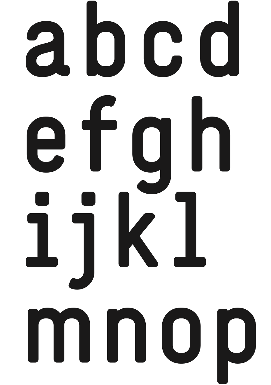
Simple Type Specimen, NORM, 2004, Simple LL & Simple Koeln/Bonn
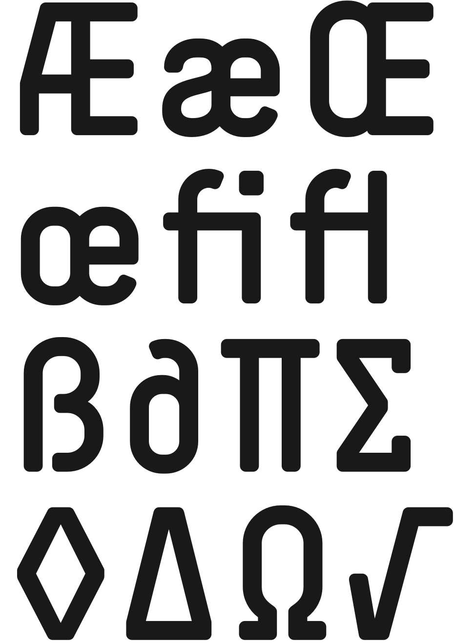
Simple Type Specimen, NORM, 2004, Simple LL & Simple Koeln/Bonn
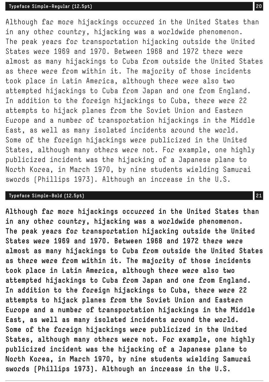
Simple Type Specimen, NORM, 2004, Simple LL & Simple Koeln/Bonn
Eugene Yukechev: You distribute your fonts exclusively via Lineto. Could you tell us a bit more about your experience with the type foundry?
Manuel Krebs: We have been working with Lineto from the beginning. It’s a small type foundry that doesn’t have hundreds of typefaces. Our typefaces are used alongside other typefaces and we want to support these local business partners, who are our friends. It’s a community. We also know other people who have foundries of the same size, but we are very happy with Lineto. It would be a bad idea to go to a different foundry. It’s not like we design three typefaces every year. We mostly work with them because both of us are very slow. They have a very good selection of typefaces. They take care of this and their credibility.
Lineto has a good reputation. It’s linked with that mentality of connecting the old and new generation. They are also very engaged in our creative process, because we talk a lot to them about what we do. In the end, they really lead the discussion. Sometimes we go to Berlin to show them things and discuss it all. There is a lot of discussion and it’s good for us. Sometimes you need a fresh look, because you work on a project for a long time. All discussions with them are very productive and we need this kind of connection. That’s why we are there.
Gayaneh Bagdasaryan: What does your creative collaborating look like? Is it more like ping-pong?
Manuel Krebs: We have so many things that we share, we talk about very specific things. I’m very happy to not work alone. It’s great to have this kind of confrontation and checking of new ideas. Judgement from Dimitri is very important for me. Many times a day we ask each other questions and have very short discussions, when we are not sure. And these short discussions give you certainty, because you have to make a lot of decisions and choices. We have changed many things this way. If I worked alone, I would have evolved very differently. We have colleagues who work alone and they are in their own cosmos somehow. In a certain way, they are autistic. In our case, you have a critic and a support that makes you strong if we both have to defend something. We have some things we don’t agree on, and sometimes I’m upset when I need to change something we had discussed. Certainly, if you have two people, the graphic language is marked by this.
Dimitri Bruni: I would say exactly the same thing, just changing the names. It’s a long relationship and it also has its evolution. In many cases, we just have to look at each other to know what to do. It’s the person I trust when making decisions. You would be shocked if you saw us talking about things. Sometimes you have to explain something, sometimes you don’t. But very often our words are “good”, “not good”, “terrible”. The conversation is also very visual. Very often we have options when working on projects. We are our best partners and our worst clients at the same time. If we agree on something, you would also agree with us.
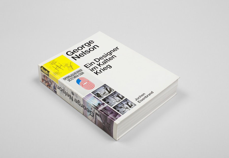
George Nelson: Ein Designer im Kalten Krieg, Jochen Eisenbrand, Park Books AG, Zürich, 2014, 168 x 224 mm, Neue Haas Grotesk
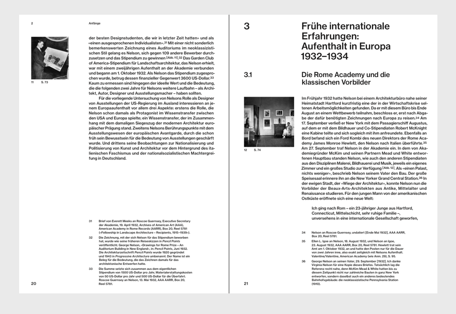
George Nelson: Ein Designer im Kalten Krieg, Jochen Eisenbrand, Park Books AG, Zürich, 2014, 168 x 224 mm, Neue Haas Grotesk
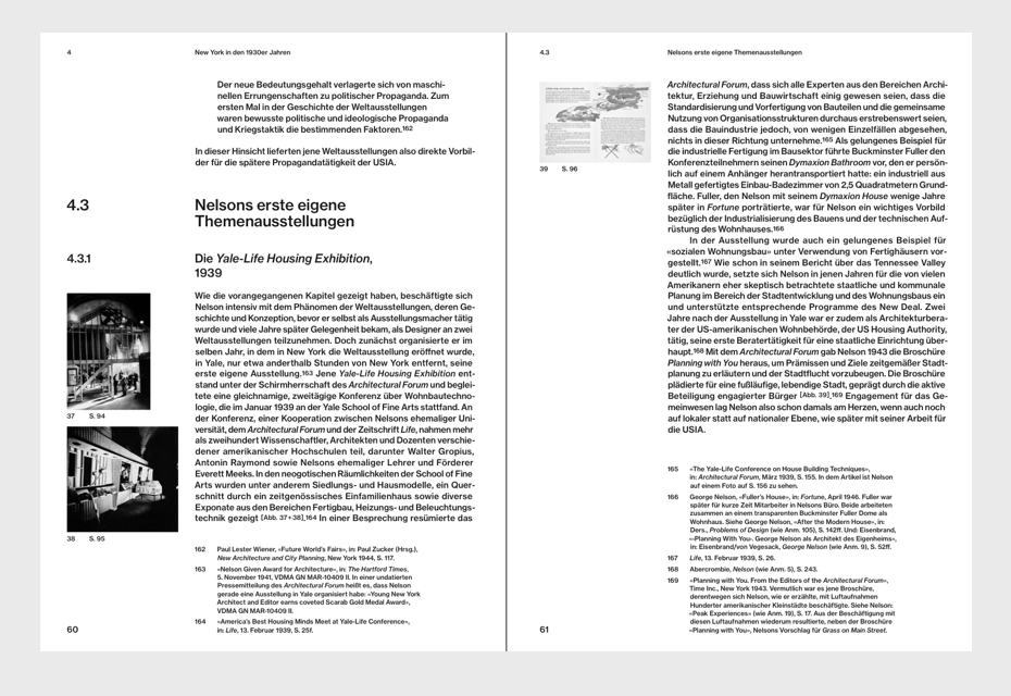
George Nelson: Ein Designer im Kalten Krieg, Jochen Eisenbrand, Park Books AG, Zürich, 2014, 168 x 224 mm, Neue Haas Grotesk
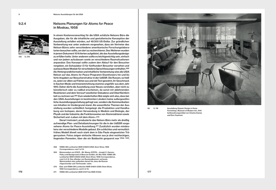
George Nelson: Ein Designer im Kalten Krieg, Jochen Eisenbrand, Park Books AG, Zürich, 2014, 168 x 224 mm, Neue Haas Grotesk
George Nelson: Ein Designer im Kalten Krieg, Jochen Eisenbrand, Park Books AG, Zürich, 2014, 168 x 224 mm, Neue Haas Grotesk
George Nelson: Ein Designer im Kalten Krieg, Jochen Eisenbrand, Park Books AG, Zürich, 2014, 168 x 224 mm, Neue Haas Grotesk
Chimerizations, Florian Hecker, Primary Information, 2013, 156 x 234 mm, Replica / Replica Mono / Replica Chimera
Chimerizations, Florian Hecker, Primary Information, 2013, 156 x 234 mm, Replica / Replica Mono / Replica Chimera
Chimerizations, Florian Hecker, Primary Information, 2013, 156 x 234 mm, Replica / Replica Mono / Replica Chimera
Chimerizations, Florian Hecker, Primary Information, 2013, 156 x 234 mm, Replica / Replica Mono / Replica Chimera
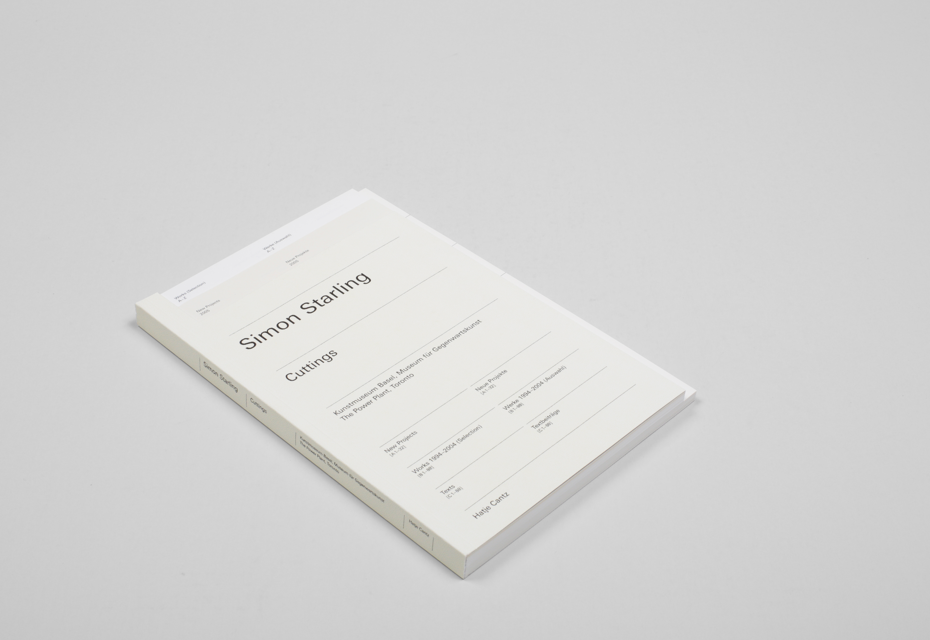
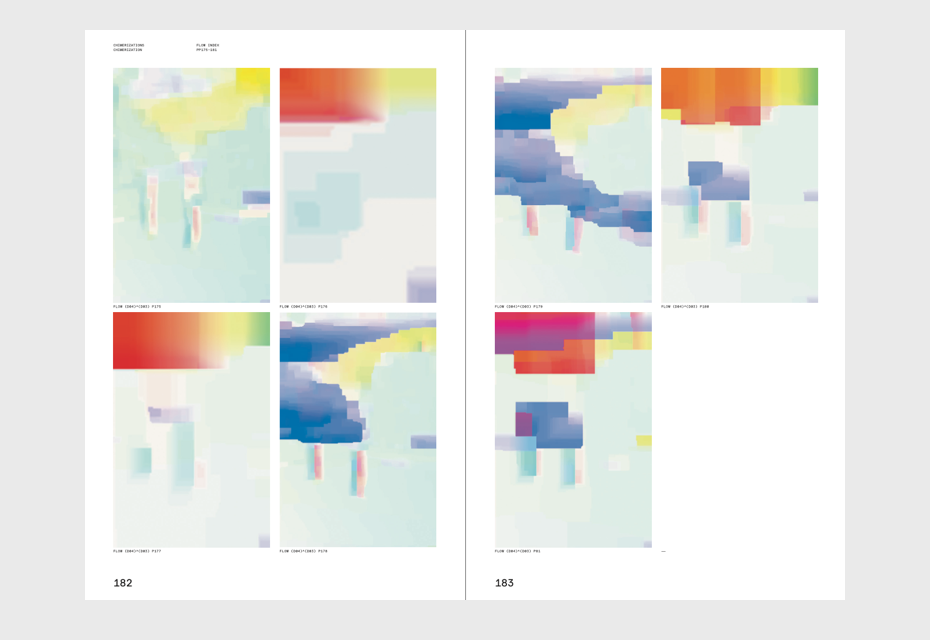
Cuttings, Simon Starling, Museum für Gegenwartskunst Basel, 2005, 156/156/144 x 234/216/216 mm, LT Univers
Cuttings, Simon Starling, Museum für Gegenwartskunst Basel, 2005, 156/156/144 x 234/216/216 mm, LT Univers
A stroll through a fun palace, Lucius Burckhardt, Cedric Price, Hans Ulrich Obrist, Swiss Arts Coucil Pro Helvetia, 2014, 160 x 240, LL Riforma
A stroll through a fun palace, Lucius Burckhardt, Cedric Price, Hans Ulrich Obrist, Swiss Arts Coucil Pro Helvetia, 2014, 160 x 240, LL Riforma
A stroll through a fun palace, Lucius Burckhardt, Cedric Price, Hans Ulrich Obrist, Swiss Arts Coucil Pro Helvetia, 2014, 160 x 240, LL Riforma
A stroll through a fun palace, Lucius Burckhardt, Cedric Price, Hans Ulrich Obrist, Swiss Arts Coucil Pro Helvetia, 2014, 160 x 240, LL Riforma
Gayaneh Bagdasaryan: Are you often completely satisfied with the results of your work?
Manuel Krebs: It’s easier with a typeface. With graphic design, I’m almost always disappointed. When we design it or talk about it, it’s always very good. But when I see it, I realise that it’s not so close to what we wanted, because we didn’t work precisely enough during production.
Dimitri Bruni: When we print a book and they come to the studio, we leave the box laying on the table for hours, and when we open it, we only see the problems. Some books are of good quality and some are not. We try hard to make good work for ourselves first. If it’s good for others, it’s not necessarily good for us. You must judge your own work, and it’s nice when other people like it too. But you have to know for yourself that it’s good and not be fooled by an outside comment.
Manuel Krebs: We reflect a lot on what we have done in the past. We have to have a critical look at it. Sometimes we see something we did 15 years ago and say, “Hey we can’t do anything as liberated anymore”. Now, we wonder weather if we had seen our actual work 15 years ago if we had thought, “Hey how terribly straight and boring”.
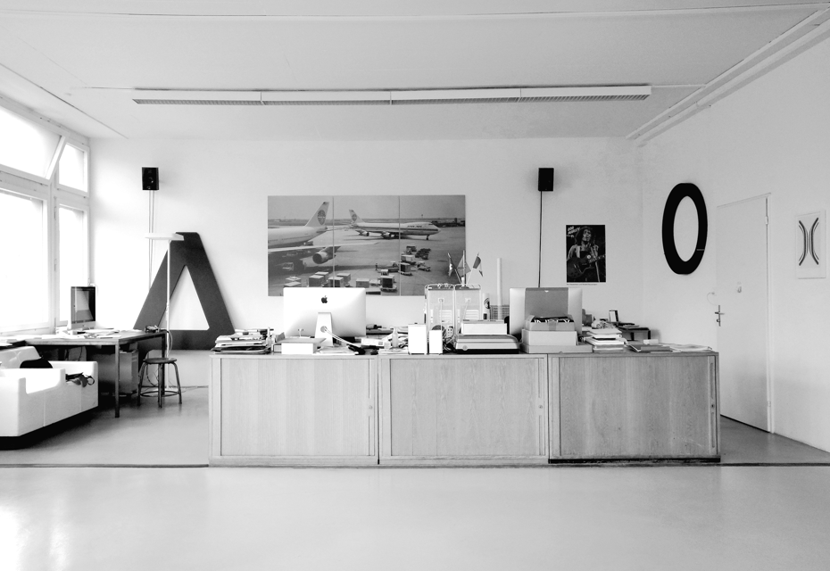
NORM HQ
Gayaneh Bagdasaryan: A final question: what is beauty?
Dimitri Bruni: Beauty is when it’s right.
Manuel Krebs: I totally agree. A short story. I was in a small village in Italy on vacation. One day, they made a party for some special occasion. They decided to decorate the street for that and I was helping out. We used small garlands that we made ourselves. At some point I wondered if we had enough, and a woman looked at me and said, “Emptiness is ugly”. So, when you are talking about beauty, you also talk about a certain ugliness. They are related. Sometimes, ugliness fascinates us much more than beauty. I also think that there is not really much room for emptiness — our world is full of things. But you need a certain emptiness to compare.
Dimitri Bruni: As for the question whether beauty should be outside or inside, we, or at least I, am more interested in beauty coming from the inside, which requires certain systematic decisions and rational thinking. A thing becomes beautiful when there are no questions about the final result, even if it looks ugly.