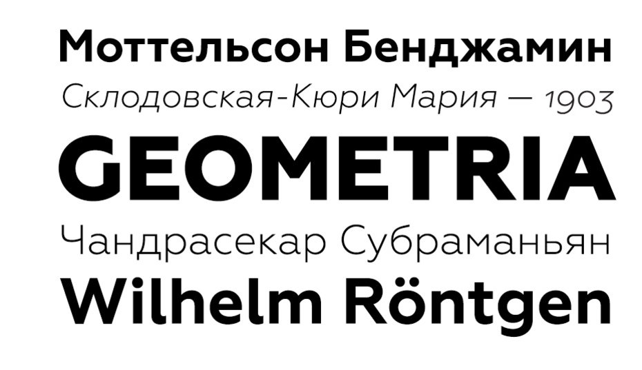
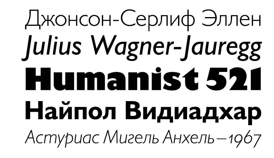
 We are somewhat ambivalent about this selection. The difference in importance between some of the winning entries may be so drastic that their appearance on the same list may seem out of place. Considering our selection criteria may help justify our choices. They were: 1. The font has to include the Cyrillic character set, 2. The font (or its Cyrillic component) must be released in 2013, and 3. The font should be legally on sale to the public. These restrictions left some designs, such as proprietary fonts and student projects out. 36 font families were included in our long list. Our editorial board and staff voted on the top ten. Without further ado, let us present you with the top ten Cyrillic fonts of 2013, listed alphabetically.
Brioni, Brioni Sans, Brioni Text, designed by Nikola Djurek and Alexander Tarbeev (Cyrillic)
Foundry: Typotheque, The Netherland
Brioni, Brioni Sans, Brioni Text, designed by Nikola Djurek and Alexander Tarbeev (Cyrillic)
Foundry: Typotheque, The Netherland
Brioni by Typotheque
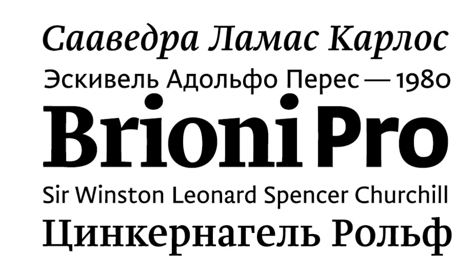
The design of Brioni Serif is based on experiments with a broad-nib pen, however, the strokes evolved in the process of translating the hand-drawn sketches into digital type. The type family’s powerful rectangular serifs, temperate proportions and rhythm make it suitable for various printing methods. The serif part of Brioni family is offered in two optical sizes: besides the normal styles, there are a set of typefaces designated as Text with lower contrast between thick and thin strokes for small point sizes. Brioni Sans was designed by Nikola Djurek in 2010 as a companion to the eponymous Serif font. Despite their kinship, the two type families are independent tools intended chiefly for composing long, dense texts. Brioni Sans is suitable for continuous reading thanks to its classical proportions and elegant shapes, moderate stroke contrast and finely tuned kerning. On the technical side, Brioni family makes extensive use of OpenType features (for example, there are nine types of figures), has a wide range of weights, and offers support for a large number of languages, including Cyrillic and Greek scripts (designed by Alexander Tarbeev in 2013).
Geometria, designed by Vyacheslav Kirilenko and Gayaneh Bagdasaryan
Foundry: Brownfox, Russia
Geometria, designed by Vyacheslav Kirilenko and Gayaneh Bagdasaryan
Foundry: Brownfox, Russia
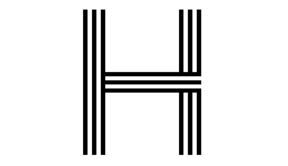
Geometria by Brownfox
The young studio Brownfox is on its way to building an impressive font library in major typographic styles since its debut last year. It’s second release, after Brutal Type, a new interpretation of DIN forms designed by Dmitry Rastvortsev and Gayaneh Baghdasaryan, is a sans-serif called Geometria. Its restrained geometric forms go hand in hand with some unexpectedly subtle details. Its apertures are open and the shapes are well-pronounced. The font family may be reminiscent of other well-known typefaces in this category, such as Futura or Avenir, but has a distinct personality of its own. Brownfox foundry comes to fill a void in Cyrillic type market: geometric sans-serifs with a variety of weights, book old styles, and a contemporary, fresh neo-grotesque are all much needed additions. Geometria offers support for all Western European languages, sixteen weights, OpenType functionality, Cyrillic and Latin ligatures, and mathematical symbols, among other features. This font was a winner of the Granshan International Type Design Competition in the “Cyrillic text typefaces” nomination.
History, designed by Peter Biľak and Ilya Ruderman (Cyrillic)
Foundry: Typotheque, The Netherlands
History, designed by Peter Biľak and Ilya Ruderman (Cyrillic)
Foundry: Typotheque, The Netherlands
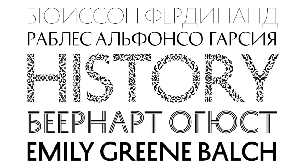
History by Typotheque
Cyrillic and Greek alphabets appeared in Typotheque’s most protracted project (as noted by Peter Biľak) in 2013. In a nutshell, the font system of History is a set of multi-style typefaces, which can be placed on top of each other to obtain new solutions that yield infinitely diverse and spectacular display materials. Peter Biľak started work back in 1990, inspired by the layering effects of 19th c. Tuscan wood types. The idea of mixing different ingredients into the font’s “skeleton” was given new impetus when Biľak and his company were working on the Minneapolis—Saint Paul city typeface proposal. The studio offered its client a prototype font system that could be synchronised with the calendar on the designer’s computer and randomly select historical forms from its own font family database. For the new design, Biľak left only one “skeleton” (with the proportion of Roman inscriptional capitals) onto which 21 typefaces can be “hung”. An essay about the design process is noteworthy, as are the numerous examples of its use.
Humanist 521, designed by Eric Gill; Vladimir Yefimov, Isabella Chaeva, Tagir Safaev (Cyrillic)
Foundries: Bitstream, USA and Paratype, Russia
Humanist 521, designed by Eric Gill; Vladimir Yefimov, Isabella Chaeva, Tagir Safaev (Cyrillic)
Foundries: Bitstream, USA and Paratype, Russia
Humanist 521 by Paratype
The long-awaited Cyrillic extension to Gill Sans, the digital version of Eric Gill’s famous typeface, from Bitstream and Paratype needs no introduction. According to Gill’s autobiography, the type destined to become one of the most telling signs of the British visual environment, Gill Sans originated from lettering for the fascia of a progressive bookshop in Bristol. Upon seeing the lettering, Stanley Morison asked Gill to design a new sans-serif typeface for Monotype. 1927 thus marked the beginning of a font which came to serve the Church of England, the BBC, the early Penguin book covers, and British Rail with equal confidence. The Cyrillic version of the font now offered by Paratype is a part of a full multilingual character set complete with old style figures in six text weights including Extra Bold designed by Vladimir Yefimov and Isabella Chaeva, and the newly added Ultra Bold designed by Tagir Safaev.
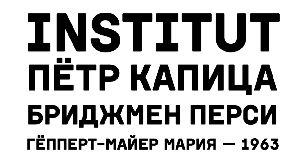
Institut, designed by Vyacheslav Kirilenko with Gayaneh Bagdasaryan
Foundry: Brownfox, Russia
Institut, designed by Vyacheslav Kirilenko with Gayaneh Bagdasaryan
Foundry: Brownfox, Russia
Institut by Brownfox
A disarming typographic equivalent of a vacuum tube, Institut grew out of the aesthetics of monospace types used on punched cards and name plates in endless corridors of Soviet research institutes. Its forms may appear heavy and even rough at first, but it creates an unexpectedly pleasing effect in setting. The romance of ground control centres and top-secret laboratories is played up by Vyacheslav Kirilenko in his specimen. The project is notable for its successful branding effort, which creates a vivid identity and and helps to overlook the lack of the lower case or other weights.
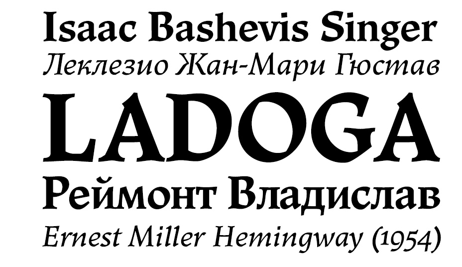
Lagoda by Paratype
Victor Kharik’s formidable project which took over a decade to complete is a revived and expanded digital version of a serif typeface designed by the Soviet designer Anatoly Shchukin (1906–1994) and based on his signature lettering style for book covers and title pages. Ladoga is a calligraphic letter, owing much to a broad-nib pen and closely related to early old style types based on humanistic manuscript hands. Warren Chappell’s Trajanus, issued by D. Stempel AG in 1939–1940 served as a more immediate model. Victor Kharik’s efforts resulted in a sophisticated typographic tool: four scripts (Latin, Cyrillic, including Church Slavonic with special diacritics, Greek, and Hebrew), small caps, superiors, inferiors, alternate glyphs, four text and two display weights. A full list of Ladoga’s features would take up a number of pages, as demonstrated by the designer’s own detailed description.
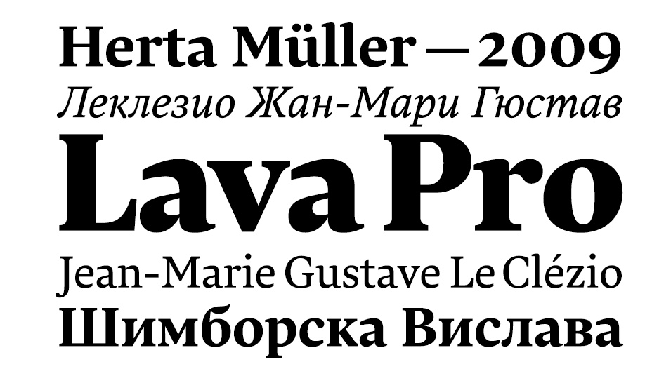
Lava, designed by Peter Biľak and Ilya Ruderman (Cyrillic)
Foundry: Typotheque, The Netherlands
Lava, designed by Peter Biľak and Ilya Ruderman (Cyrillic)
Foundry: Typotheque, The Netherlands
Lava by Typotheque
When Peter Biľak decided to publish his own magazine Works That Work in 2012, one of the first things he did was create an original typeface for the new publication. “I wanted the typeface to be the voice of WTW”, Biľak writes, “confident enough not to need to show off, with the comfortable, relaxed manner of an engaged storyteller, ready to handle long stories, but also small captions or titles. I named it Lava”. Another requirement was the quality of on-screen rendering on a variety of tablets and phones in both high- and low-resolution environments. To satisfy these conditions, Lava was given open counters and moderate proportions, with meticulous letterfit and kerning. In addition, the typeface includes several options for numerals: old-style figures, lining figures for use with capital letters and small-cap figures, all of them in proportional and tabular widths. The type family supports most European languages based on the Latin alphabet.
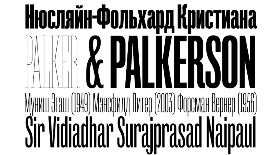
Mr. Palker + Mr. Palkerson, designed by Yuri Gordon
Foundry: Letterhead, Russia
Mr. Palker + Mr. Palkerson, designed by Yuri Gordon
Foundry: Letterhead, Russia
Mr. Palker + Mr. Palkerson by Letterhead
Mr. Palker and Mr. Palkerson is a super family of slab- and sans-serifs with an extended range of weights. “With Palker and Palkerson any copy is guaranteed to look like a picket fence. The six fonts allow you to fine-tune what you’d like to make this fence out of, from the steel rods of Thin to the stone blocks of Black. In their simplest form, Messrs P&P; are designed for tight headlines in Victorian or industrial style. They are a wholesome, somewhat old-fashioned slab serif and a sans with small apertures”, is how Yuri Gordon describes his fonts. The designer is not one to skimp on typographic “spices” and niceties: there are several alternates for each letter, unicase character sets, fanciful ligatures, and small caps, unconventionally designed to match the capitals in weight and width at about one half of their height, so that two rows of small caps could stack one above another or above the lowercase. The resulting two-storey constructions could be used to create a decorative effect reminiscent of Vyaz, appropriate for fin de siècle period typography or logo design. Like many other fonts designed by Yuri Gordon, the Palkersons immediately found their way from the designer’s monitor into print.
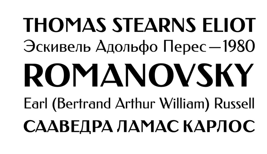
Romanovsky, designed by Vasily Biryukov and Olexiy Volochay
Foundry: Paratype, Russia
Romanovsky, designed by Vasily Biryukov and Olexiy Volochay
Foundry: Paratype, Russia
Romanovsky by Paratype
Paratype released the light weight of Romanovsky in March of 2013. This sans-serif originated in Osip Lehman’s type foundry in 1910, a year after the release of Latin prototype Feder Grotesk by Jacob Erbar (1878–1935) at the Frankfurt foundry Ludwig & Mayer. The idea of creating The digital version of Romanovsky was initiated by Dima Barbanel’s Workshop, who used it in Russian Encyclopedic School Dictionary, published by the Saint Petersburg State University. The bold weight was designed later by Olexiy Volochay based on the Ludwig & Mayer foundry catalogue (Lehman did not have a bold style). The multilingual Romanovsky is a hallmark of Jugendstil (Art Nouveau) with a number of distinctive features, such as about twenty ligatured capitals in Latin and Cyrillic, accented Cyrillic vowels in upper and lower case (including the seldom-accented letter “ё”), and the recently adopted rouble and hryvnia signs.
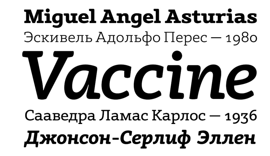
Vaccine by Paratype
Vaccine is a rhythmical slab serif font, characterised by the soft rounded corners of its serifs and terminals and the sharp junctions of its horizontal and vertical strokes. This slightly wide face has a virtually imperceptible stroke contrast. The family consists of five weights with corresponding true italics. Vaccine’s success demonstrates that interest in slab serifs shows no signs of abating and begs comparison to other designs, such as TypeTogether’s Adelle, with recently added Cyrillic character set designed in collaboration with Alexandra Korolkova.